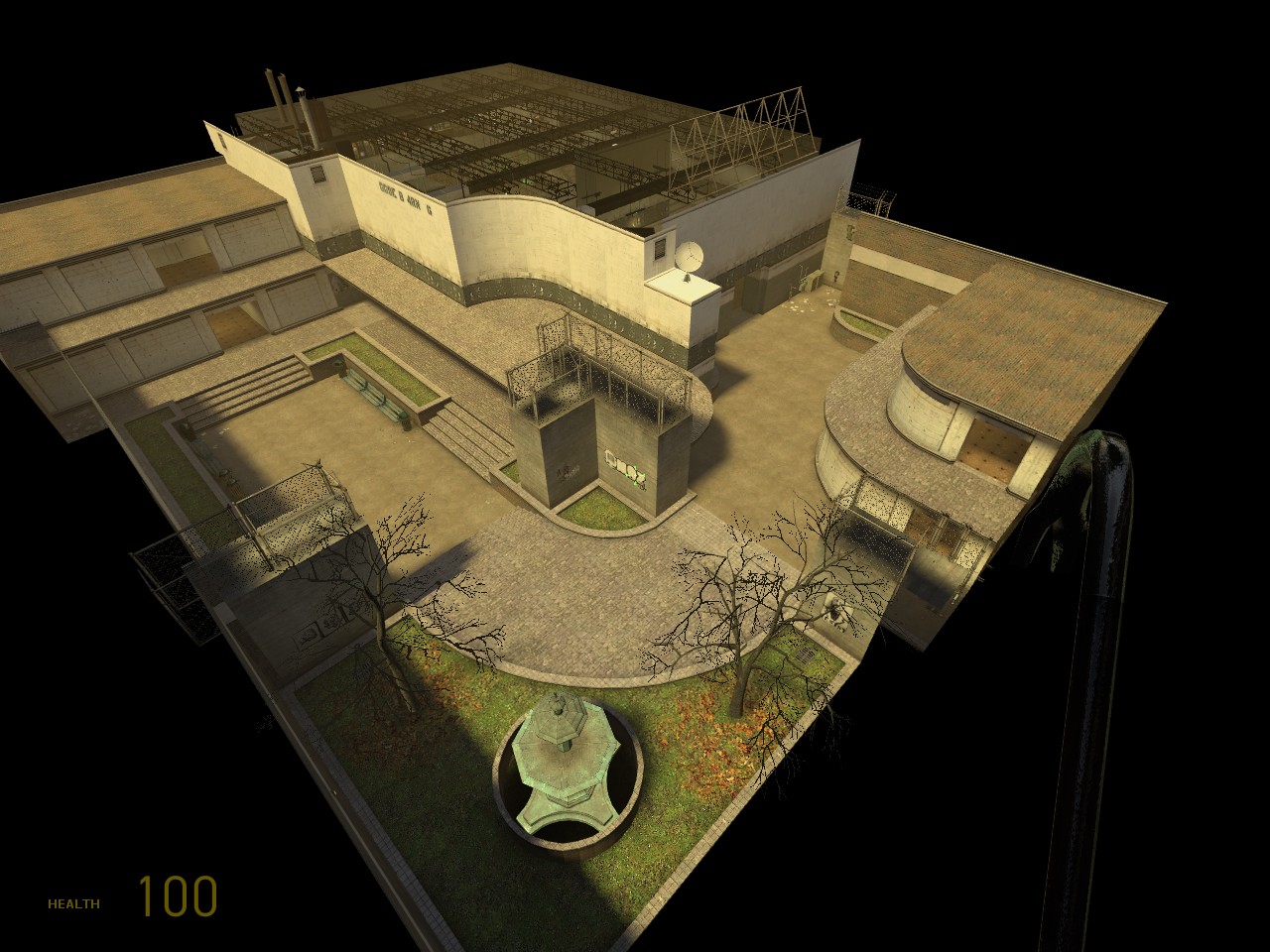
One of the teleports comes out behind the fountain and the only other ar2 is there as well. Thats a necessary pickup when heading indoors. Then it offers cover from approaching opponents from all directions and is shaded as well for making it harder to see back there. Curving it would not only take away some of that shade but hinder movement as well.
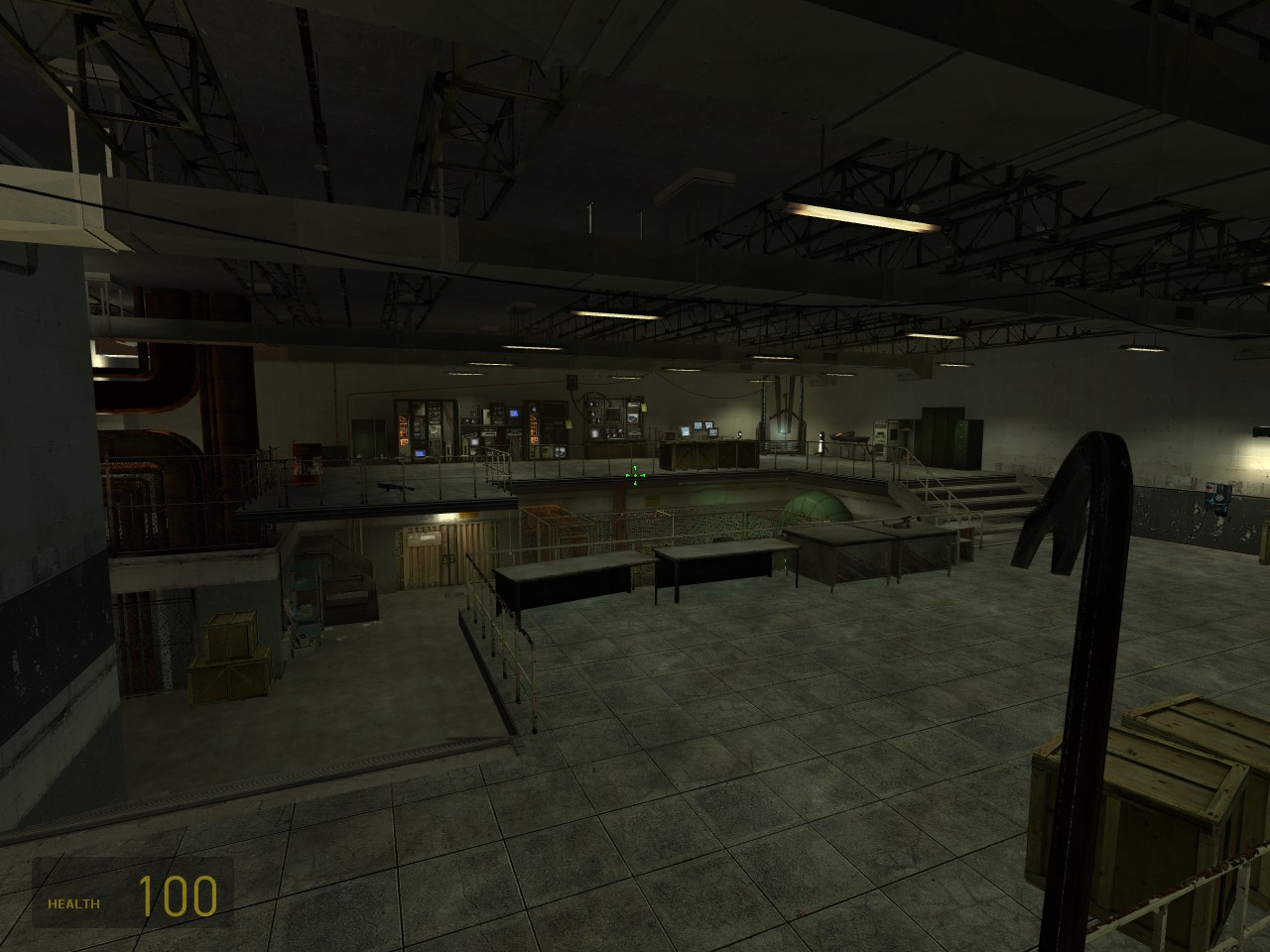
And no the fountain doesnt fit, neither do the chairs from the City 17 trainstation that are acting as a waiting area inside the complex. The combine apc and Breen Podcasts are also far out of context not only from eachother, but especially compared to the Black Mesa workstations. Then theres the tiled rooms and oddly placed restroom without even a door. The handrails are from Nova Prospekt as well and its far from a prison theme. Then the wall decals outside with the two benches makes it look like a high school.
What does this all mean? Thats its rather rag tag to begin with and nothing fits. But in some odd way it goes together. Maybe just because I think so, maybe because it actually does.
Yes, you cant focus too much on gameplay can you. Thats why previously I had asked the [VDuS] clan if I could remake aim_arena_b4. It had no lighting, was compiled and is played only in fullbright, no cubemaps, ugly as sin. I came up with aim_arena_b6. The odd thing is that b4 still gets played far more even though Id swear it makes my eyes literally bleed.
The thing you said which I completely agree with is that you cant discount the looks too much. Better graphics, shading, lighting, and even at a minimal degree architecture, plays a role in the gameplay itself.
To make a map that is architecturally consistent, and somewhat complex, however, would require another project from me. This one just cant fill those shoes. I had a basic plan, a fast paced, two leveled, five sectioned, 1v1 map. You dont have to go very far to get at your opponent. There are two of each weapon, evenly spaced, therefore it is evenly played. The best man wins.
With the experience of making this map behind me for the most part now, I think I can begin to grasp at a larger theme, and more complex and consistent architecture. That will have to be the next project. But this ragtag, mosh posh, Punky Brewster impersonation of a map called dm_joyride is going to have stay as the makeshift garage style that is is. If I could just get a slight performance increase I could move on.
Thanks for the replies, and more suggestions are welcomed.
The map is moreso designed for gameplay, complex architecture was not the goal and goes to waste when your ingame focusing on your opponent. While its nice on a map for the sake of the map itself, it has no effect on gameplay. Hence, the simplistic approach. dm_drift for example has kickass looks, but it runs like crap so it will never see much play. It also has the poorest weapon placement Ive seen in awhile.
I cant round the back wall by the fountain. In Quake 4 the physics allow the player to smoothly glide off of walls, it has no effect on player speed. In HL2DM the players momentum slows some if he hits a wall at even a slight angle. This means that sharp angles actually provide a key gameplay function. It allows for smooth player transitions in terms of direction. Curved walls make the player feel slow. dm_lostvillage and aim_arena are perfect examples. While ugly in terms of mapping, they provide the most solid gameplay, and are two of the most played custom maps. Neither has curved walls that the player will come into contact with for a reason. *The exception is when your dealing with very tight corners, which when they are curved are closer to being perpindicular anyhow. Any medium to large size areas function better with sharper turns.
I ran a compile without any static props, and the fps did not increase very much. So the main performance hitch is in the level design itself and being able to see almost every other area of the map from any angle. Fortunately the map is not very large, so I should be able to turn a few walls and doors to remedy that and improve performance.
Again, bear in mind, the focus is on gameplay, and within that context 1v1 or small pubbing. The lower inside track of the map circles the map extremely fast, the two teleports keep the player guessing as to where his opponent is,. Then the outer track (typically on the second story), allows for a more tactical approach.
Posted by
reaper47 on
Wed Dec 13th 2006 at 10:20am
I don't know if you know the famous "Zombie's Optimization Tutorial". If not here's the link:
http://www.student.ru.nl/rvanhoorn/optimization.php
It contains all the info you ever need regarding optimization and performance. The rounded parts can create a lot of polygon salad. Did you ever view them with "mat_wireframe 1"? Make sure they are func_details, especially where they are more of a decoration than a solid wall.
I think the map looks very OK for a first try. Regarding the props vs brushwork issue, I just meant you actually doing it quite fine, especially the rounded parts. Just try running through a map you consider to be very detailed (dm_steamlab, for example) and use "r_drawdecals 0" and "r_drawstaticprops 0" in console. That way you'll see the "pure" brushwork without the details added on top of it (props, decals,...). You'll see that the brushwork and especially lighting makes a lot of the visuals and atmosphere, although it's rather simple.
The simple walls around the fountain are an example for a place where a prop hides some over-simplistic brushwork around it. Try rounding those parts, too.