@Underdog. I couldn't really understand your post, but are you
upset at the references to Orpheus? The fervor with which you
(like Orpheus) champion 56k friendly images is uncanny -- and I think
it's something that Cpatain P was pointing out in good fun.
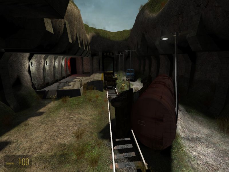
@DK. I agree with Captain P's comments that the long hallways
aren't great for gameplay. Also, the symmetry of the hallways (an
issue that was pointed out to me by both Underdog and Reno in one of my
own maps) detracts from the overall architecture I think.
<DIV class=quote>
<DIV class=quotetitle>? quoting Captain P</DIV>
<DIV class=quotetext>Underdog, you should recommend a tool like Xat to people with such large screenshots (filesize-wise). Just like Orpheus did. :smile: </DIV>
<DIV class=quotetext> 2 times in 2 days, not that I am keepng count. :rolleyes:
</DIV></DIV>
I just found out about 45 minutes ago and the answer is "No freaking way"
I have been the butt of that joke for days now and I think that I would rather just stop a file download from now on. If these people are this rude, they don't need me adding my rudeness atop it. So from now on, if its to big, I will just move on.
BTW, the joke HAS run its course.
Posted by Captain P on
Fri Oct 28th 2005 at 9:44pm
Underdog, you should recommend a tool like Xat to people with such large screenshots (filesize-wise). Just like Orpheus did. :smile:
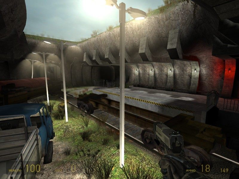
Anyway, I think the first screenshot looks more abstract than really
mansion-esque. A nice style nonetheless, but not really fitting with
what you're aiming for I think.
Second shot looks more like it, though it's still very rough (architecture and texture-wise) it's already more like a mansion.
Third shot looks less good, the texture choice clashes somewhat with
the modern shape of the lamps and the pillars. The hall looks too long
for a hl2dm map (players are slow so hallways and paths shouldn't be
too long).
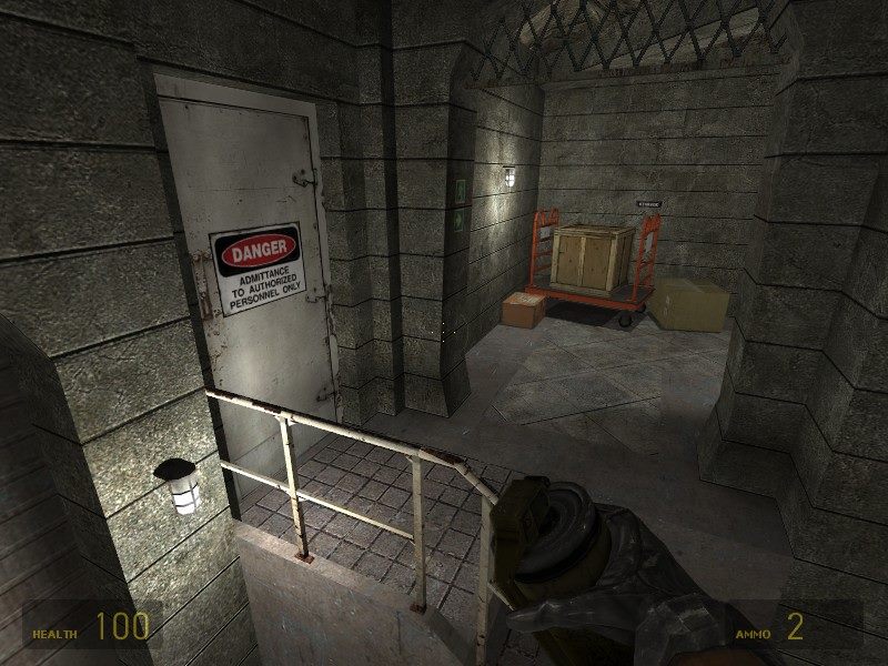
Fourth shot looks strange. I can't make up what it's going to be yet.
Fifth shot looks more like it, though the same things apply here as
with the third shot: clashing styles and too long hallways for a hl2dm
map. I also assume you'll fix those window textures in the upper left
corner? They look out of place.
All in all, I think it's too early to give any real comments about it
but it's better to spot things early than too late. Good luck with
this. :smile: