Unfortunately I don't have HL2 so I couldn't play your map, but I'm going to make a few comments based on your images.
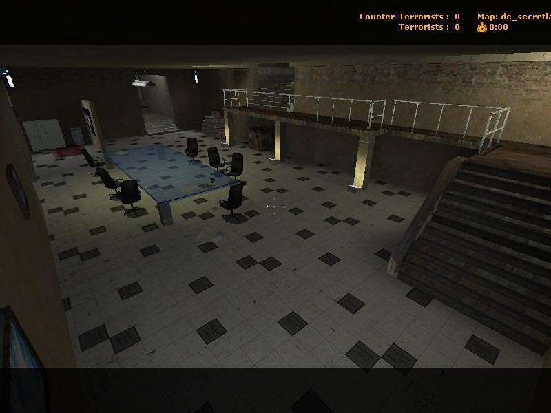
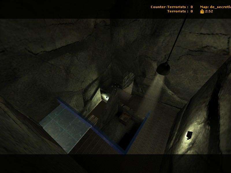
Your texturing looks good enough, no visible errors (although the rocks do look a little strange... perhaps its because they are just flat walls?).
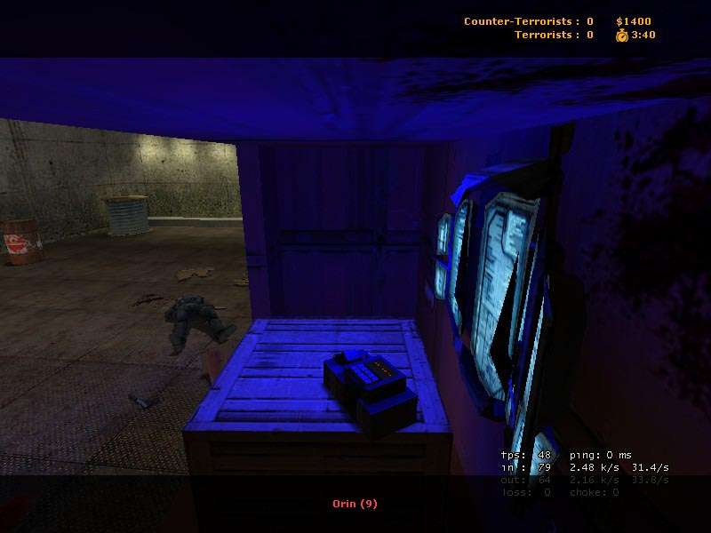
Your lighting is average, although the lights at the base of the catwalk support show some promise. The blue light is so blue it's irritating. Definitely room for improvement with your lighting in general. Try recessed lights, or lights that highlight some sort of interesting geometry.
Which brings me to my next point: your level geometry needs work. Right now I'm looking at rooms that are essentially boxes. This map, from the screens, looks like it could be run fine in Half Life 1. Experiment with curves, and more complex geometry. Try to make each surface of your map interesting. Especially the ceiling.
If you look at someone like crackerjack, he creates amazing maps with amazing detail on every surface of his levels. Here, look at his profile and check out some of his maps to see what I'm talking about:
http://www.snarkpit.net/users.php?name=Crackerjack
I'm sorry I couldn't download the map, but I hope you can take this constructive criticism and improve your map. Oh wait... its complete? Hmm well, things to keep in mind for your next project.
Good luck!