dm_overdrive by Drshark

Map Rating

  • 0
  • unrated

Map Download

Map Info

Map Description

Hello

I have been mapping for a month or so, gotten quite a lot of feedback about my mapping, and it was mostly "Practise your Brushwork please!!1", so i did. 18 hours straight i mapped on this, and then a couple more hours the day after. The map is pretty much finished, just need to tweak physics object and lightning, maybe some details too.
Tell me what you think, and i hope that my first map won't be crap :)

PUBLIC BETA UPLOADED

Known bugs &/OR issues

Cubemaps refuse to work properly
Skylight looks weird
Minor leak holes (But there aint a leak in the compile)
Some textures have misaligned themselves
Some textures have rezised themselves and won't change (the window for example)

TO DO:

Fix the skylight
The minor leak holes shall be fixed
The misaligned textures will be fixed
Making some more interresting geometry
Tweaking light, ALOT
More balancing

Got something you want to see in the map, or you found a bug? PM/Email me, and i'll see what i can do.

I'd be happy to test you'r maps if you'd do the same for me :)

-Dr.SharK

-Dr.SharK

Discussion

Posted by Drshark on Tue Jun 6th 2006 at 4:07pm
[Author]

Yawn. 9 downloads, ZERO comments? Someone must have something to say! Comeon people! :biggrin:
Posted by Drshark on Tue Jun 6th 2006 at 11:35am
[Author]

Now, let's talk alittle about the beta that i have released. I would like some feedback :smile:
Posted by Drshark on Sun Jun 4th 2006 at 5:28pm
[Author]

PUBLIC BETA UPLOADED

Known bugs &/OR issues

Cubemaps refuse to work properly
Skylight looks weird
Minor leak holes (But there aint a leak in the compile)
Some textures have misaligned themselves
Some textures have rezised themselves and won't change (the window for example)

TO DO:

Fix the skylight
The minor leak holes shall be fixed
The misaligned textures will be fixed
Making some more interresting geometry
Tweaking light, ALOT
More balancing

Got something you want to see in the map, or you found a bug? PM/Email me, and i'll see what i can do.

I'd be happy to test you'r maps if you'd do the same for me :smile:

-Dr.SharK
Posted by Drshark on Fri May 26th 2006 at 4:13pm
[Author]

I am unable to continue mapping for a while, since Valve f*cked up the SDK on ATI Cards.
Posted by Drshark on Wed May 24th 2006 at 7:45pm
[Author]

Thanks alot for the feedback guys, i have added some new brushwork

The beta is almost ready to go, will upload it today

I must have struck some luck with this map, since the layout is perfect for battle.

I've made a video, which is currently uploading, showing what i mean, heck, its almost a skill video.

The beta is well, in beta, so it's bugged. I already know about many of them, but if you find anymore than i list when it's uploaded, please say so :smile:

-Dr.SharK

EDIT: Uploaded http://rapidshare.de/files/21329774/Death-Matched.zip.html
Posted by reaper47 on Tue May 23rd 2006 at 10:24am

Ahh crap, sorry, I thought they resized themselves.
Yea, there's some discussion about the uploading feature. Sometimes it takes a while for the pics to show up (clearing the browser cache sometimes works). Sometimes the downsizing doesn't work or resizes correct images.

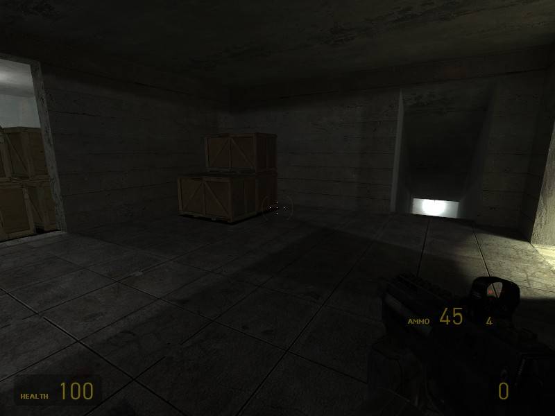
Anyway, a nice, energetic shot of the crossbow, but I'd recommend to face the facts and use screens with no players and the HUD and weapon models hidden (there's a console command). It gives a better view of the "rough" architecture, which you'll see through all the action when playing the map "live".

I'm quite particular when it comes to lighting but for a "first map" it already looks fairly good. I agree with the upper left light being a no-no (the ceiling shouldn't be lit) but the rest looks ok. Maybe a colder, more-bluesish light in contrast for some of the lower areas or the room to the right. Avoid any white/grey lights. Always give them some coloring.

People tend to look at the parts of a map that look the worst and the "flattest" so the border for the doors look rather flat and the texture looks odd. Spend some time on the door borders, use some more fitting textures ect. That's quite important as they are landmarks for the players (people run from door to door and see them from close).

Always remember that the first map(s) you make aren't supposed to get any cheers in public. It takes more than a few months to really get into it and produce something that actually looks like eyecandy and good game balance. I'd recommend to take a (very) close look at existing maps you consider to be excellent - perfect. Look where they put their detail, the lighting ect. Looking at good custom maps is often a good idea. Valve's maps are 
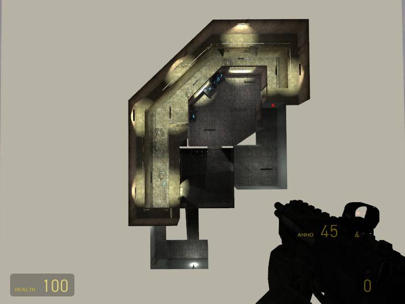
very smart and efficently built so it's often hard to see the tricks that make a seemingly simple and low polygon room look good. But look at steamlab and lockdown and how they used spotlights. Look at underpass for some interesting architectural details. Look at the ceilings and floors. As for layouts a good tip is to make your corridors short but wide. People don't like corridors but you need them for any non-killbox (killbox=satan) layouts so at least they should leave enough space for some fights and fast movement.

I'll quote Reno: You're on the right track! You're still in the phase where it's important to analyze a lot of other maps for mapping tricks and instpiration.
Posted by Drshark on Mon May 22nd 2006 at 7:03pm
[Author]

<span style="color: white;"><html><head><link rel="stylesheet" href="themes/standard.css" type="text/css"></head><body topmargin=2 leftmargin=2>Ahh crap, sorry, I thought they resized themselves.

Well anyway, i'm gonna see what i can do regarding making more obstructions. I have just played it with a bunch of people, and they thought it was fun, though a little bit too unbalanced.

I would have wanted to get more pics up, but the site refuses for some reason (erroe when direct upload and no show when from an image host)

I'm gonna make it more interresting, i have already seen those Brush turtorials, so stay tuned.

Btw here's a description

"Overload is a Half Life 2 Deathmatch map, the first one at that, from me. Overload uses textures from the Nova Prospekt section, and is set in a prison (well, sort of).
The gameplay in the level is frantic, mainly for 2 or 3 players. All weapons are in there, and plente of stuff to throw around with."

-Dr.SharK<html><head><link rel="stylesheet" href="themes/standard.css" type="text/css"></head><body topmargin=2 leftmargin=2>

EDIT: Here's a download link if you would like to check it out (the room filled with boxes HAS been decorated now :wink: )

http://rapidshare.de/files/21114103/dm_overload_abcdefghi.bsp.html
</span>
Posted by Crono on Mon May 22nd 2006 at 6:29pm

Nice.

It seems the learning progression in general is: box -> hall -> halls connecting boxes. :smile:

As far as this map goes, I can't tell my by the screen except for the upper level, the lower level looks like a bunch of props and junk. So, other than what ReNo suggested, I'd have to say, while the lighting is very nice, it's a bit wrong. I would suggest messing with the lighting more, giving it a wider angle for florescent lights like that. Also, be aware that they project light in every open direction, so you may want to widen the angle some more. Fluorescent lights, also, are very efficient for completely lighting areas, keep that in mind, so if you want dark dank lighting, a focused light (like a hanging lamp) would be more appropriate.

The light you show in the middle (directly left in the screen) is the most obscure, because you used a model of the light being off. If you can't find a model of it on (which I doubt since you're using them too) You can project light back on it to make it look on, not the best solution, but it works (You can also alter the skin to make it appear on it is pretty simple as well, you'd just have to distribute it with the map.)

I can't really comment on anything else, since not much else is there. Keep it up though, It isn't bad by any means.
Posted by ReNo on Mon May 22nd 2006 at 6:15pm

It looks basic but a fairly solid first effort. It's not just a box room, and it has lighting, so you're certainly on the right track :smile:

You could however still stand to work on your brushwork. Break up your flat surfaces with pillars, support beams, alcoves, indents, seperate layers with varying depth, windows, skylights, floor grates, etc... Use your brushwork to bring in some detail rather than leaving it all to the props - use props to enhance what is already there.

Keep it up though, you're doing fine and practice is all you need by the looks of things :smile:

Oh, and in future please keep your images to 800x600 and around 100k - no need for them to be so large in resolution or filesize and some of our members don't have speedy connections.

Welcome to the Snarkpit!