dm_ff_stinger_rc1 by Juim

Map Rating

  • 4.666666666
  • 3 ratings / 4.67 stars

Map Download

Map Info

Map Description

A curvy medium sized dm map with many secrets, and some good connectivity.

The current discussion topic can be found here

Discussion

Posted by Juim on Sun Jun 7th 2009 at 2:43pm
[Author]

well, it's finished for the most part. Download has been updated to this final version. I called it rc1 just in case someone found something I missed but I really can't think of anything else to do here. Heavily optimized from beta 9, (Thanks Haymaker and [eye]Valar!). Retextured and re-lit, I feel like this is also the most playable so here's a couple of screenies:
User posted image
User posted image
couple of shots of the lower area.
User posted image
Here's a picasso style teleporter!
User posted image
From up above. The rest of the areas are pretty much the same as the other screenshots, so I won't bother reposting them, but thanks for your inputs and as always, having a look!
the download:
http://www.brdstudio.net/ffmember/juim/dm_ff_stinger_rc1.zip
Posted by ffjakebrake on Tue May 12th 2009 at 9:19pm

The only thing I have to say is that the true testimony comes from the multitude of players who have playtested this map over the last few weeks. The general feedback is that this map is extremely enjoyable to play with a real diverse layout which keeps the action fresh. I continue to receive many requests to put this map up next n the cycle while we are playing. There are areas of this map which are tactical, and yet other areas where it is straight out close up warfare. Once again, great job! So far this year, this map is the players favorite, at least on my two servers!
Posted by haymaker on Fri May 8th 2009 at 6:31pm

Yes the barrel reskin is not too much work at all. Check out Aaron's tut ( nice work btw on the tuts Aaron ).

And check your PM's Juim.
Posted by Le Chief on Mon May 4th 2009 at 10:12am

Gee, I hope I can give as good feed back as Haymaker did :p

Well, the visuals are starting to look pretty solid now, lighting looks a bit sharper, don't know if that's just because there is more contrast (colour and brightness wise) now, I still think the textures look really diffuse though. You need to add more "trim" and add a bit more depth to those walls by using more "detailed" textures I guess and ease off a little on those bare textures, although the diffuse textures don't stand out as much as they did the last set of screenshots.

I'll download it later and I'll let you know what I think, I'll pay attention to gameplay and such this time ;). But seriously, if I don't reply within 2 days, you should pm me just to remind me, I'll probably forget!
Juim said:
I don't do modeling yet, but I would love to customize the exploding barrels with the FF logo!.
Photoshop skills is all you need! I wrote a tutorial on this. Hopefully its not too messy, I think I might have to refine it up a bit!
Posted by Juim on Mon May 4th 2009 at 1:48am
[Author]

Come on people!. Reaper! Reno!, I at least deserve an "I hate this map!". I can take it!. And,... I historically have made huge changes based on suggestions made by you Pitters. As it is, I am getting the most positive feedback I have ever recieved on this one from the server crowd. So make with the opinions/critz. I'd do it for you!
(Insert soft emotion extracting violin music here). :pirate:
Posted by Juim on Sun May 3rd 2009 at 1:55pm
[Author]

http://www.brdstudio.net/ffmember/juim/dm_ff_stinger_b9.zip
Latest version. Here's some screenies:
User posted image
User posted image
User posted image
User posted image
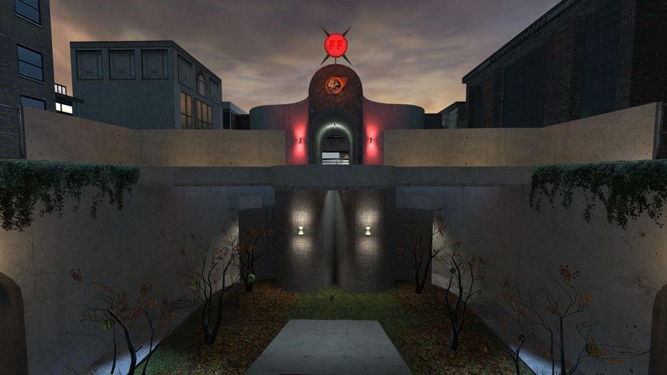
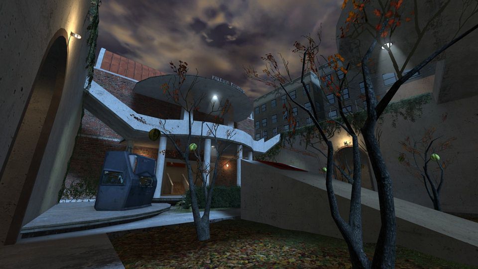
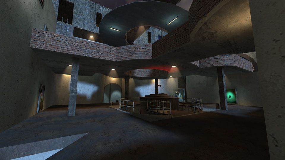
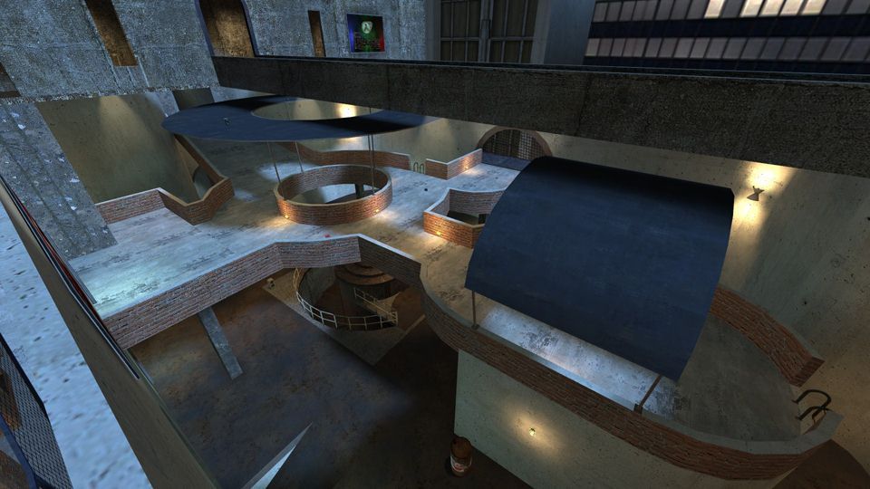
So I widened the walkways in the upper west courtyard. Added some awnings for drop down Z-axis fun. Added some teleporters to several different parts of the map to aid gameplay. Re-lit the entire map(and added a tone of walkway lights), enlarged the "Jump" pad, clipped the outer walkways(so you can't get outside the map now), and btw the whole map is clipped to facilitate low grav servers,(but the frame rates might not be so desirable from way up there unless you have a monster rig.). There are no screenies of the lower area, as not much has changed there. I must admit that the way my brain works, sometimes I need to step away from the mapping for a bit, and usually, something will come to me.And, the watermelons in the "Pluck-n-Chuck courtyard are 'splodable now!
Things I need to do yet:
The lower area(duh)
I need a good tutorial on floating weapon pick-ups. (The one at interlopers leaves a pile of weapons at the world center.).
Founders hall(east side). Need to add a back room, it's a pet project for the clan, but I also need to add some incentive to go there for gameplay balance.
I don't do modeling yet, but I would love to customize the exploding barrels with the FF logo!.
And of course, any major changes you might see/suggest will always be taken into consideration, (as you can see by the B9 version!.)
Thanks for the great feedback as always.
Posted by Juim on Sat Apr 25th 2009 at 11:25pm
[Author]

Thanks Hay for the great comments. I am attempting to balance that area out by adding a back area to the founders hall, and throwing in a combine ball spawner. Your praise is unexpected and greatly appreciated.It's Awesome to get such positive feedback from such a noted mapper!!!!!!!!!!!!.
(PS)..
I will definitely put a healthpack in that area you mentioned.
Posted by haymaker on Fri Apr 24th 2009 at 7:58pm

I've had a few games on this now, and it plays great! The attention to FPS has really helped it along. Your best effort to date by a fair margin imo. Yesterday I noticed a particular angle into the 3d box that was near-perfect too.

I found it quite easy to just camp the back basement orb-hcharger-understairteleport area for most of the games I've played. That area has a lot more power base than the "FF" hall, which I found I just didnt even want to go to, knowing there would a good chance of slams there, or an rpg user nearby. Not worth the might-not-be-there power points either. So for me the map seems a bit unbalanced that way.

One other subconcious point i noted is that I kept expecting an hpack/vial at the top of the ladder leading to the back window, from that hcharger area below. idk why but it seems that there should be one there, maybe because it's a 4-way intersection.

Sweet map, one of my favs so far this year!
Posted by haymaker on Sun Apr 12th 2009 at 2:20am

Lookin' good! View seems a little "sharper" in that screenie. Those walkway-awnings look like a good idea, save some fall damage. Just as long as they don't impede entry/exit from the walkway via jumps.

Aaron's comment on sound is worth working on. I didn't say anything before because it hadn't occurred to me, being in-development as it was.

I hadn't noticed anything terribly amiss with the 3d box but I wasn't really looking, though. I do like the way your buildings have turned out, they look "alive" somehow. Maybe just some func_illusionary silhouettes made out of halflife/black poking up here and there in the distance might work.
Posted by Le Chief on Sun Apr 12th 2009 at 12:24am

I played this map the other day. Not really much else to say, it takes me a while to figure out layout or pacing issues and little things like if the height of objects should be decreased or what not, might play thought it again and look for that sort of stuff.

It had a few perks which I think add character to the map which is a positive.

I still agree with my comment about the map being very diffuse in terms of lighting and texture choices. I think by having diffuse lighting and texturing your missing out on alot of depth and making the level look less meaty. I'm sure your onto that though, this is probably just an early iteration of textureing and I'm sure you'll refine the lighting as this project continues, we have already seen big changes in that department ;).

And ofcourse, ambient sound... don't forget about that but that's usually one of the things that happen in the second half of development.

Edit:

One other thing, I think you could do a better job with the 3D skybox or that space outside the level. I didn't really get the feeling of being a part of a greater world, it still felt "oh yeah, so beyond those buildings is where the world ends". I think you should add some distant buildings to really create that sense of depth, and also, I think it would be better if you removed that ground and extended the height of the buildings so we can't see the bottom or start of them.