Dm_Industrial by Dancefloorasaurus

Map Rating

  • 4
  • 1 rating / 4 stars

Map Download

Map Info

Map Description

BETA. Not intended for server use at this this.

Discussion

Posted by Dancefloorasaurus on Sat Jun 6th 2009 at 11:12pm
[Author]

Thanks for taking the time to do such a detailed reply.

I'll be working with Hammer later tonight, and go through the list.

Some of the issues I'm aware of, but a lot I haven't thought of; ease of game play, easier hinting, etc.

lol, I guess the beams have been unanimously nixed.

:cowjump:
Posted by haymaker on Sat Jun 6th 2009 at 3:27pm

Had a run around here

pros:
  • frames are good, try to keep them to at least 75% of where they are
  • good proportions mostly, looks like it will get to be a fast map
  • lots of potential
cons:
  • capital letters in name
  • tired theme, done to death. Don't try to ape steamlab :P
  • beta lighting is bland. Not too dark, but a couple of nice light_spots will fire this place up dramatically. Check out dm_icepick for an excellent "industrial" map. Also more skylights and light_env will be effective.
  • couple of sticky props, better nonsolid: blue door on th floor, vertical pipes directly near that, some vertical pipes farther on, etc. Anything that a player can get stuck on.
  • crates should have consistent phys behaviour
  • missing texture on a few bits of beamwork
  • bad text alignment on rounded corners
  • red electrical room needs to be bigger for gameplay, try to cheat the entrances wider too somehow? Similarly the nice glass door frames youve made, try deleting one side of them.
  • idk what it is but somehow you've made the easy jump from the shelf-top to the the top of the electrical device difficult, sort that out, will come in handy for item placement later
  • seems like there's one too many hallways, idk if its possible to simplify your transit routes, maybe make another room in there somewhere that's vis-isolated. That or make the hallways 1.5 - 2x as wide to avoid frustrating gameplay. It's ok to have narrow halls imo, as long as they're not the primary route.
  • Ceilings on stairs in DM are better off going level with the top height rather than following the slope, allows for faster downward travel
  • the lockdown-style control room is too small for those physprops in it, suggest expanding it to the right as standing by the conc pipes, keeping the hall corner intact for vis. Could go to the left a bit too.
-Standing down at those pipes again, the engine can see into the next area with the broken railing. Defeats the purpose of having the convoluted corners, either make it a straight hole or set the dorrways frather apart to allow for proper hinting there.

-maybe replace a ladder or two with metal stairs, better gameplay

-dynamic light there is costing way more than it's worth to render, can hardly see it. Best not to have these in DM at all unless the'yre vis-isolated

-the hall with the shelf down the centre, and the 3 lights, again too cramped

-agree with Riven about the brick beams, too farfetched. Bricks set like that would have a metal angle iron under them, and be decorative only. Suggest scrapping that idea as it's so high up anyway.
  • room in the last shot, I would move that whole shelf-window-ladder assembly back another 256 or so, make a longer room. Right now theres nowhere to jump from the top.
-and the broken beam while nice still has a ceiling above it, strange situation

Sorry about the overbalanced list. Looking forward to future versions !
Posted by Dancefloorasaurus on Sat Jun 6th 2009 at 9:52am
[Author]

Thanks for the reply, Riven.

I plan on opening up Hammer later today (it's 3:30am right now), and making more ground.

A couple quick comments:

Thanks for giving me flak about the brick beam. I've gotten it before. I understand how it wouldn't be used for such a support, but perhaps the bricks could be cosmetic? I like the imposing look they give to the room, that I feel metal supports wouldn't accomplish. If I destroyed it a little, with the brick facade falling off, do you think it would be more believable? You're an architecture student, so I ask, would this work if the concrete was pre-stressed? If not, I'll scrap them, I'm about 60/50% for them staying or going right now.

You'll probably catch the old school formed concrete foundation texture on some of the walls. It's not accurate.
Posted by Riven on Sat Jun 6th 2009 at 5:39am

Well, I'd love to download and play it now, but I have no computer with HL2DM installed. However, I will comment on the screenshots. From the shots though, it looks like a nice map with a few cosmetic down-falls here and there. These can be altered or fixed easily. If anything, there is a lot of potential with what you've already designed and built that could be made into an even more coherent space that could reflect the environemt it's trying to portray a little better. I won't get too heavily on the detail, but will try to mention some immediate changes I think could be altered to make it 'feel' more like the place you might have in mind.

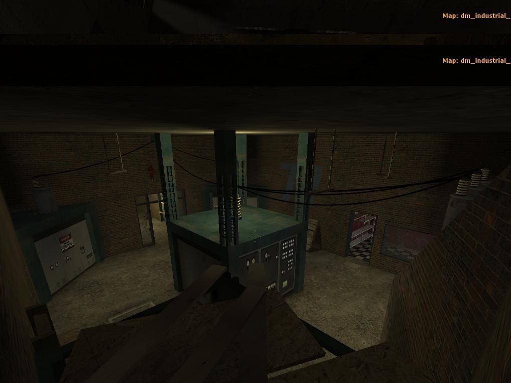
Obviously I don't know the layout of the map, but I feel looking at screen shot #5 (the one with the green frame structure in the middle and inlaid consoles). Yea that room looks like it is a centerpiece of some sort. As if that's where all the connections meet. I might be mistaken, but I would suggest (if you're looking for I/O interaction) if a lot of your rooms are interconnected via shallow door-ways then you could add a whole new dimension to your layout by including two 'groups' of slow-closing thick doors. When button one is pressed on that central console (assuming so...) then the select doors of group 1 begin to close and the select doors of group 2 doors begin to open. (Kinda like the slow moving water/air tight doors of the movie 'Deep Blue Sea'. That way some players could 'squeeze through' at the last minute before the doors close. Doing this could change the layout of the map and make it central that whoever gets to the control room gets to control the layout of the map (essentially).

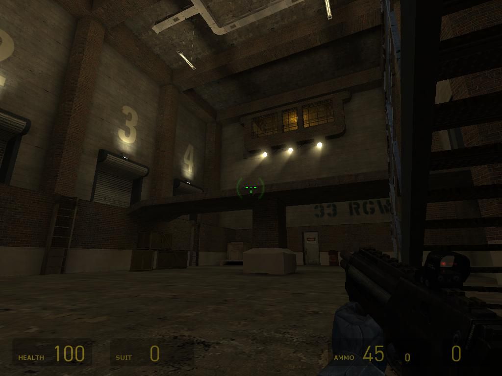
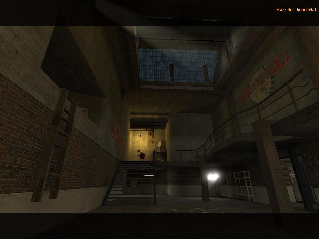
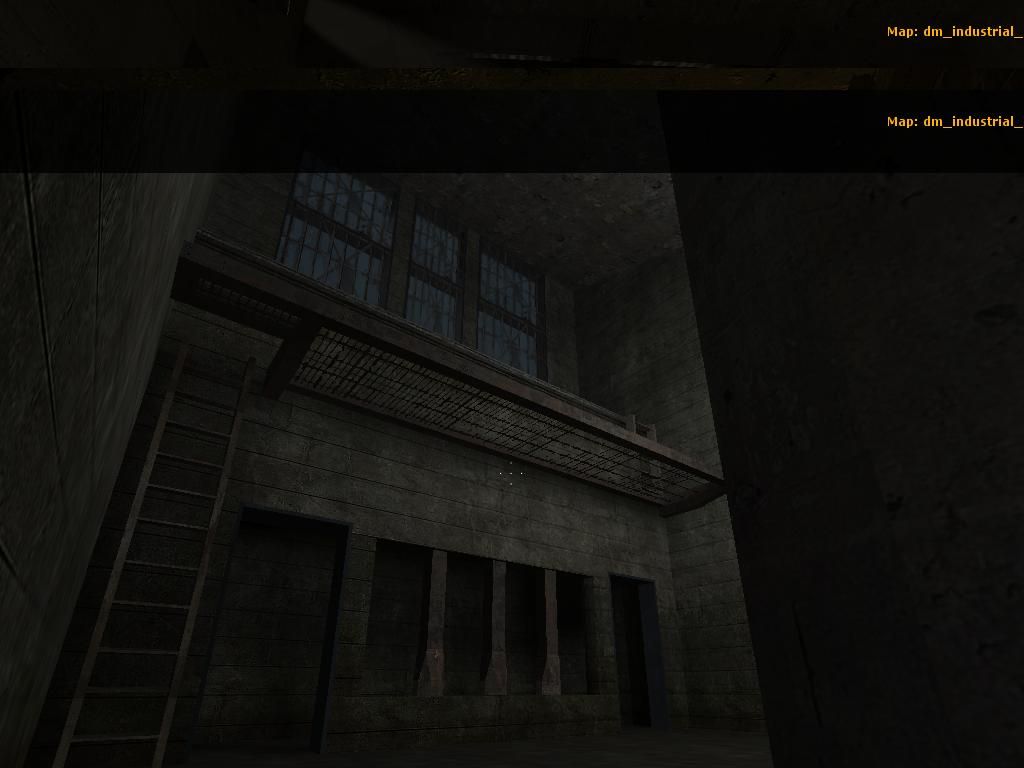
In shot #2, I see what looks like a brush-based ladder. That's fine and all, but I think you could have saved yourself some time (and polys) and gone with the included HL2 short ladder model. It looks almost identical and probably would fit perfectly right there instead.

In shot #1 I see what looks like brick beams of some sort lining the top of the ceiling. TBH, I've never seen horizontally-lain structural brick 'beams' floating above my head. The columns are believable, but the horizontal beams should probably be re-textured with some kind of concrete texture instead. If you're wanting to beams to stand out more, look for a lighter texture of some sort, and I think you'll be able to keep the detail you're trying to impose. (Also, same goes for what looks like an observation/control room with the framing of the windows and rounded edges -probably a little more plausible but not wholly believable as made from brick ;) )

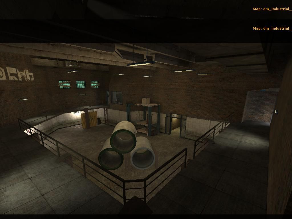
With shot #3, I'd totally turn on the shadows again for those static pipe models. -Or make some up with the block_light brush textures. And, I think this room has a lot more potential visually. I understand it's in beta, but for me, this room could do a lot with the lighting available to it. Personally, I would keep it semi-dark and get rid of half the light models currently hanging with it (and turn some of them into those broken versions of the florescent model for a greater 'excuse' to have it darker in there than normal) THEN, I would turn down the lightmap scale and play with spot lighting A LOT! You could get some cool contrasts of shapes if you'd allow the light to 'cut across' the upper level catwalk, and 'spill down' onto the floor below. It would make for a neat disconnect between the walkway and the floor below while running around the room. Also, nice detail with the concrete ceiling rafter ;)

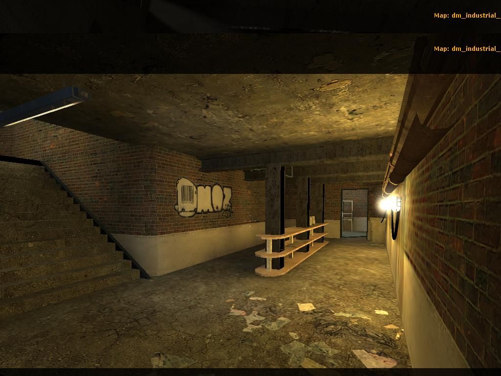
In the last shot, I have no idea what this room might be for, but it certainly lives up to the 'industrial' title you've given the map. Having said that though, there's not too much else to say about it. The ladder could be switched, and I suppose the door frames (which I like) could be sunken in on either side to add a little bit more detail and give your trouble to add them at all a little more worth to being noticed. I don't like the texture choice too much here especially for those strange looking window 'columns' -they're very thick.

Overall, the map looks very well-made; solid. Could maybe use more detail and better texture choices (some look like a rush-job), but overall, it's well on it's way to becoming a solid playable dm map. I look forward to seeing the next update and playing it as soon as I can!