dm_waystation by SamCom

Map Rating

  • Star map!
  • 5
  • 1 rating / 5 stars

Map Download

Map Info

Map Description

A small 2-4 player map for Half-Life 2: Deathmatch,made for the MapCore Cube mapping competition. The rules required the playable area to be kept in a 1024 x 1024 x 1024 cube, so there's plenty of vertical gameplay to take advantage of the vertical space. Set in an abandoned train station waiting room, this is my second released HL2:DM map, so hopefully I've improved! :)

Here's the voting thread on MapCore:
http://forums.mapcore.net/viewtopic.php?f=57&t=16067

There are seven other awesome maps, so you should go check it out!

Discussion

Posted by SamCom on Mon Mar 28th 2011 at 7:10pm
[Author]

Le Chief:
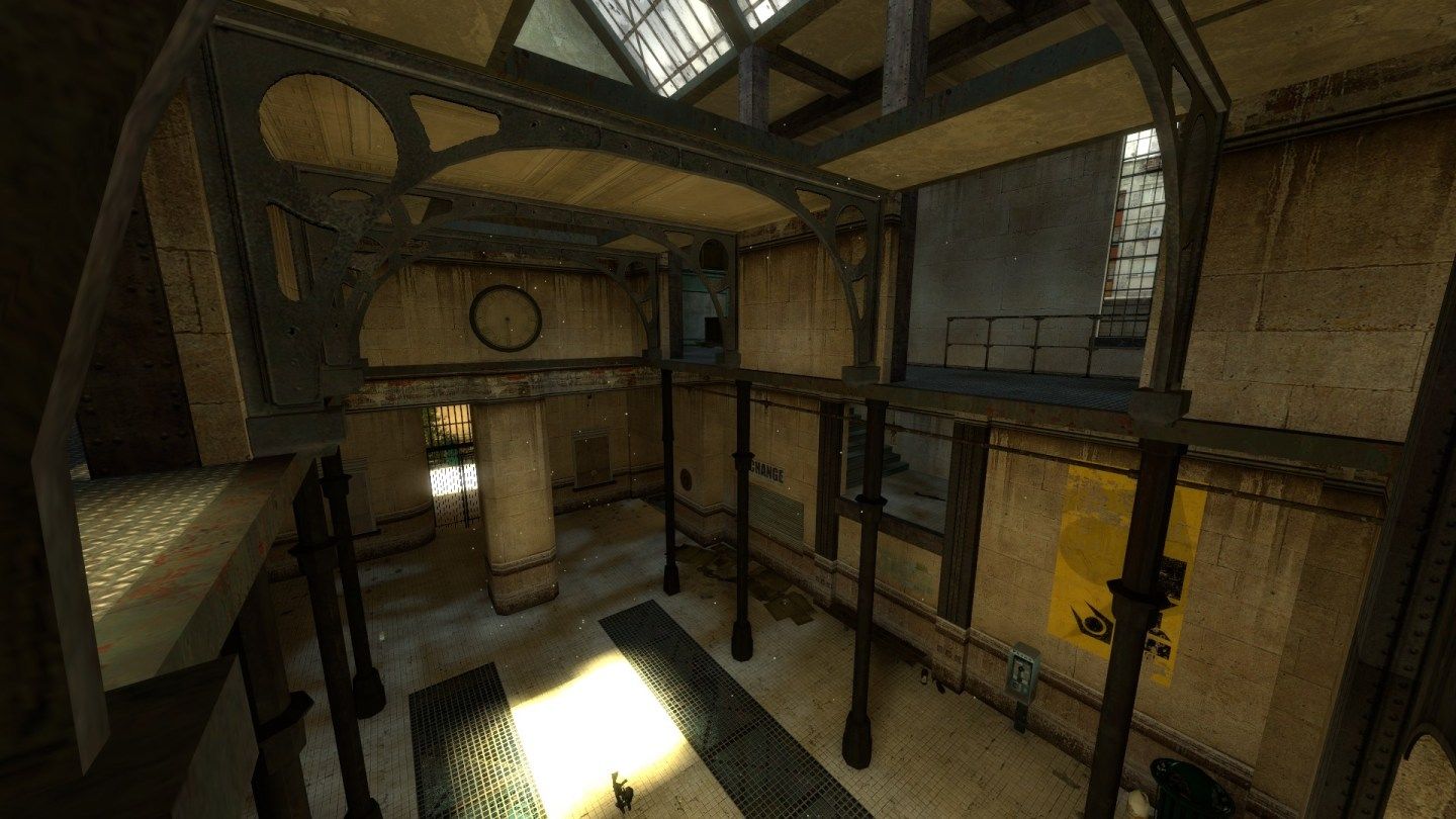
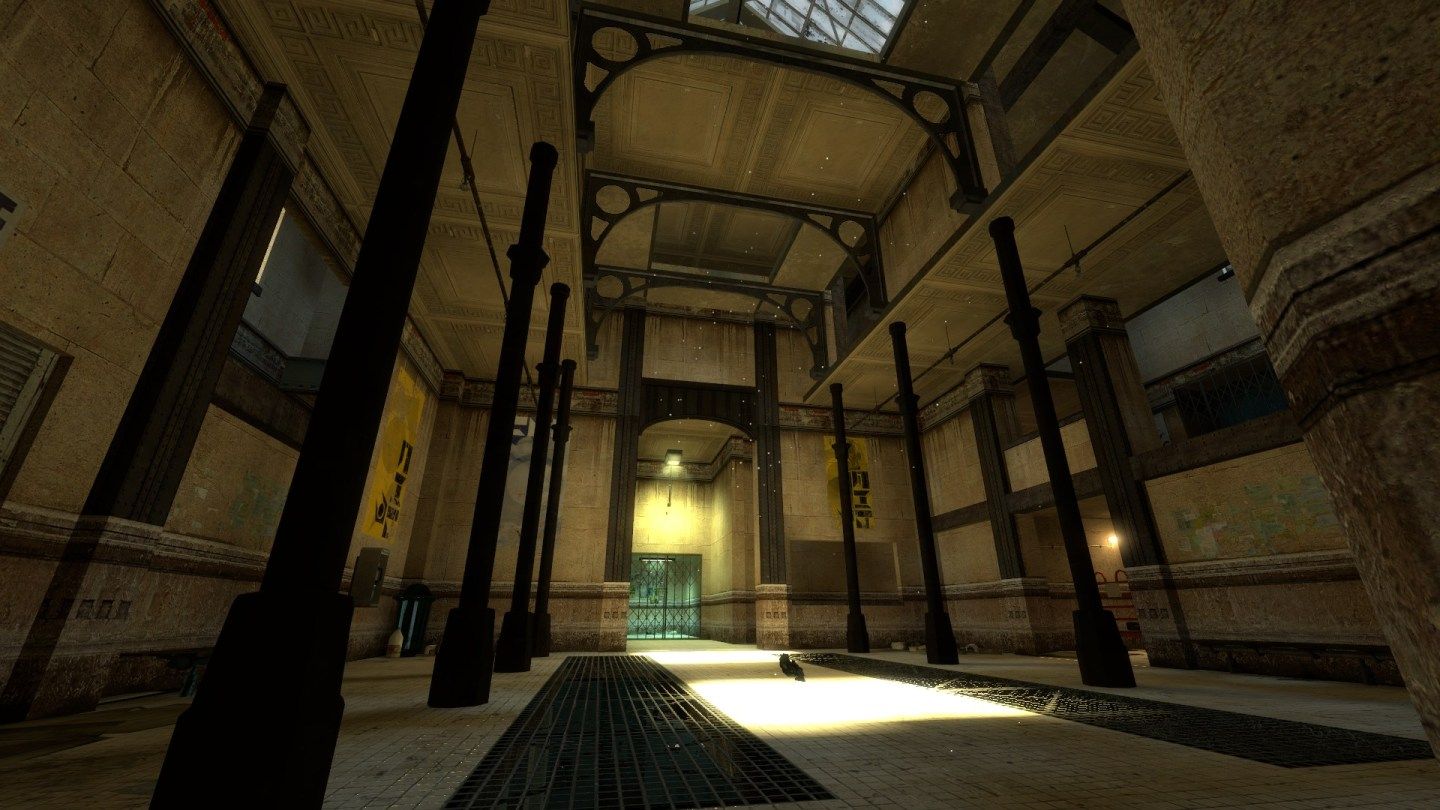
Yeah, the poles were kind of tricky. I tried using point_targets to light them, and that brightened them up, but then they looked fullbright, so I decided to leave them as they are now. Maybe there's a way to get them to shadow correctly?

Yeah, I was a little worried about the decorative ceilings meeting the poles, but I had a plainer ceiling texture up there and it looked worse. I should have added in some trim pieces there, but that would have involved moving half the map up a few units, so I let it go.

Riven:
Actually, I'm still sort of a noob with HDR. :) Do I need to turn the light_environment intensity down to keep the spots under the skylight from blowing out like that, or is there a better way?

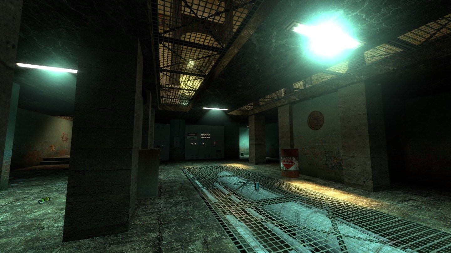
Optimization is noted, I figured in such a small map it wouldn't matter too much, but I'll go back and nodraw them.

I added a few smoothing playerclips in some of the tighter spots around the doorways, but I probably missed more than a few. Was there any particular spot where you got caught?

Thanks for taking the time to load it and run through it! And thanks on the portfolio, it's still a work in progress.
Posted by Riven on Mon Mar 28th 2011 at 9:03am

I must say, this is a nice looking small map. It's not symmetrical in layout, which I appreciate. The detail for the walls is just enough. The varied columns and texture transitions, and use of trim textures are nice. As an aesthetic piece this map looks very nice, and I can tell you've used HDR before, but I do think it's just a tad overblown in this level. It looks fine, but the bright areas are almost too bright. They never saturate completely.

On the optimization front, I took a noclip stroll through the level, and noticed that there were a few 'never-gonna-see' brush faces still textured (like the outside of the skylights, or underside of the skybox). It's a small map so leaving those won't make much of a difference I wouldn't imagine. But if it's the principle you're concerned with, I would fix 'em.

Optimization in gameplay I noticed lacked player-clips along walls to smooth-out player movement. Not too much to complain about since it's not completely a common practice, but it would be more impressive had you given mind to it.

Beyond all that though, I think the level was quite superb for the 1024x1024 challenge. I have yet to play the others, maybe I can make it in time for voting. Either way, thanks for uploading it to the Pit!

-Oh, and nice portfolio! ;)
Posted by Le Chief on Fri Mar 25th 2011 at 10:37pm

Aesthetics:

The first thing I noticed is the 8 circular poles are quite dark, especially in the last screenshot. Other than that it looks pretty good. Does look like the layout takes advantage of the vertical space which is good!

I think the continuity regarding the way some of the geometry joins together could be improved. E.g back to the poles in the 3rd screenshot, the way the top of the poles meets that ornamental roof is awkward and it wouldn't be like that in real life. Also in the 2nd screenshot, the concrete pillar in the immediate foreground on the left... the bottom of it is quite dark but then the floor immediately surrounding it is much lighter. You could put a dirt decal at the base of the pillar to ease the transition into the lighter floor but other than that you would have to change the textures to improve the situation.

It sounds really nit picky but I think it's one of those things that separate the good maps from the better maps you know?

p.s needs dead pigeons and bird shit everywhere :lol: