Say hi to our newest member, RichardELDEN!


i cant do much in terms of editing (well i cant do anything) as i have lost the files :/Have you thought about decompiling it with WinBSP ? its quite a small map and it prolly wouldn't take much to get it back.

scary_jeff said:I dont think you actualy need ts to play it but that is what it is ment to be for. You see you could put the files in hld but it wont have any weapons etc. So the best Mod for it is Ts (hense y i mapped for it :razz: ).
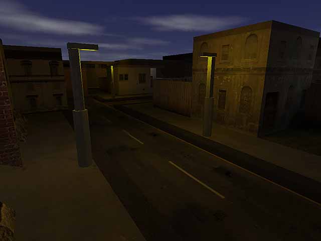
I don't know if it's just the screenshots, but the map does seem very dark, though it looks like a pretty good atmosphere. I like the texture lights on the walls and things, and the skymap is good. One thing that strikes me as wierd is the width of the streetlights, and the actual light section of the strretlights seems very small.Also by the looks of things you have got plenty of polys to spare for things lying about like bins, wooden pallets, etc. I'm guessing I need to have the mod TS to play the map, so I haven't actually downloaded it.
