[map] dm_diehard

[map] dm_diehard

Re: [map] dm_diehard Posted by WAR_Nuker on Thu Aug 6th 2009 at 9:09pm
WAR_Nuker
4 posts
Posted 2009-08-06 9:09pm
4 posts 110 snarkmarks Registered: Aug 6th 2009
http://www.filefront.com/14210275/dm_diehard.zip

This was my first source map, which I started around five years ago. It was almost complete but I was never satisfied with it so i never released it. So, I decided to load it up, rename it from dm_garage to dm_diehard, polish it off, and submit it to the community. I have a tendency to not submit things, but I want to be rid of that. This is the first of a few projects I have not submitted that were almost done.

This map is based off of the first level of the game Die Hard Trilogy for PS1 (terrible graphics but very fun), which was a parking garage. I recreated the map in hammer and then added my own artistic licence as well as a couple secrets. The map is compact but offers plenty of cover for some pretty interesting firefights. I always thought a parking garage would make a good place to paintball or something, so here you go. Enjoy!
User posted image
User posted image
User posted image
User posted image
User posted image
User posted image
User posted image
User posted image
Re: [map] dm_diehard Posted by reaper47 on Thu Aug 6th 2009 at 10:22pm
reaper47
2827 posts
Posted 2009-08-06 10:22pm
reaper47
member
2827 posts 1921 snarkmarks Registered: Feb 16th 2005 Location: Austria
Yea, I remember Die Hard Trilogy. Fun game!

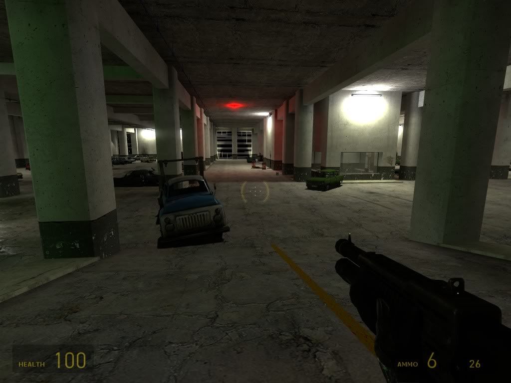
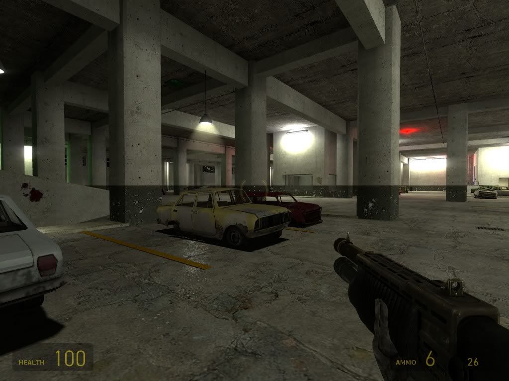
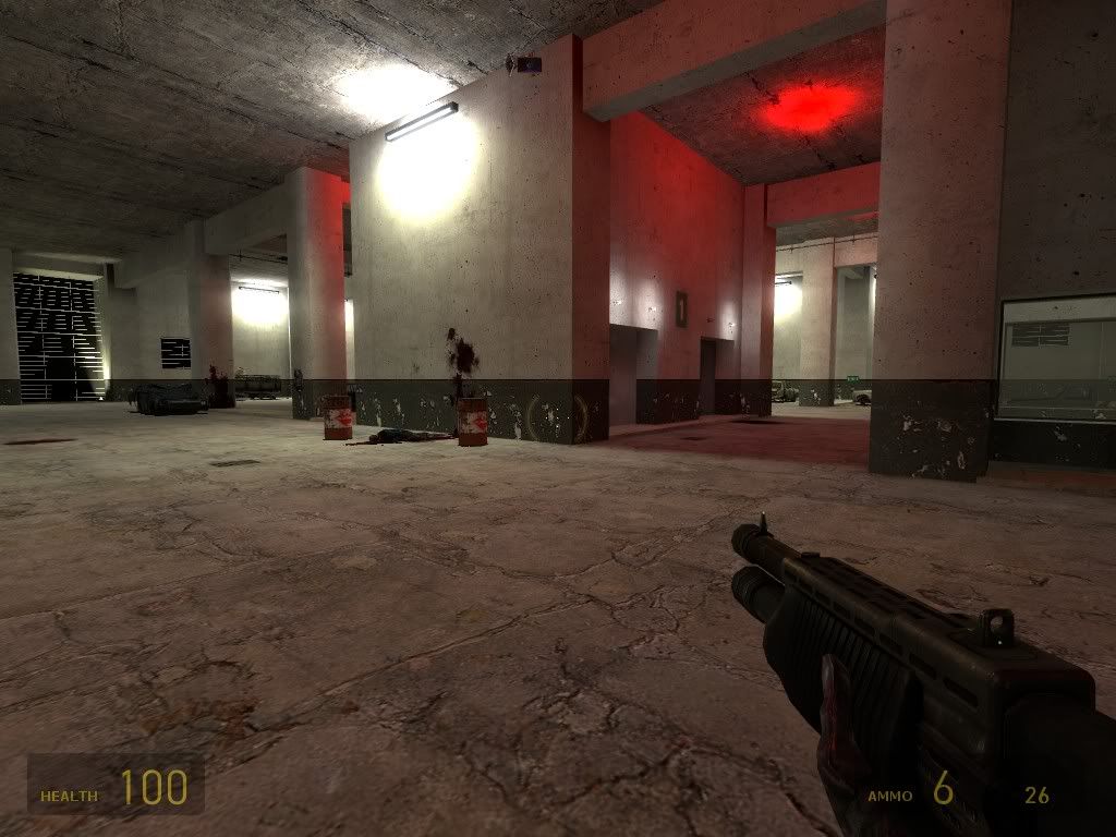
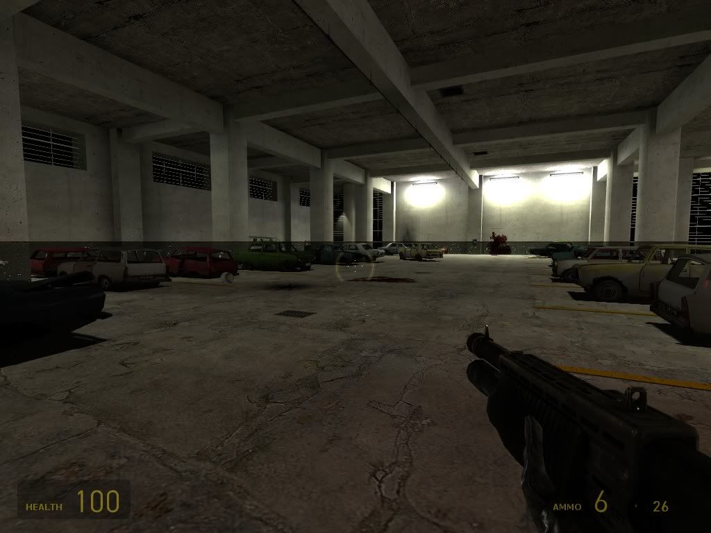
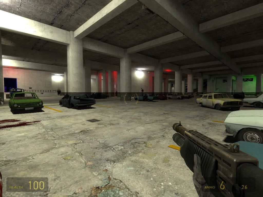
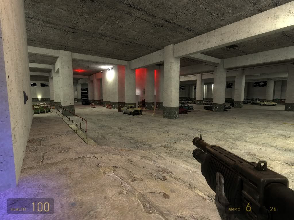
The map looks good. Rather simplistic, layout and setting-wise, but the architecture, lighting and texturing fits and throwing a ton of cars around might be quite entertaining. What does the button in the control room do?

A few minor things: Brightness is too high for most of the lights. I'm also not a big fan of having lights in all colors of the rainbow, but that's more of an aesthetical thing. Try to use more varied texturing instead. I tend not to use ragdoll props in HL2DM since I'm always afraid of them causing considerate lag spikes (tbh, I never tested it). Last but not least, no matter how much stuff you build around it, the layout is still a box, which is not that exciting.
Re: [map] dm_diehard Posted by Riven on Fri Aug 7th 2009 at 4:55am
Riven
1640 posts
Posted 2009-08-07 4:55am
Riven
Wuch ya look'n at?
super admin
1640 posts 1266 snarkmarks Registered: May 2nd 2005 Occupation: Architect Location: Austin, Texas, USA
Yea, I agree, this feels almost like a kill-box somewhat. It does have some redeeming qualities though.

I think it could use a better texture pass over it. (Try not to use such over-scaled textures so close to the player, instead vary the textures lining the walls to get a much more interesting look.

One thing that caught me off-guard the most, and what I think you should fix no matter what, but that's all the dynamic lights you have turned on in the map. They are very costly on processing power to render in the Source engine and should be used sparingly only for special effects really (IMO). You should go into the flags properties of each point_spotlight entity and turn off (uncheck) the dynamic light option. -There are way too many!

Otherwise, it's an all-right map with bland gameplay layout. Not bad for a first map (considering you have a custom texture or two in there). Gets a plus for interesting lighting though!

BTW, you need to add this map to your profile by clicking on the 'control panel' link at the top of the site (when logged-in) and then clicking the 'maps' tab and selecting 'add map' button and filling out all the form fields to officially add this map to the database and upload it to Snarkpit as well so that it will appear on the front page! We don't want floating maps in the forum! -Help other users find your maps by adding them!
Blog: www.playingarchitecture.net
LinkedIn: Eric Lancon
Twitter:@Riven202
Re: [map] dm_diehard Posted by Le Chief on Fri Aug 7th 2009 at 7:32am
Le Chief
2605 posts
Posted 2009-08-07 7:32am
Le Chief
member
2605 posts 937 snarkmarks Registered: Jul 28th 2006 Location: Sydney, Australia
Just looking at the screenshots...

I actually don't have a problem with the layout. It dosen't feel simplistic or like a kill box to me. It is a bit flat and lacking in height variation though.

I think the layout is quite linear and this is what I would expect from a car park. I think you could improve this by improving the lighting, more contrast in the brightness of the lights, maybe some spot lights too, rather than just lighting the whole space diffusely which really exposes the linear-ness.

Also try to implement some yellow lighting or something, a few small yellow lights would look nice I think after you get the lighting sorted out.

You also need to flesh out the space more, pipes, vents and ducts, defiantly need signage (numbers, advertisements, signs (warning, instructional etc etc)), vending machines, car parks are usually dirty places so some grunge and a bit of rubbish around the place is good too.

Not sure how this would play out, these are fairly large flat spaces so things might get dull, focus on placing longer ranged weapons. Shotgun might be good for those smaller spaces. Might be interesting knocking those cars about, unless they're static than you could use them more for cover.
Aaron's Stuff
Re: [map] dm_diehard Posted by haymaker on Fri Aug 7th 2009 at 2:12pm
haymaker
439 posts
Posted 2009-08-07 2:12pm
haymaker
member
439 posts 921 snarkmarks Registered: Apr 1st 2007 Location: CAN
Ill just point out that map designs like this are self-destructive in terms of performance, I can tell even on my new build that this will be a laggy mess online. Plus there really isn't a lot going on for gameplay mechanics.

Your finishing detail is very good, though, take what you've learned about that and apply to your new optimised-in-the-design project...
Re: [map] dm_diehard Posted by ffjakebrake on Sat Aug 8th 2009 at 1:19pm
ffjakebrake
16 posts
Posted 2009-08-08 1:19pm
16 posts 2 snarkmarks Registered: May 12th 2009 Location: Lake Tahoe, California
Wel, I hope you continue to finish up your previous projects as the HLDM community sure appreciates your efforts! This looks like a nice, clean map from your screenshots so I'll give it a run through today! :)