Snarkpit Downloads Archive

Spanish Style Fountain

This is a spanish style fountain..it is rather large it is meant to be put in a courtyard against a wall.

Thanx
Reigndancer

Discussion

Posted by G4MER on Tue Jan 5th 2010 at 12:17pm

Valid point, one I am often guilty of as well. Your comments are not so constructive as nit picky. But thats ok.
aaron_da_killa said:
I'm not giving attitude man I'm simply critiquing the model.. you know saying what I think, I'd rather get constructive criticism over compliments any day!

I don't really want to create an excessive post by ensuring I sound nice or finishing on a positive note after every critique. I put a decent effort into that post and like... went to the trouble of finding a photograph of copper (no its not clay) and making it a seamless texture...
Posted by Le Chief on Tue Jan 5th 2010 at 5:05am

I'm not giving attitude man I'm simply critiquing the model.. you know saying what I think, I'd rather get constructive criticism over compliments any day!

I don't really want to create an excessive post by ensuring I sound nice or finishing on a positive note after every critique. I put a decent effort into that post and like... went to the trouble of finding a photograph of copper (no its not clay) and making it a seamless texture...
Posted by G4MER on Mon Jan 4th 2010 at 7:14pm

Aaron, We happen to live in El Paso TX, right on the MEXICO boarder.. maybe you heard of the recent drug war going on in Juarez Mexico? Well you see we happen to have many examples of fountains just like the one we made here to go by. The copper used is a direct example of what you see, with the greenish tones as the copper starts to corrode and get that green look everyone goes for in the southwest. mixed with a hammered copper that is treated or a mix of more of another metal to keep it from corroding. The link you gave looks more like a clay pot over a copper pot. I thank you for your opinion, and the grout ideas was one we over looked, as was the bump mapping that Riven pointed out. however I do think you protest way to much.. maybe you should read over this nice tutorial a wise man posted here and reconsider how you approach your criticism.

http://www.snarkpit.net/snarkpower/articles/game/cat/pn/tp/192/TUTORIAL_-_CONSTRUCTIVE_CRITICISM:
Posted by G4MER on Mon Jan 4th 2010 at 5:54pm

Wow arron, want to knock the attitude down a few notches there buddy?
Posted by Le Chief on Mon Jan 4th 2010 at 6:49am

"ReignDancer" said:
They are hand-hammered copper pots.
Ah well if that's the case then I don't think the texture gives a strong impression that the pots are copper. The rust (white) stuff I think it is on copperpatina.vtf looks like the grunge that you usually find on ceramic pots when they're left outside.

I did a google search for copper pots and I couldn't find any as dirty as the ones in this model so I think you should redo copperpatina.vtf and use this as a base and add a bit of grunge to that if you want but keep it subtle. Then give it a reflection as well to finish off the copper look.

And while I was looking at your other textures tagf.vtf is pretty unnecessary, in fact it accounts for almost half of the total texture space for this model. A 1024x1024 texture for something like this is a bit of a waste of memory. And tilework2.vtf is full of jpeg compression like artifacts.
Posted by ReignDancer on Sun Jan 3rd 2010 at 2:37pm
[Author]

Thanks guys. I will try what you suggested.

Aaron- The reason the tile looks stretched on the bottom area might be that it is. I hate when you have to cut tile so that it fits. Then you have to hide the cut end, and sand down the edge so it doesn't hurt anyone.

Also its not a clay pot. They are hand-hammered copper pots.

Thanks for the suggestions tho. :hee:

Reign
Posted by Le Chief on Sun Jan 3rd 2010 at 1:54pm

Just some thoughts I had on the model:
User posted image
Posted by G4MER on Sun Jan 3rd 2010 at 1:03pm

Thanks Riven for taking the time to comment on her work. I am working on the textures as suggested. Thanks for the advice.
Posted by Riven on Sun Jan 3rd 2010 at 8:12am

Sorry for not getting to it sooner, but yea, I did mention to Muhnay how this model could be improved 10 fold if given a proper bumpmap and reflectivity enabled (with a proper mask for the non-reflective portions).

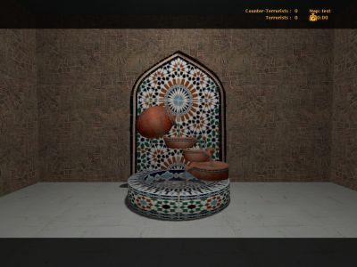
But as to the model itself: After placing it into a quick dev coated CS:S map I made to check it out, I was surprised how large it was. I know that's mentioned in the description, but it still caught me off guard. -In a good way :p My first inclination was to say this model should be used for a centerpiece and not a 'side show detail.' The flowing animated water texture was a nice touch too; it really added a nice depth to it that can only be complemented when a nice sound will inevitably go along with it. -Perhaps you could include that in an updated zip!

Nevertheless, I think the UV mapping for the model works, and the texture choice and resolution is well adapted. If there's one thing that could be helped with the texture, it would be if it were baked with ambient occlusion shadows. Right now it seems over-bright, which works for a bright outdoor environment, but adding an ambient occlusion to it, could only make it look more professional.

Other than that, the modeling itself I think was done quite well. No changes there methinks.

I think you did a really great job on it though :hee:
Posted by ReignDancer on Sun Jan 3rd 2010 at 4:17am
[Author]

Why is it nobod posts any thoughts on my fountain..it has been downloaded 10 times and no comments. Come on people I know you have an oppinion. Is it good? bad? How could I make it better? One person said it needed a bump map.. What do the rest of you think?

Reign