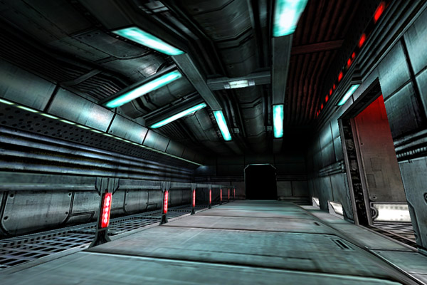
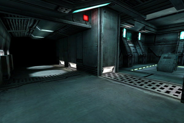
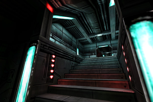
Basicly just a nonsense map, like any other co_ map, actually. I was feeling bored and really had an urge to start mapping for NS again. So this is what I've came up with so far. I like it, and will most likely finish this map.
Thanks for the comments. I don't really know if I want to expand my
detail like that. I've tried it before and it didn't really work out as
I had planned. I'll leave it like this for now. But we'll see.
wow.. the detail is really nice - simple things like walls and ceilings are turned into works of art here
Posted by Nickelplate on
Thu Jan 20th 2005 at 7:59pm
screenshots too big. :biggrin: just kidding. This map looks excellent. One thing that I always recommend is that if two textures are touching eachother, dont make them even on the wall. Like those red lights on the wall. Make those bulge out as half-cylinders or make them cave into the wall as an inverted half-cylinder. but too keep it from looking too "wolfenstein3d-ish" I always make the surfaces differnt like that (as long as i can afford it in my VIS budget.)
[edit] make your flourescent bulb looking things bulge out from the ceiling. turn the red square light into a pyramid and make your spotlights less defined. (make them overlap and make them bigger because flourescent bulbs do not make a spotlight.)
Posted by thursday- on
Thu Jan 20th 2005 at 4:17pm
Architechture is solid. I just see a lack of "purpose" in the map (Suppose thats why it's described as a nonsense map) and feel more powerful lighting is needed. I'm a big fan of red and blue together lately, I find that to be powerful.