I think he is commenting on your overuse of the texture as opposed to
the texture itself. Just stack a few different textures, instead of the
same one repeating, or consider using a texture that repeats vertically
without being so obvious. You have some nice ideas going on with your
brushwork and lighting, but the repetition of the texturing really
pulls it down.
crete texture? the one all over the walls? i'm
definitely open to a retexturing, it's just I don't know any good tfc
wads. could you point me to a good one?
The map is almost done. I just have to mirror it and retexture and alter entities.
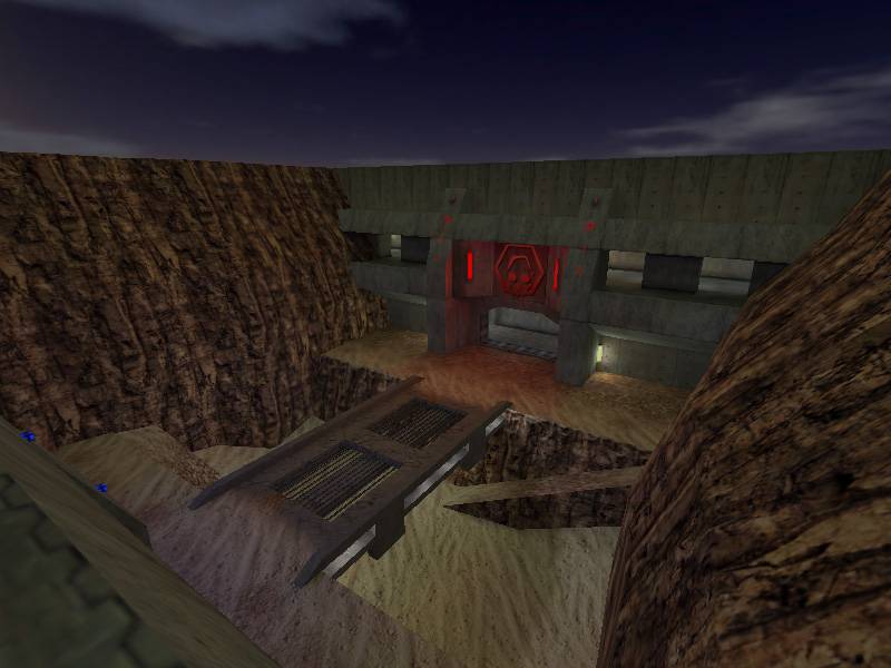
I rather like the canyon walls. Perhaps you can see them better in
these new pictures. The five picture limit is impossibel to show
anything, so go to this forum thread to see about 20 new shots:
MJ, to be fair, I think you're being a little negative without due cause to do so - "still no valid responses" won't go down well with the people who did comment :wink:
The important thing in TFC is the playing, and unfortunately Morphine, there isn't much support outside of clan based leagues for TFC as a playable mod anymore. The ultimate proof of the pudding with TFC is the playing, as I say, and it just ain't gonna happen.
Nice map, just a bit late :sad:
Posted by [DNv]Cross on
Fri Feb 18th 2005 at 1:52am
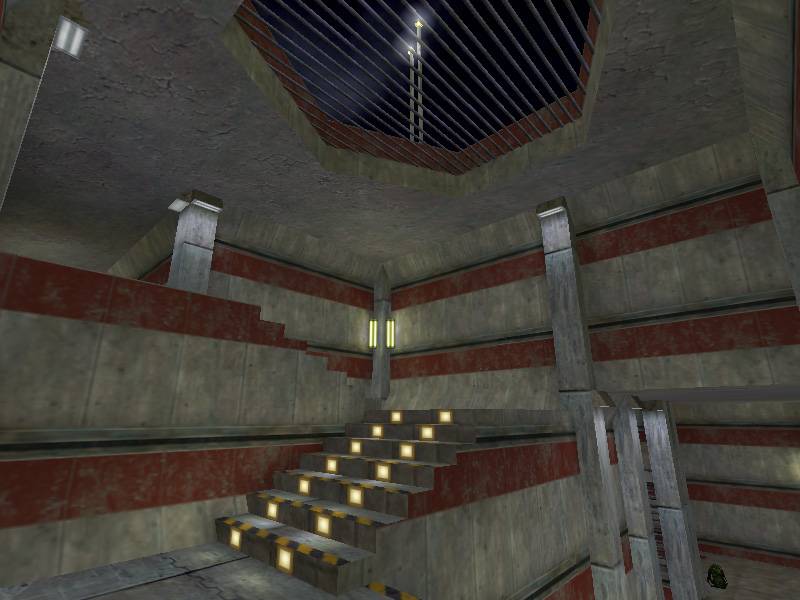
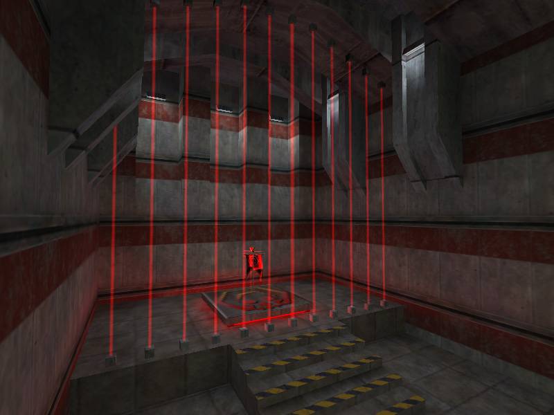
Looks awesome so far! From what I remember of the old TFC maps,
this thing definitely has them all beat in terms of overall
aesthetics. Lighting is dark, but I'm drawn to dark maps with
subtle hints of color, and that's precisely what I see here. The
architechture inside is striking, with the curved walls and the
pillars. These are all things I could never really get down in my
own maps, with arboretum being the best I ever managed for 1.6.
Outside is a bit bland, but I really like the look of that
bridge. The rockfaces as previosuly mentioned could use some
tweaks. For my own rockfaces, I used a method developed by the
late n0th1ng that involved alternating triangles. Definitely
suggest you give that a try on those faces.
Can't comment much on layout from these shots, but I can say that
aesthetically it looks beautiful. Keep up the good work!
You've come a hell of a long way from when you started!
Real nice oldschool BW , like the overall look of it except the rocks, rework them and u have a nice looking Oldschool Map for your Portfolio.
And if u want to even do some more on that , put in some red lights to give the map a certain "vibrance"(Can u say that in english???) and variance in lighting colors