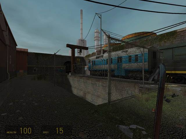
I like it, but i think you overdid the train sound.
first i was like "wow a train sound cool" but after five minutes listening to it, i felt a little crazy.
the canal would be cooler if you added some grid in the end, instead of just a wall.
Ok, i must have spent ages on this map and its theme in one form or
another (scrapping it, restarting it, redesigning it etc etc). Finally
put my foot down and gonna stick with what I got :smile:
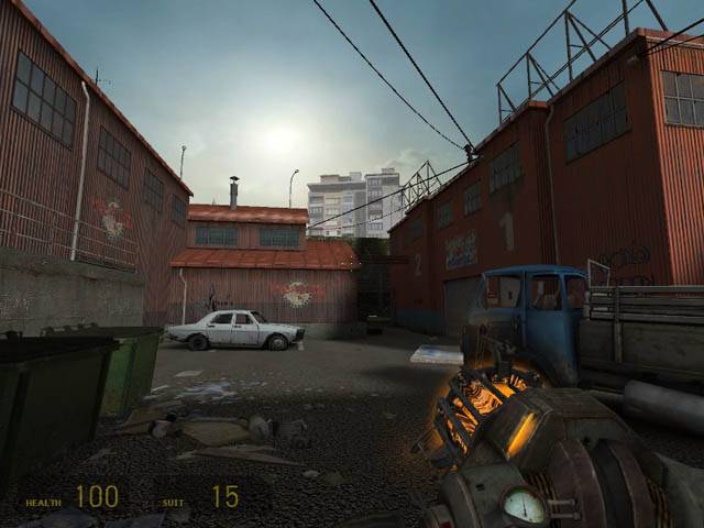
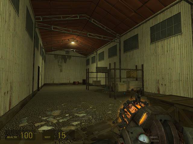
Anyways firstly the name has changed. Also the entire side with the factories has been changed completely so it looks nicer and should play better :biggrin: All the pictures are new ones from this beta.
Put up a new pic (pic 2) just as a quick update to show am actually
still working on this (alongside cs_bulletheory which is taking up most
of my time). Completely redoing the factory section of the map using
some of new stuff learnt from working on that css map.
Ahah yeah, its named after the band, though its probs only a temp name till i come up with something more fitting.
Thx for feedback, i agree its very unoriginal. As i said i wanted to
get the old canal and factories look going on but its ended up lookin
at little too modern so far.
I agree with ReNo, for teh most part. You definitely need to spice up the lighting a bit to make it really unique.
Use a different fence prop, as well - Your exteriorfencea model has wheels for teh exteriorfenceb model which is a gate, and it looks strange just used as a regular fence.
The overall scene looks pretty decent, but paying attention to small
parts makes them look a little simplistic and dull. You have used the
gravel texture shown prominently in the second shot a little much I
reckon, and not only that but the texture isn't even a very nice one :sad:
Lighting could certainly use work, really isn't "doing it" for the map
if you ask me. Really though, the map has potential. It just looks a
bit too generic for my liking; nothing really sets it apart from the
many other city/station maps.