de_haywire by LoveMeister

Map Rating

  • 0
  • unrated

Map Download

Map Info

  • 0 ratings
  • 983 views
  • 147 downloads
  • added Mon May 16th 2005
  • updated Mon Oct 27th 2025
  • more content for: Counter Strike Source

Map Description

Summary of the level

The map layout is fairly simple and compact with one main area
and 2 alternative routes. There are no really dark spots for
camping nor are there any sniper killing zones. All the good sniper
spots have at least one dead angle making them difficult to hold.
Yet it is still possible to use scoped weapons to great effect.
I've also made some fairly confined areas for those of you who
prefer the shotty : ).

Please check the readme for further details.

Discussion

Posted by LoveMeister on Tue May 17th 2005 at 11:12pm
[Author]

Thanks for your unput.

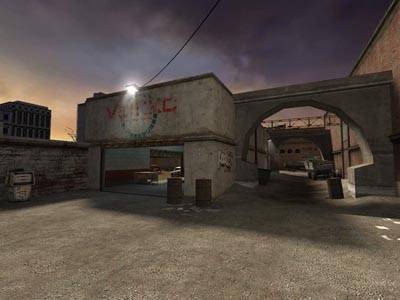
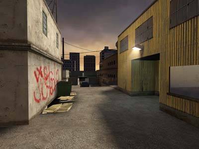
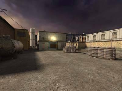
I'm not really too concerned about the looks right now. That will come later. It's not ugly as it is right now - just unpolished. I'm a game-artist turned mapper so the challenge for me is layout/flow. I agree it indeed is rather boxy but trust me - a few props here and there to break up the shiluette of the roofs especially and it will all look fine.

If you have the time to play it a few rounds and tell me how you think it works I'll be ever so grateful because that is my main concern. I've spend quite some time thinking about the design and I do believe it is good and tight but since it's my baby I might be a bit blind to the maps short-commings.

Edit: haha - we were writing at the same time here. I am looking very much forward to your comments on gameplay.

Again, thanks for your time
  • The LoveMeister
Posted by Addicted to Morphine on Tue May 17th 2005 at 10:42pm

Everything looks very boxy. Are there areas that use
curves? Also -- why is that archway not symmetrical? It's
strange that it seems closer to the wall on the left. Also, you
could probably make it look smoother without it ruining performance.

Edit: I just reread that and it
seems a little too negative, so I wanted to add that I think you've got
a strong base here... it's looking fairly good. But nothing
particularly stands out right now. With a few changes or
additions in the area of visual flair you could create a memorable
map. I haven't played it yet so can't comment on the layout but
once I fire it up I'll give you some detailed comments.
Posted by Orpheus on Tue May 17th 2005 at 10:10pm

I just love good images sizes.. :heee:

oh, yeah the pics look nice too. :wink:
Posted by LoveMeister on Tue May 17th 2005 at 9:38pm
[Author]

I've added some screenshots in higher quality as people were complaining about the current ones were too lousy quality. Here's the new ones - now with action : ).

http://img286.echo.cx/img286/503/dehaywirenew013xq.jpg
http://img286.echo.cx/img286/2262/dehaywirenew022re.jpg
http://img286.echo.cx/img286/9133/dehaywirenew032up.jpg
http://img286.echo.cx/img286/7209/dehaywirenew044fp.jpg
http://img286.echo.cx/img286/4671/dehaywirenew054tc.jpg

Cheers
  • The LoveMeister