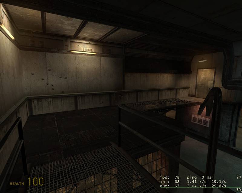
Im going for a somewhat creepy/moody theme. The areas shown are somewhat wip, and they are not as dark ingame as they seem to be in the screens. Its not going to be a DM.
There's something about this map that I really like (well, judging from the screenshots only). You've done a great job of tying together interesting shapes with nice lighting - feels very natural and interesting.
Actually, a shoreline, or some other not so commonly used theme would be cool. i havent really started with the exterior areas yet, so i can make up anything i want.
Posted by Captain P on
Sat Oct 29th 2005 at 10:22pm
Yeah, I understand the theme's choice. Still, maybe you can make it
stand out a bit by giving the area's a very specific looking purpose?
Well, maybe not because it's either a storage room, a generator room or
something like that. Only thing I could think of to make it stand out
is by adding a different area around it or such. No industrial
background but a shoreline, or something more distinct than the average
City17 skyline. Hard to do, so, yeah, just go for a good playing map. :smile:
Thank you. I totally agree with your opinion about the props captain. I wont smack the walls with props. Ill just add some stuff do decrease the emptiness aorund the floors and where its needed.
I know that the warehouse theme is used alot. There is a good reason for it as well, since most mappers (like me) dont create new their own material for their maps. I dont have any tricks to make my theme stick out more than any other maps. Im just focusing on building a map with great gameplay and good fps. The theme was just a comfortable choice.
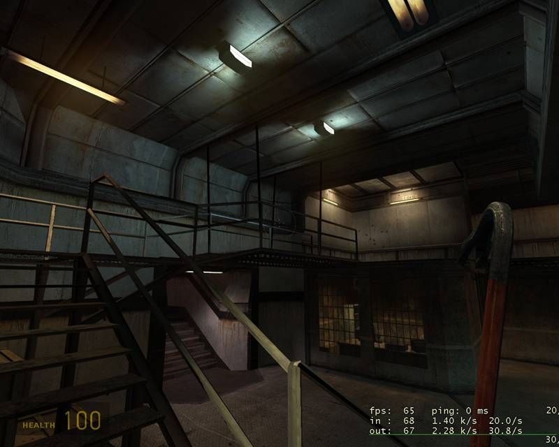
Looks good- nice hanger/warehouse theme but with a futuristic tang.
Posted by Captain P on
Sat Oct 29th 2005 at 3:32pm
It all looks very natural to me, nothing seems not to fit. Both
architecture and lighting, I think the lighting is very well done.
It is, indeed, still somewhat empty. Don't speck it with all kinds of
extra props on the walls and all, I think those look good and natural,
you'll only waste their calm and real look. The floor is what looks
most empty. Putting some objects there would be good, I think.
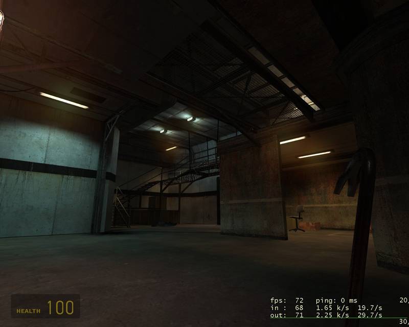
There's another thing and that's the purpose of this building. It looks
industrial, like so many maps, but what is it meant to be specific? The
generic industrial theme is getting old somewhat so if you could give
it more sense of purpose that would be a good thing.
Hm, how do you mean that the rooms are unexciting? Is it that it is quite empty from props/boxes/crap/decals or is it something else? Cause, ive just built the base and lighting. I wait with the most details until later.
I will confess something. The stairway and paths are not props! They are all brushes, hehe. But it hasnt affected the fps much. I got 70 fps in that screenshot with 6x antialiasing and 1280*1024 on my crappy computer with athlonxp2100+.