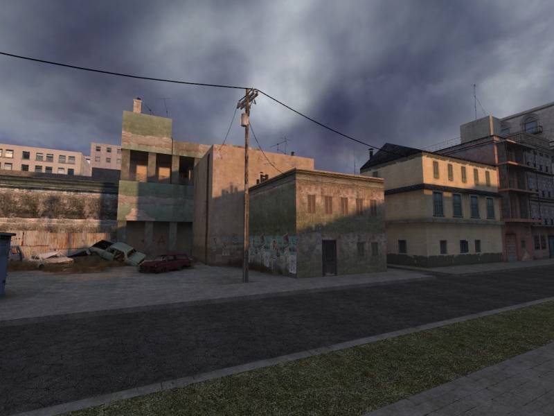
In the first screenshot - try making the windows inset into the building. Right now the buildings look a little bit too flat. And the texture seems low-quality, it's kind of blurry.
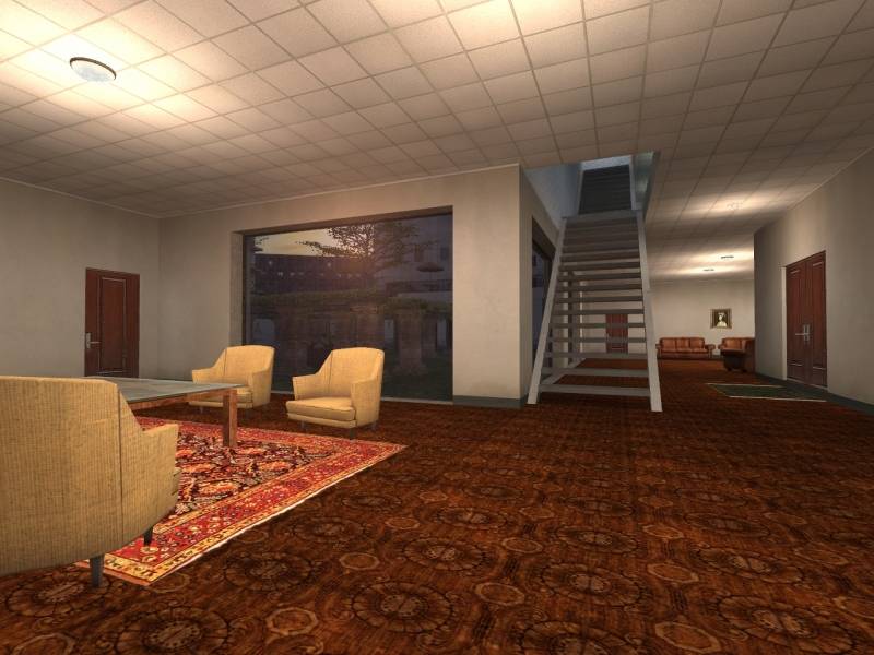
The floor texture in the second screenshot repeats a tad bit too much. You should up the scaling on it, or rotate it at a 45 degree angle or something - so you don't easily see the repetiveness.
Posted by Junkyard God on
Sat Sep 3rd 2005 at 10:20am
I was going to comment on the blockyness but i think it actualy fits pretty neat in this map
looks good, i like the first screenie alot
Looks quite a nice piece of work there. I especially like the inside pics. On the outside I would have added a few more steet lamps and made the buildings a bit more 3-d.