sp_undeadarena by Addicted to Morphine

Map Rating

  • 1
  • 1 rating / 1 star

Map Download

Map Info

Map Description

I wanted to create a small arena map for fighting a neverending horde of zombies, and this is what developed. The map has grown larger (and taken on a more realistic setting) than I had originally intended.

Discussion

Posted by Addicted to Morphine on Fri Mar 3rd 2006 at 10:10pm
[Author]

Thanks for the kind words SpiKeRs, I really appreciate it.

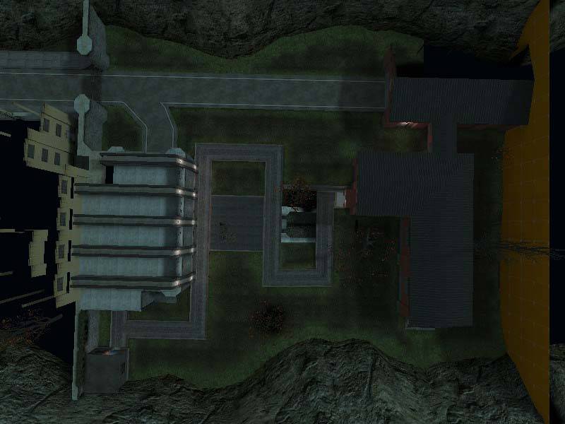
As for the setting, I originally just wanted to create a simple arena
with simple architecture -- nothing more than a glorified and expanded
killbox where one could fight wave after wave of zombies. The
original concept looked like this:

User posted image

As I expanded the arena I decided to depart from the arena feel and go
for a more realistic theme. The original concept shot evolved
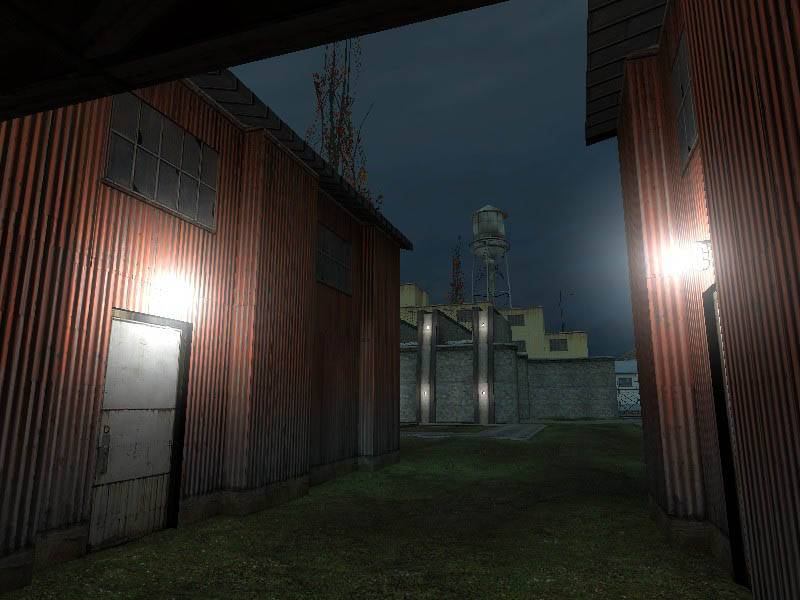
into the outside of a garage loading bay, with the yellow industrial
building next door.

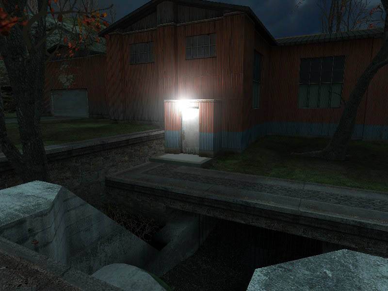
It continued to evolve into an industrial area in a small valley.
I'm pretty happy with the yellow building and the inside of the garage,
and I really like the way the outside of the garage looks (its the
stone building with the crazy pillars) but I'm afraid the outside of
the garage no longer fits with my industrial theme. I do like how
it looks, so I don't want to part with it, but if you think it's too
jarring and confusing for the theme I'd consider reworking it.

Right now I'm working on adding another building similar to the yellow
one and making it larger and have it be a combination warehouse office
complex. It's opposite the sewer entrance.

You're right, I haven't done any lighting passes yet, but once I do
perhaps it everything will look more unified. I'm considering
adding fog as well, but I don't know exactly how that will look.

I still have a lot to do, but thanks for the comments.
Posted by SpiKeRs on Fri Mar 3rd 2006 at 9:14pm

What I like about this is it seems so clean (with regards texturing and structure), lots of nice lines and defined edges, if you know what I mean :smile: The architecture looks great too. But whats the setting? Where is it exactly? It doesnt look especially coherent in that regard. I know its already been commented on, but I think some moody lighting could really help to address this issue.
Posted by Addicted to Morphine on Fri Mar 3rd 2006 at 7:40pm
[Author]

Despite the apparent lack of progress, I've still been working on
this. Mostly on the main building that isn't really ready to be
shown yet, but I've also been working on the sewer entrance and I've
also done some of the terrain.

There's too much of the map open to the void right now for a compile,
but here's a hammer shot of the terrain and sewer entrance.

User posted image

I'll show more soon -- expect more progress this weekend.
Posted by Addicted to Morphine on Mon Feb 20th 2006 at 12:56pm
[Author]

Hey Oprheus, I was gone all weekend and just got back.

Thank you for your feedback, I was hoping you'd give me some comments on my screenshots, so thank you for doing so!

Here's my response:

-Originally the curvy walls were crete textured, and I got some
feedback saying ot spice it up -- get creative with the textures.
I thought the stone textures looked decent, but I could be wrong.
I'll explore other texture choices (same goes for the yellow building
in the background).

-The grass is flat, and I plan on displaceing it all once I've finished
off the buildings (there are still a couple to be built).

-Despite what the screenshot may suggest, the beams across the garage
ceiling are made out of concrete and not wood. It may be clearer
in game -- but I'll look for a new texture. As for adding shafts,
I'm not exactly sure what you mean.

-I didn't like the wall with all the supports, and I will definitely change them around -- like you said its very boring,

-I'll change how the rock intersects with the little booth near the wall.

Once again, thanks for looking and giving me feedback. I'll also try to download and rate one of your maps.

@HazardGameR^ -- I will definitely change the way that small building
looks. Also, I definitely plan on adding spotlights when I do my
lighting pass. I think the long shadows will loook good.

@reaper47 -- thanks for your comments. I haven't done the lighting yet, but I will keep your comments in mind when i do.

@gorami -- thanks for your comment. I'll make sure to keep the
gameplay exciting and varied. I'm thinking the only weapons I'll
be adding are prop_physics and the shotgun. I'm also planning on
releasing the VMF when I'm done so that people can tweak the entities
and change the level to suit their tastes.

I'll post more screens soon -- and hopefully you'll see the progress. Thanks all.
Posted by Orpheus on Sun Feb 19th 2006 at 4:50pm

Anyone seen Morphine lately?

I am waiting patiently for him to rate one of my maps for this critique. :biggrin:

BTW folks, the asking price for one of my critiques is one map rating. Preferably, one you have looked at.
Posted by gorami on Fri Feb 17th 2006 at 11:36pm

Well its looks amazing and it has the spookyness just like the hl2 did in zombie infested level. Should be exciting map for improving you gameplay but you need to keep it interesting considering you just fighting zombies so needs the atosmosphere.
Posted by Orpheus on Fri Feb 17th 2006 at 9:41pm

(I only hope this works as I have never used another thumbs before to post a critique. If its ugly, I apologize in advance)

javascript:void(0)

User posted image
The swirly/curvy architecture looks good but, you may run into a clash if you mix it with the wrong texture sets. In this shot, you have rock walls with an industrial texture set above. IMO it clashes, BUT since I cannot see it all except in this screen, it might work out alright elsewhere.

User posted image
In this shot, the thing that sticks out is the building in the background. Its not built wrong, its textured... differently. I would try different sets. You might eventually come back to this one but at least try another one. I like the architecture in the front area here. It looks well made. I also like the dim light levels, at least in so far as the screenshot. Sometimes an ingame level is contrary. A few displacements on the ground couldn't hurt. It looks like a tennis court in its flatness.

User posted image
Run for the hills. There be crabs hereabouts.

User posted image
Everything in this shot looks superb... Except the ceiling. Its horrible. Trying to make a flat plane look less flat by adding wood is not a good idea. Yeah, it looks OK if you have a castle, but this is not a castle. Try to create some depth by making varying degrees of elevation. Shafts work wonders, as well as a few fans.

User posted image
Those dips in the wall back yonder, make a few of them deeper, break up the pattern you have going so its less repetitive. I would also think about making the area more diverse in texture choices. Having a wall for instance thats two levels high, with contrasting textures looks better than one 30 foot tall monotonal wall.

User posted image
This shot looks excellent except... The grounds to flat again. I would also think about how the building is in the rock walls. Usually building show some form of intrusion when built into a wall of rock. Perhaps some cracks or maybe a barrier wall to "hold back" the rocks that are crumbling off. Your building slides in as if its having sex or something. :lol:

/2 cents
Posted by reaper47 on Fri Feb 17th 2006 at 7:39pm

Why are people so obsessed with zombies? IMHO there are much more interesting enemies in HL2. On the other hand complaining about zombies in a zombies map isn't that constructive... it's just something general I noticed. The architecture looks quite ok already, maybe you should add some trims and borders to the walls as they sometimes look too flat.

I don't agree with the red lights. Red lights are annoying and I find them to fit only in spots where you expect red lights to be in the real world: Near dangerous places where they are used as some kind of "warning sign". Get rid of the grey/white/bluish lighting for interiors. Try to use strong yellows to add some warmth and contrast to the lighting.
Posted by HazardGameR^ on Fri Feb 17th 2006 at 3:36pm

/me likes :rolleyes:

The lighting is actually pretty ok, depending on the "feeling" you want to add.

Maybe some spotlights here and there outside, from the top of the building to the grass. And also some red lights inside might look good.

That wall on the shed or whatever going into the cliff looks (very) odd.
Maybe you should try to make the cliff flat, so the wall goes flat in too.
User posted image

Add some props to the grass! Fountains, barrels, bench, flower-beds (Whatever you call them in English :rolleyes: ). And trees! With swings... Might not fit in though :razz: . You name it... Displacements only won't help it :popcorn: .

Nice map overall! Dont change the lighting too much, i think it looks good.