sp_undeadarena by Addicted to Morphine

Map Rating

  • 1
  • 1 rating / 1 star

Map Download

Map Info

Map Description

I wanted to create a small arena map for fighting a neverending horde of zombies, and this is what developed. The map has grown larger (and taken on a more realistic setting) than I had originally intended.

Discussion

Posted by Addicted to Morphine on Mon Mar 6th 2006 at 3:08pm
[Author]

Basically, this area is just an arena for freeroaming zombie fun.
The player will start out in one area of the map with no weapons, with
zombies approaching, and will have to explore the map (in whatevevr
order he sees fit) to find weapons and ammunition. There will be
limited ammunition and health and I'm considering adding a points
system (I hope this is possible) to see how long the player can
survive, since there will be wave after wave of approaching zombies
thanks to the npc_maker entity (and some areas that hold ammo will
trigger fast zombies to leap over the walls and attack, for
example). Once the ammo is depleted the player will have to rely
on the gravity gun and the crowbar... although there will be a chance
for more weapons and ammo based on a reward system. Crono's idea
was that after a certain amount of zombies are killed a new weapon will
become
available, or an NPC will join the fight with the main character.
Hopefully this can be easily accomplished with math counters and
triggers. I'll have to look into it.

I'll likely release the VMF once I'm done so that others can change the
entity settings and customize the level to fit their needs, although
the number of people willing to recompile a map is probably slim to
none.

If this map turns out ill suited to Singleplayer fun, I can try to
redevelop it as a DM map. Although, that would require more
thought into adding z-axis gameplay and would probably involve
hollowing out the buildings.
Posted by Orpheus on Mon Mar 6th 2006 at 2:09pm

I am finding it difficult to envision a one area single player event. How are you planning on this unfolding?

I will comment on the screens soonish.
Posted by Addicted to Morphine on Mon Mar 6th 2006 at 1:24pm
[Author]

You mean on the grass? I hadn't given it much thought but the
blend texture I'm using right now doesn't have the grass sprites...
towards the end of development I may look into how to edit the vtf file
to get it to work. Thanks for pointing that out.
Posted by Addicted to Morphine on Mon Mar 6th 2006 at 1:23pm
[Author]

@Crono: I'll fiddle with the glow settings until I find something that works.

Yes, I agree that sewer area looks weak. I'll go back and try to
figure out how to make it more believable. I'll probably put some
steel support beams in or something along those lines.

Right now the only building that's enterable is the big ugly stone
building. The red warehouses are not at this point, but that may
change as I keep working on the map. I wanted to start off with
the buildings closed, just because I may leave the buildings closed off.

I know we talked about this last night, but I definitely want to investigate the points system you talked about.

And you guessed it, not quite functional yet :smile:

@ReNo: Yeah I completely agree about the buildings. The Warehouse
isn't very unique, but at the same time the realism works better than
the other building across the way. After your comment and Spikers
comment I think I'm just going to redo the original stone building and
make it into a brick garage type building that better fits into the
realistic theme I have right now. The stone building is just a
vestige of my original plans for the map, which have since changed.

Yeah -- the pathways and roads are some of the weakest parts of my
map. I don't know why I didn't go and displace them, I guess I
was just afraid of how I was going to deal with the displacement
textures if they were curved. I guess I'll just make the
displacements overlap to give it the curve on the roads.

You're right, the cobbled paths don't make much sense the way they are now, I'll play with the textures a bit.

Thanks for the shot of that road, I'll definitely try to capture what you've got going on in the 3D view.

I'll make the changes to the light glows and the arch.

I will definitely make an overlay pass once I'm completely satisfied with the architecture and lighting.

Thanks a lot guys for the comments! If anyone else has something to add, please don't be afraid to speak up.
Posted by Andrei on Mon Mar 6th 2006 at 12:10pm

Looks pretty good so far. One thing that gets to me is the complete
absence of detail sprites. Are you having trouble with them aswell or
just didn't want em in there?
Posted by ReNo on Mon Mar 6th 2006 at 5:30am

I'm liking your new red warehouse a lot more than the original stone building. The red warehouse features tried and tested architecture that is utterly believable, but the rather odd design of the stone building kind of undermines the realism and makes the map feel a bit lost.

From the overhead and the odd glimpses in the screenshots, the 90 degree rigidity of the paths is ugly. I can completely see why you've done it (lines up with your displacements, makes texture alignment, on what would be a rather tough to align texture, far easier) and it is excusable, but I think even just introducing short 45 degree sections at the corners could help matters.

Something else to consider would be banking the paths/roads a bit (not just the pitch either - rolling them sideways a bit could be cool), so they aren't completely flat, as well as putting in smoother transitions between different gradients so that its not the currently obvious flat->banked->flat that it currently is. You might be best off making the paths into displacements to achieve this, as otherwise it could get tricky and awkward with lots of cutting into triangles and vertex manipulation, but it depends on the extent of roughness you wanted to introduce. Something else that strikes me about the paths is that you have fairly size sidewalks on either side and a tiny little paved section between them - seems a bit wierd to me, as a path that thin would have no need for sidewalks. I think that the road may look better if set into the terrain rather than sat on top of it too, perhaps extend the width of it a bit and have a non-straight line edge to it as well, so that the entire road part is always exposed but there is some buffer area that has a non-smooth edge to it. Not sure if you know what I mean, so here's a demonstration of a more interesting road...

User posted image

The light glows are a bit strong, but as Crono says it kinda works. Tone it down a bit definately, but don't go too far. Try and introduce a tinge of colour too, as very few lights are such pure white. Don't necessarily get tempted to go all out colourful, but just a very subtle hint would help. In general the map could use more light fixtures too.

In the last shot of the shack, you could afford to smoothen that arch a bit.

More clutter will make things much nicer, and don't be afraid to use liberal amounts of overlays to break up repetitive textures a bit.
Posted by Addicted to Morphine on Mon Mar 6th 2006 at 4:04am
[Author]

Thanks for the comments Nickel. I'll definitely make sure that
the walls are clipped to prevent the player getting stuck. I
wouldn't want a backpeddling player whose running away from a fast
zombie to get stuck on a pillar.

As soon as the map is playtestable, I'll put up a download. I wouldn't expect anything for a few more weeks though.

I noticed you posted in the Intro chapter, did you manage to take a look at the First Alpha chapter?
Posted by Nickelplate on Mon Mar 6th 2006 at 3:56am

You seem to like the non-flat walls. It's a great-looking thing, but make sure you put clip brushes in the corners to smooth out the walls so players dont get stuck on the walls. You know how annoying that stuff is.

The map LOOKS great. I can't really playtest it ATM, AtM, but I can tell you that it looks EXCELLENTLY designed and my only other recommendation is that you add more tiny details, like small plants and smaller throwable, moveable rocks. Also, on any stone walls or concrete, use Displacements.

Lookin' Good, Bro.
Posted by Crono on Mon Mar 6th 2006 at 2:17am

The bright lights fit well, since it is a warehouse-ish area, to be able to see people coming towards the entrances of the place, they'd have very bright lights ... however, you should be able to see WHAT the light is coming from. :smile:

The grated ceiling is hideous and needs some sort of support system (here's a good chance to mess with physics!!)

I like the shot of the shack the most. Probably because of arch on the door way. It looks good though.

The difference in the shots of just the architecture to the shots with the lighting is really impressive. Not that you put the arch. shots in this thread.

By the way, are the buildings enter able? Because, this doesn't look too large, and you could flesh out the buildings to make it a bit more interesting while playing.

But, I guess we're not at the "functionality" stage yet, huh? :smile:
Posted by Addicted to Morphine on Mon Mar 6th 2006 at 2:06am
[Author]

Hey everyone,

As I promised, I've used my time this weekend to get enough work done
on the map to get another compile in. I took plenty of shots to
share with you.

Please please PLEASE give me as
much criticism and comments as you can. I want to hear what looks like
rubbish, what needs changing, what small details I can add to make this
level really come to life. I haven't really made a detail pass yet,
but any suggestions will really help.

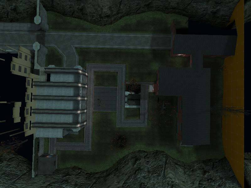
The first shot is an overhead view of the map. Obviously the map
is not very big, but at this point I'd rather release a small map
rather than not releasing a larger map at all.

User posted image

Right now the map has a figure 8 layout (the stone building on the left
is accessible, but the red building on the right isn't, so you can only
run around it).

The next shot is in the sewer. You can see the broken great which
allows you to drop in quickly, but forces you to leave through the
pipe. I'll be adding some ammo and a few headcrabs to this area
before its done.

User posted image

Notice how half the pipe is dark and the other light? I know it has to
do with how models in Source can only take one light source, but it's
annoying and I'm not sure how I'm going to fix it. I'll probably have
to do a workaround with light entities to balance out the pipe
brightnesses.

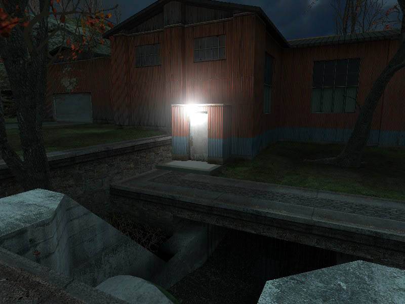
The next shot is my favorite (if I do say so myself) and its of the
sewer pipe exit and the red building I've added since the last compile.

User posted image

The light glow is too bright, I will tone it down greatly next compile.

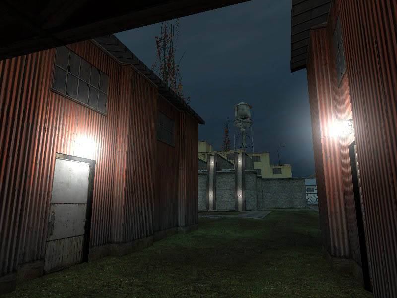
Same area different angle:

User posted image

A little to the left:

User posted image

The glows are gross.

A reverse shot from the same area to put it in perspective with the rest of the level:

User posted image

Another reverse shot this time from the other side of the building:

User posted image

Wide shot of the red building:

User posted image

Right side of the red building:

User posted image

I'll probably be replacing the dev textured area with a brick warehouse.

Reverse angle:

User posted image

I fixed up the little shack so it doesn't look like its having sex with the cliff :razz:

User posted image

Issues I'm aware of:
  • I had forgotten about the displacement paint alpha bug, so for
    the next compile I'll invert everything so that it'll look the way I
    intended. Right now its grassy next to the paths and cliffs, and
    muddy in the open areas, which is obviously the opposite of what I
    wanted.</li>
  • The light glows are way too bright. I'll play around with the settings until I get a much subtler glow.
  • I have a big orange wall behind the red building. I need to
    figure out what to do with it... but I'm leaning towards a brick
    warehouse and some more cliffs.</li>
Stuff I'll work on for the next pass:
  • The inside of the garage needs to be reworked. Mostly the pillars that Orpheus pointed out in the intro.
    </li>
  • Lighting, lighting, lighting. I'll be adding spotlights to spice up the buildings and the open areas.
  • Decals. Gonna need to splash some blood, bullet holes, and burn marks here and there to make this a true zombie level.
  • Props. I'll be dirtying everything up with some
    prop_physics debris and general trash. Prop_ragdoll dead bodies
    will also be added.

    </li>
  • NPC's and items. Once I finish up all the level design
    stuff I'll be adding the zombies, ammo, guns, and a couple of survivors
    to possibly fight alongside as long as you can keep them alive.</li>
Thanks for reading this long update!