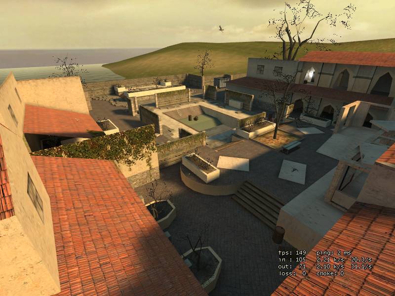
Here is a new version of dm_finca_housewarming from sof2. I've added a lot of detial, improved performance, changed a few weapon placements, scaled down certian areas, added a new passageway, and much more. Feel free to criticize or comment...
Discussion
Posted by snowforskate on
Wed May 31st 2006 at 12:47pm
[Author]
Good to hear FF is enjoying the map.
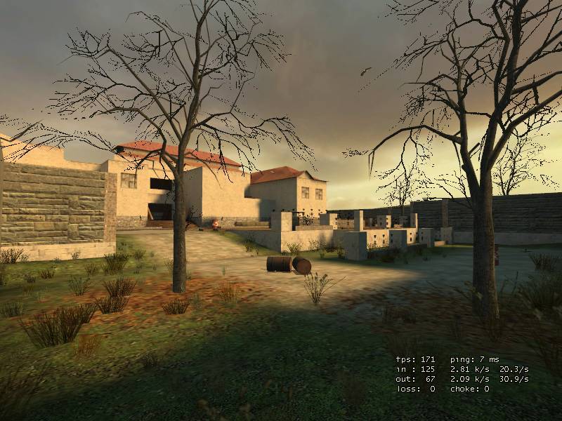
I've acctualy been working quite a bit on improving this map latley. I think the size of the map was what kept the good flow. Tho I know the flow can be improved. I regrted placing 4 of the main weapons in the front courtyard. bow, mag, shotty, & ar2. **smacks forehead** Sometimes you would see everyone rush the courtyard as if there were no weapons to be picked up in the backyard. I also began to dislike the massive dead end. Other than that, I was happy with the flow but like I said I think it was the size of the map that kept the flow good. I should have a new version of this map to post in about a week. I will post it named with a _b for the snarkpit critiques. A week from then, I will finalize the map, being my first final. Then I plan to go back and final all my other maps. I've been workin on new maps as well but I would like to finish what I got here for now. Here are a list of things I've been doing to the map...
Added: 3d Skybox.
Added: New architecture.
Added: flying seagulls.
Added: Ambient sounds, locked doors, seagulls calling.
Added: Displacments and blends in planter boxes.
Added: Player clips on stairs and debree smoothing out player movement.
Added: A few new decals.
Added: Watter in the pool.
Added: Trim along the front buildings.
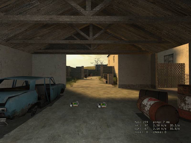
Added: More physics props.
Added: Handrails for pool.
Added: New hallway to remove the massive dead end.
Moved: Ammo boxes, orbs, etc. away from the weapons to incourage more movement & better flow.
Moved: 2 of the weapon placements to improve flow.
Removed: A few physics in a dark room no one was using.
Suggestions or comments to improve or change things are appreciated.
Posted by lordnitro on
Wed May 31st 2006 at 6:08am
snowforskate.. excellent job, i like the style and the flow on the map..We have had in our cycle on the freedom fighters server for some time...I also like the fact that you also made it indoors ,and outdoors..
Also -- even though this is a direct port I think you could stand to
add some more details to the upper parts of the buildings. Since
you're not going to be running around the roofs, feel free to add
trims, support beams down the sides of buildings, antennas, cables
running between buildings, decals, and like myrk said window trims.
It looks like you did a good job porting the map, but maybe the port is too faithful. Don't be afraid to make it look more detailed.
It can be done. The question is, can it be done successfully.
Virtices and entities hate rotating and often bork out.
So, if you have used vertex manip, and have active entities such as track trains, you might be in for a chore fixing the damage. In the end, it might be worth the skybox.
It might be worth, re-assigning the images in an existing skybox instead. Skybox images used to be assigned as top/down/left/right/front/back. You could just reassign them as you need.
good luck.
Posted by snowforskate on
Sun Feb 19th 2006 at 7:38pm
[Author]
Thanks juim for the comments I kinda oversought your post with my last reply, I feel I got the map pretty dead on to the original as well, every floor lip to every brushwork of detail. The hardst part was matching up one room comming from the back to the front, with the floor connecting to the middle rooms, the way it was designed in SOF2, this took me quite some time to get just right. Also I must be missing a step for optimizing water because I couldnt use water in th pool without the fps drasticly taking a crap on me. basicly lost 20 to 30 fps on my 7800 in the spot that was already at 65 fps, so thats why I left water out of the map.
Orpheus, I never tried this but thanks for the idea.
well yah, little things like maybe some ivy covered walls,or more plants and foliage maybe. Alittle water in the bottom of the pool would be cool. Some refuse or garbage strewn about, and maybe some furnishings or a few more physics props. Stuff like that. These are things that will add to the map but not take away from your re-creation of the sof2 map.
Personally, I think a night time version of this map would create some very interesting lighting opportunities.
Remember these are just thoughts and suggestions, not criticisms. I really do like the map.
Posted by snowforskate on
Sun Feb 19th 2006 at 2:46am
[Author]
I wanted to use a skybox with more color but all the tutorials I read said compile and look what side the sun is on, then place your env_sun and light_env on the side your sun is on. The only skybox I found with the sun on the side of the map I wanted it was the default. I never figured out if you can turn the sun's side or not but with that skybox, the sun was on the side it was placed in SOF2.
"70% done"? give some suggestions then pls... All I can think of for a v2 would be locked door sounds whitch I got to lazy to add and a more colorfull skybox if possable. I suppose I could add some more detail in cerian spots as well. but not 30% more...heh there are some visleafs under one side of the map that could use a little optimizing works still.
This is an excellently crafted source version of one of my favorite Soldier of fortune 2 multi-player maps. I commend you for your accuracy. I think, though, given the capabilities of the source engine you had some pixels to spare in a few areas, perhaps you could have embellished a bit and added some more eye candy, but otherwise it's spot on as far as I can remember.
<DIV class=quote>
<DIV class=quotetitle>? quoting Myrk-</DIV>
<DIV class=quotetext>
I think Orphs comments may be a slight exaggeration to some degree also...
</DIV></DIV>
Have I ever posted ought but what I think Master Myrk?
Maps catch my attention in weird ways sometimes. This one strikes my fancy.
/methinks, you exaggerate my intentions Sir. :wink:
Look at all my maps. All I have built solo are chock full of 90* angles. Coincidence? /methinks not.
[edit] I would like to add however. This map is hardly 99% complete. More like 70% :rolleyes: