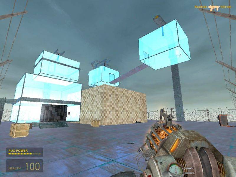
Well i got this idea a while back when i was still making maps for half life deathmatch and so i decided that with better graphics it could be cool........it's called chambes cause there are glass chambers filling it....its not really very big but its got enough cover and other stuff.....my friends tested it for me..ahahhaha...they were actually having a lot of fun and ive never actually seen anyone have that much fun..recommended is about 6 players.....i got a bit of help of ideas like 2 from my one friend ocram...so please try it enjoy it and tell me what you think thanks hey..
Nothing wrong with 800x600 - it tends to be regarded as the "best" resolution to be honest.
Posted by Elon Yariv on
Thu Mar 23rd 2006 at 12:38pm
Make the screenies smaller next time, 640x480.
Posted by reaper47 on
Thu Mar 23rd 2006 at 12:28pm
There are literally thousands of maps with box/ramp combinations out there. We can't see them anymore. I'm sure it's fun to play, especially if you or your friends build it. Even a big box with a few weapons in it can be fun (dm_killbox) for a few minutes but there are too many of this kinds of maps to check out every single one of them and give extensive feedback.
If the gameplay is really perfect then you could put the same layout in a theme, some architecture that looks and feels more interesting than a few shiny walls. It would be wasted in such basic geometry. Gameplay is not everything. Maybe it's 60 or 70% of a map but without any atmosphere (looks, sounds, theme - not necessarily polygoncount or texture effects) it's just empty.
Yes well thats kinda why its called alpha meaning its not finished but
thanks for the feedback but really do try it with a few friends i think
its like 1 meg or something
<div class="abouttext">Message submitted 0 minutes after original post:</b></div>
Yes well thats kinda why its called alpha meaning its not finished but
thanks for the feedback but really do try it with a few friends i think
its like 1 meg or something and also a picture cant tell you everything
like whats inside the chambers
Posted by Captain P on
Thu Mar 23rd 2006 at 10:27am
Well, I'd have to play it to see if it's fun to play, but the looks don't impress me. Shiny surfaces don't necessarily make better looks, you know.
I mean, it looks like you didn't put any lighting in this map, and that besides a field with glass cubes hanging in it there doesn't seem to be anything to this map - no theme (default Combine textures and that's all?), no background (you should use a 3D skybox).
Sure, it may play fun, but some people like to see a nice, immersive environment as well. Try to think up on a nice theme, whether it's the overused warehouse/industry theme or a Combine structure, or something set outside.
Most people wont give your maps two looks if there aren't screenshots. Certainly not going to download it with no visual or technical information on the map.
Take some screenshots and load them up here, you can host at most 3 on your user account.
Get some feed back on those and give some more information ... setting? Ideas you tried to use? Anything besides "here is this map, look at it and tell me what's wrong" :razz: