Phew! Finally done.
It took almost a whole year to get it finished.
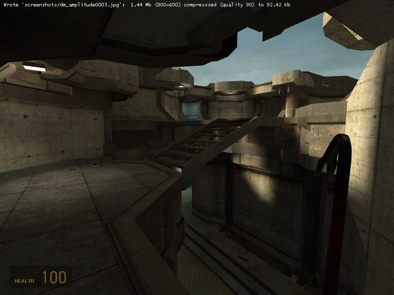
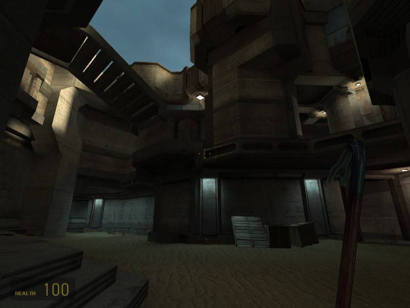
In this map I reused most of the brushwork in several places to speed up the mapping. For example all the stairs pretty much look the same. I hope this doesn't appear boring. While working on the brushwork I discovered a little trick that allows one to create a 45 degrees rotated version of some given brushwork where all vertices are on the grid. Moreover it makes it very easy to combine a "45 degree version" of some brushwork with an unrotated one. I'm not sure if the trick is already known. If not, maybe Reno wants to write a small tutorial in case anyone is interested

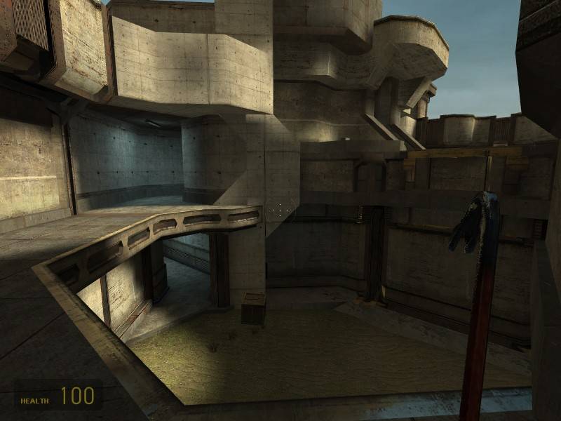
Layout: I'm very satisfied with the layout of the map. It seemed very good to me and it kept me working on the map until it was finished. I tried to get some crossfire-feel to it with some sort of building (one looking a bit like a bunker). The textures also resemble a bit to crossfire. Still I think it got quite different.
Props and weapon placement: I didn't put a lot of props in it. They are rather placed like weapons (which they are). There are more props on the lower levels and fewer on the higher ones simply because there is more space to fight with them on the lower levels. Explosives are also to be found mostly on the lower levels because they are too devastating when shot from a high position (especially the RPG). The more precise guns tend to be on the higher levels (with exceptions).
Beta: Actually the map IS finished. But since I didn't put it up here on Snarkpit before, I decided to call it 99% finished and wait for some input. If anyone finds some errors I missed I can easily correct them.