dm_stack by Windows 98

Map Rating

  • 0
  • unrated

Map Download

Map Info

  • 0 ratings
  • 2777 views
  • 559 downloads
  • added Mon May 1st 2006
  • updated Mon May 1st 2006
  • more content for: Counter Strike Source

Map Description

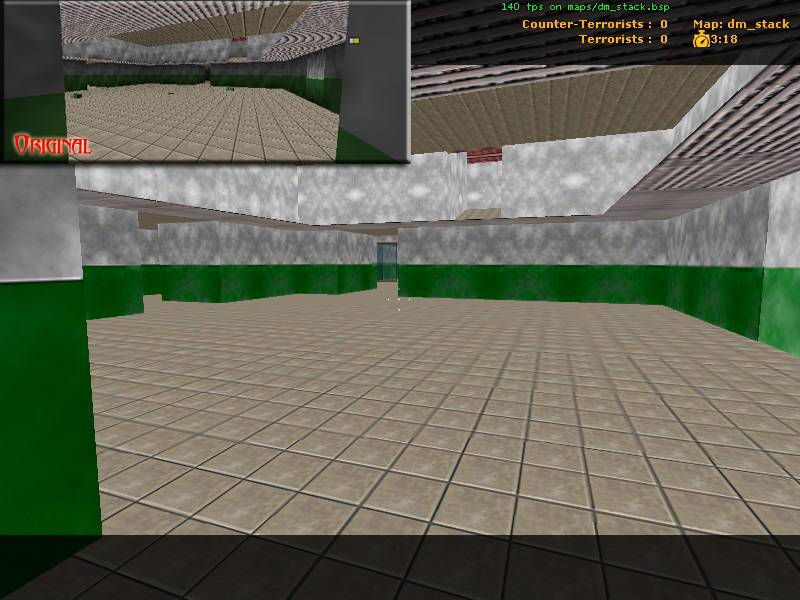
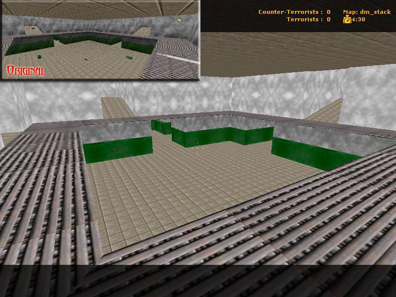
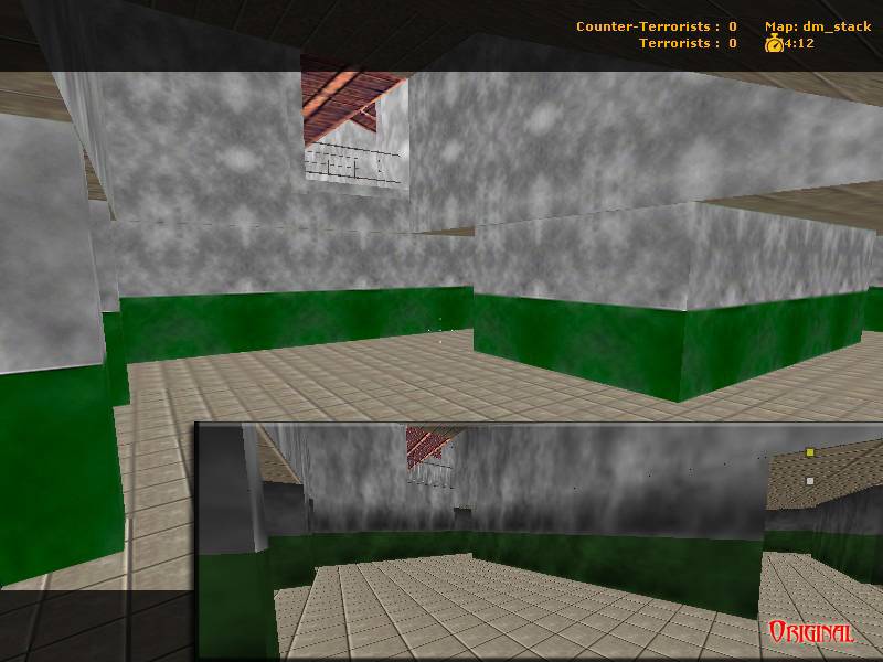
dm_stack is replica of the level Stack from Goldeneye 007 on the N64. I am aiming to be as close to the original as possible. All the textures were done frm scratch by myself. All the mapping was also done by myself. What I need is testers.
Info on alpha testing

NOTE: This is a CS:S map, it has dm_ because it is meant for deathmatch mod servers

Ok, dm_stack is now in it's alpha stages. I need some of you to test it. Your bassically looking for anything you want changed, or you think is wrong.

Anyone who tests the map PM me and let me know, but also post your review in here. I want to keep track of you all so I can put you on the credits list.

Keep in mind, I know some things are wrong. And this map is not even close to done. I know theres no lighting, or cubemaps, nav, and all that jazz. I know most of those super obvious things. I am going to add the ammo boxes and guns(they all will be working and such), and the random spawns

THIS IS AN ALPHA, KEEP THAT IN MIND

Download URL (4.3mb): www.dimensionstudios.org/vmf/public/dm_stack.bsp

Sorry about the file size, its because of all of the custom textures

P.S.
Hit the "use" button to open the blatent secret passages (the lighter sections of the walls) The use button is the button you use to talk to hosties.

Discussion

Posted by Captain P on Fri May 5th 2006 at 7:38am

I just ran through the map for a little while. Seriously, don't put a map up for testing when it's unlit - lighting is simply too vital to be ignored even early on.

Anyway, I feel the map is small, both cramped (negative) and tight (positive). I'd definitely widen up some, if not all, of the area's and paths. I'd shorten some paths between area's too, and rethink the connections - some connections are just double and don't seem to add much choice to the player, while other area's could do with a connection or less obstructed path.
The secret doors are a nice idea, but I think you've taken them too far. A secret should be special, not an attempt to hide a part of the map that's vital to the gameflow, so to speak.

Looking a bit further, I know there's just temporary textures on here and all, but it's pretty hard to get a grasp of this map, even though it's fairly small. It's good to think about landmarking area's early on - different details and textures can help making navigation easier, but different shape of area's and different lighting helps too. This map is completely cubic when it comes down to it's core architecture - could do with some variation here and there.
Also, I don't know what purpose this 'building' serves but right now, it feels like an odd game structure with no real-life counterpart. Perhaps more detail, lighting and all could clear that up, but the structure itself simply feels too odd.
Posted by Mr.INSANE on Fri May 5th 2006 at 3:05am

I swear it was stack
Posted by hydeph on Thu May 4th 2006 at 2:12am

<span style="font-family: Verdana;">Scale looks off. Most walls are shorter than the original. Also, just because the N64 was a box doesn't mean the Source version you've made has to be a box too. I'm sure you could spice up architecture while keeping the layout the same.

Actually, I don't want to sound like a Negative Ned but, that's a total waste of the Source engine. ;'(
</span>
Posted by Windows 98 on Wed May 3rd 2006 at 6:41pm
[Author]

I see what you mean. I tried my best. It was either me, or it is because I couldn't get the angles the same. I'll take a look and see if i can maybe fix it if they are drastically off.
Posted by Addicted to Morphine on Wed May 3rd 2006 at 4:18pm

The dimensions of the 3rd shot dont look like the original area. All the others look spot on though.
Posted by Windows 98 on Tue May 2nd 2006 at 4:43pm
[Author]

Spartan said:
Lol, I find it funny that the original version looks slightly better than the source version. C'mon man, use that source lighting to it's fullest.
Did you read? I said I didnt do the lighting, and that the textures arent done, those are just quick temporary ones.
Posted by reaper47 on Tue May 2nd 2006 at 3:58pm

Any chance of combining it with The basement aswell
It's stack, not library!
Posted by Juim on Tue May 2nd 2006 at 1:39pm

This map might be a good excercise in custom texturing, but I don't hold out much hope for enjoyability. It is a recreation of a nintendo 64 map for heavens sake!. The Source engine is capable of so much more. Even with lighting,weaponry,and spawns, its a conjoined series of un-inspired boxes,repetitively textured, and bland as heck.Not to mention that it's been done already(in source). I'll never understand the gaming worlds fascination with this map. Sorry to be so negative, but thats just me where dm_stack is concerned.
Posted by Spartan on Tue May 2nd 2006 at 9:48am

Lol, I find it funny that the original version looks slightly better than the source version. C'mon man, use that source lighting to it's fullest.
Posted by Mr.INSANE on Tue May 2nd 2006 at 2:11am

Considering this is meant to be near the same it looks really close.

Any chance of combining it with The basement aswell

I would like to say great job aside from the textures being slightly to bright it looks great