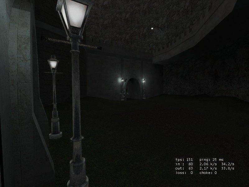
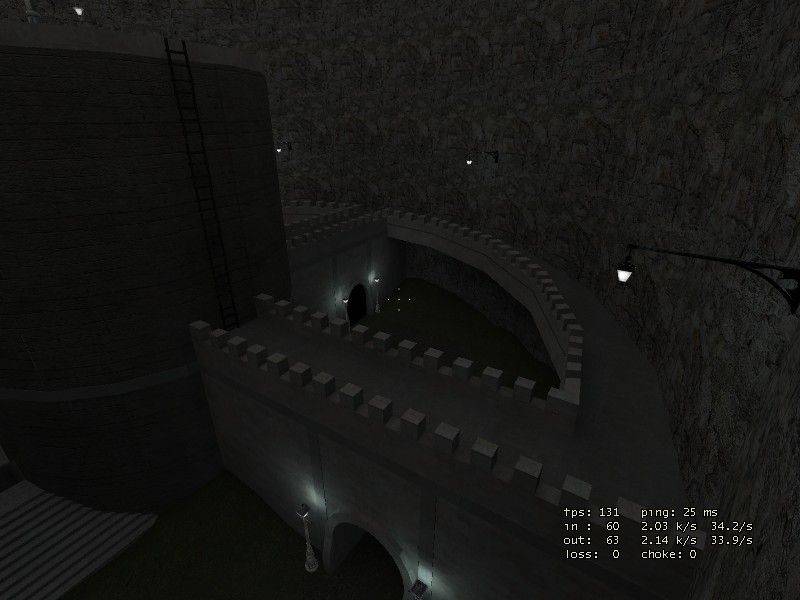
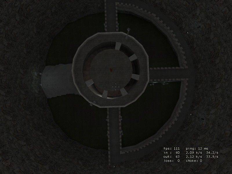
Hmm, for a CS map this looks way too artificial. Try coming up with a more consistent, vivid theme for your next map. The layout is typical for a first map. Essentially a big box (a big cylinder in this case) and a very symmetrical layout. Make sure you have at least 2 or 3 comletely seperate areas in your map instead of having one big building in the middle. Avoid symmetrical parts from the beginning (try drawing a quick sketch of the layout before you start building on the computer).
Also the whole thing is pretty dark. Always imagine how it would be to play this map at a bright day with sunlight mirroring on the screen. Otherwise players will avoid it.
You chose one of the most difficult architectural bits you can do in Hammer: rounded walls. Please tell me the battlements are func_details. Be careful with brush architecture so detailed! There's one thing I can't complain about: you don't use boring, right angled walls. In fact maybe try to simplify your architecture the next time and pay more attention to textures and look at photos of real world locations to make it look more solid and natural.
Sry for the lack of positve feedback, this is a nice map for a first attempt but there's much to consider. You should have seen my first maps

Welcome to the Snarkpit!