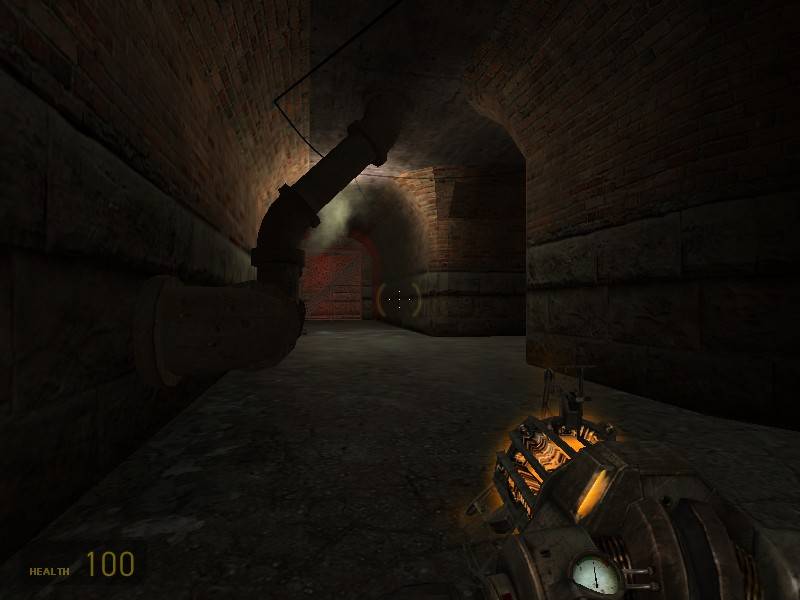
THE 'PIT HATH SPOKEN. I'm revealing for the 'pit to critique my third foray into Source mapping. Set in a mine, just like Bloody Ore 1, this map focuses on the underground tunnels instead of topside structures, which was Bloody Ore's downfall. A small "easter-egg" in the skybox can be seen -- the main elevator structures of BO1 :P.
Some features of the map include the more powerful and dangerous weapons in hard-to-reach areas, an exploding shack, phys_cannisters (gas tanks that fly around like rockets when shot) and most importantly almost no lag.
The people that have joined my test server liked it, but I'd like to hear what my fellow Snarkers have to say.
Numerous things have been accomplished with this: I've gotten out of the HL1 mindset when Source mapping; I'm using more curves instead of 45-degree angles, for instance.
Discussion
Posted by Victor-933 on
Sat Dec 9th 2006 at 1:48am
[Author]
I'm working on these things.. That floating roof part was where I
forgot to assign the prop_physics the proper name. Also, after some
thinking I decided to make the metal plates actually break, using the
old debris models left over from when those models broke when shot. It
doesn't work 100% of the time, but the fact remains that the plates
disappear after some time. I'm also trying to break up the corridors
some. I thought about making a physprop-blocked tunnel leading directly
to the RPG, and permanently blocking the other two tunnels. The chain
link elevator room.. I'm not sure what to do with it, aside from add a
vent which I probably will do.
I suppose one of my flaws is trying to please everyone -- a mere two
people asked me to expand upon the flooded tunnels which originally
were blocked off by gates, a state I may return them to.
Posted by amanderino on
Fri Dec 8th 2006 at 10:52pm
I downloaded it and played it for about twenty minutes.
I liked a lot of things.
The elevators were nicely done, I liked the atmosphere, and I liked a lot of the lighting in the tunnels.
Now, my list for things I didn't like is more in detail.. mainly because I'm very negative towards things. Don't take any offense, I shoot down my maps all the time even if people say they look good or play well. This being the reason I have not released a map.
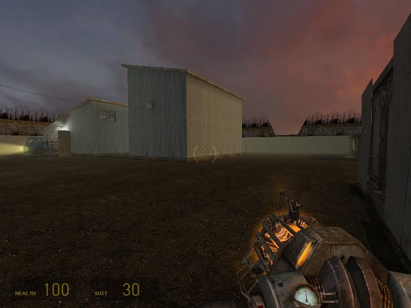
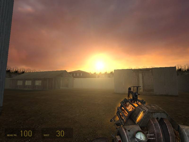
The top floor (of the elevator with the chain doors) is desolate.
The tunnel housing the rocket launcher had water in it. That is not a problem BUT the tunnel is so FREAKIN' LONG! Which brings me to the other tunnels, while they do bring the map more atmosphere, they cut into gameplay. However, if you're planning on making this map have about 30 players, it might be alright.
This next part isn't really me complaining, but something I came across. I went to the exploding shed, and blew it up to see the effect. I loved it, but when I blew it up, a piece of the roof remained.. floating. Also, is there a way into the shed without having to blow it up? I might not have spent enough time there to realize if there was. I walked up to the shed doors, couldn't squeeze through.. tossed a grenade in. Perhaps make the doors open a little more, just enough to fit one person at a time.. making the room more of a deathtrap if someone happens to be on the surface waiting..
Overall, though, I think this map has potential. :smile:
Corridors are fine, if they're interesting (read: wide) enough and provide cover and multiple approaches. It's mainly that corridors are narrow, linear and empty that makes them bad. Then again, if they're not, you'd probably not call them corridor anymore... :wink:
I agree with reaper47: it's a weak layout. I wasn't even able to find the top-side area after a few minutes, as I probably ran around in circles. I don't know actually, almost every corridor looked the same. And they were way too long too.
Besides that I saw a lot of doors. These take away a lot of speed from the game, I'd remove them if I were you.
And, several area's were dead ends. Most area's in fact were dead ends. That's bad for the gameflow: you get trapped easily, and on the other hand there's no surprize anymore: the opponent can only come from one entrance ever.
I also noticed a lack of physics objects in most area's, and an abundance of them in some others. Especially the stack of wood beams looks unnecessary, and the top-side shack that explodes doesn't add much to the gameplay since it's a one-time thing. It does add a lot of physics overhead and causes the area to be hard to walk on with all those plates on the ground.
Players want action fast, so make the map more compact, cut down on corridors and add bigger area's so players know where to find the action they're looking for. Provide more cover in these area's and more connections between them to make them interesting to fight in. Get rid of overabundant physics items, spread them across the map some more, to encourage physics combat more and avoid bad performance. Give area's clear purposes and looks, make them look more distinct to make the map easier to learn and to navigate. This also means players will remember what area's contain what items (if you place them well of course) so they have a better idea of where they can go.
Perhaps it'll help you to draw out the layout. I usually create simple overview, indicating combat area's with circles and connections with lines. Generally speaking, most area's do well with 3-5 connections, and most connections shouldn't take longer than a few seconds to move through. Of course, connections and area's can blend in somewhat, but I found it to be a good thumbrule. I hope it can help you as well. :smile:
A good 95% of the map consists of corridors. Corridors in a maze-like structure and with no real landmarks so you even get totally lost. I can't quite see how this should work out. Generally corridors should only connect bigger main-areas and should be as short as possible. Even if it's a mine map... this is too much.
Posted by Victor-933 on
Fri Dec 8th 2006 at 2:49am
[Author]
Well I decided that there should at least be some topside travel, but
not too much, because with the AR2 as deadly as it is in the mines you
don't want it easily reachable, and topside seemed the best place to
put it. As for the "death machine".. it's more of a hazard than an
instant-kill device. I guess I described it wrong, but the ENTIRE
hallway doesn't fill up, it just blocks off a part with hot steam that
does a good bit of damage.. more or less an oil slick to throw down
when someone's chasing you, although to duck in the alcove and turn the
valve to activate it might require some fast fingerwork.
As for the barren part, I've been slapping down most of the layout,
then focusing on certain areas to perfect them. On the final
run-through I'll throw all kinds of decals and physprops about to help
make the gravgun a little more useful.
It probably should be noted that I haven't quite perfected the shed
yet; some of the sheets get stuck together and need punting.. I'm
considering tagging them all as debris.
I haven't downloaded it, but, it looks really barren.
Also, if the main focus is on the tunnels then wouldn't you want to restrict topside travel as much as possible? Maybe make the topside a very minimal branching path to just hint at the surroundings and to add connectivity.
Remember: connectivity is the most important thing when designing a multi-player map. Hopefully you used some restraint, as "death machines" get old rather quickly. I'm not saying remove that type of stuff because it gives flare to a map, but, since TFC's gas chamber it's gotten very gimmicky and becomes "who can get to the controls first" type of game play which is never fun.
Anyway, good luck. I'll run through it later (probably this weekend or a little later) with specifics on what I see and think.
(That shouldn't stop anyone else from doing the same of course)