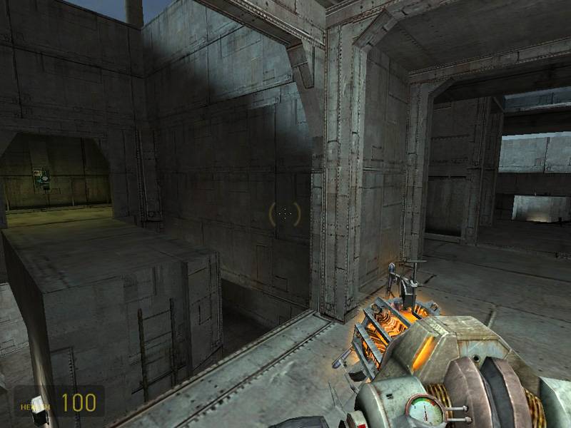
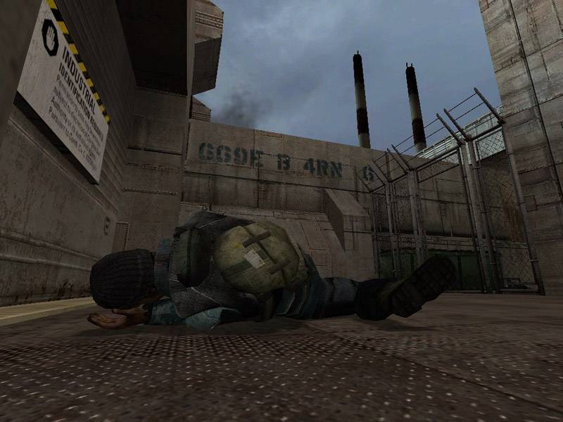
dm_choose_weapon.bsp by Jacfu

Map Rating

  • 0
  • unrated

Map Download

Map Info

Map Description

map has been abandoned...

Discussion

Posted by Jacfu on Fri Mar 16th 2007 at 11:35pm
[Author]

Thanks Baron

This map is going to change a lot, some of the areas you mentioned are just a complete mess. I will keep the good parts and discard the rest and go from there.
Posted by Naklajat on Fri Mar 16th 2007 at 10:14pm

If you didn't you'd probably figure out pretty quick after loading up the compiled map :lol:

You've made some really cool areas in this map, but there are some really boring areas too. There are also some issues with flow and connectivity throughout most of the map.

User posted image
This area is very nice gameplay-wise, but it's just too damn gray. If you do end up making custom textures for this map, make sure to use a little color in the accents and trim.

User posted image
User posted image
Two large bunches of pickups, very close to one another. Not really a good thing.

User posted image
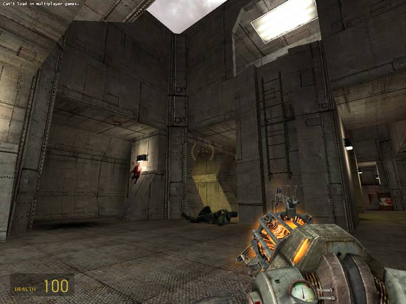
Light can be used very effectively to influence the player's focus. Contrast in lighting, which could be brightness, color, or pattern, tends to grab your attention and make players want to investigate a spot.

User posted image
Green-yellow colors are usually not a good choice for lighting, most people have a subconscious aversion to colors in this range (the phrases 'puke green' and 'snot yellow' come to mind). An environment that range could work in might be on an alien planet with big creepy insect-like aliens, as in that kind of place you're not aiming to make the player feel comfortable.

User posted image
I like this area a lot, but it's only got two entrances, and they're right next to each other.

User posted image
User posted image

User posted image
This room is really boring, just a big box with giant shipping containers in it. It might be a good idea to completely redo this and the areas in the pics below this.

User posted image
Very dark, very narrow, and very linear.

User posted image
More dark and linear.

User posted image
After walking through those dark, linear areas, you find yourself at a dead end... that could be more than a little frustrating playing online.
Posted by Jacfu on Fri Mar 16th 2007 at 9:11pm
[Author]

:lol: don't fret baron

I knew you were just kidding around
Posted by Naklajat on Fri Mar 16th 2007 at 8:42pm

lol, yeah I was, sorry I guess I should have made that the sarcasm color. :wink:

I took some screenshots a minute ago, I'll edit this post with comments in a bit.
Posted by Riven on Fri Mar 16th 2007 at 8:39pm

I'm probably wrong, but I think Snikers was kidding, right?
Posted by Jacfu on Fri Mar 16th 2007 at 10:56am
[Author]

k , I'll try those. Thanks
Posted by Naklajat on Wed Mar 14th 2007 at 11:53am

Use the orange dev textures with purple and green lights.
Posted by Jacfu on Wed Mar 14th 2007 at 11:00am
[Author]

I don't know what I was thinking about using one texture. It would be cool if there was just one or two more similar textures to the predominant one I used -that would work better than just one me thinks.
Posted by Naklajat on Tue Mar 13th 2007 at 10:55pm

Lighting would be key in a one-texture map, in any case.

I've yet to check this map out, so I will do so now. The architecture is quite eye-catching for it's simplicity.
Posted by FatStrings on Tue Mar 13th 2007 at 7:04pm

could be very boring, or maybe it could give it a really clean look, I feel that if he pulled it off it could look pretty sick