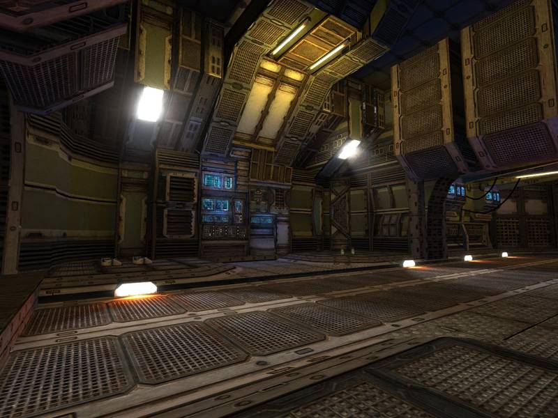
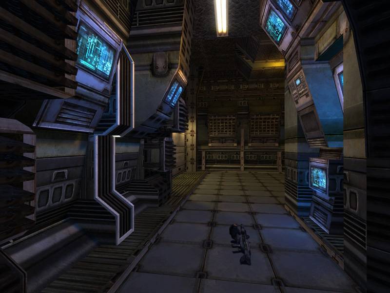
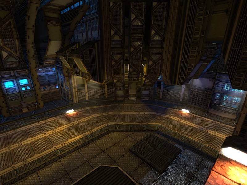
This is a map that i have been working on for the past three weeks.
Its a small sci-fi 1 on 1 map for HL2:DM.
Its made mostly for portfolio purposes, but plays quite well.
Textures are made by PhilipK.
I regret that I did'nt post it any sooner since I got some good feedback that I could have fixed if I did.
Lesson learned, thanks for all the feedback.
I have only made some small fixes since the beta.
A spawn issue with the shotgun aswell as some texture alignment and sharper shadows.
Posted by Junkyard God on
Fri Apr 13th 2007 at 7:17am
I think it would be nice if you'd maybe expand this map a bit for maybe a v2.
To support some more players, maybe you could add some kind of outdoor area (something like a mars landscape ala quake 4?) or something like that.
This map would be nice to run around on with more than just 3 or 4 players.
I downloaded the map today at work, I must say iy is impressive looking. I wonder what the performance would be like if you made much more of the decorative architecture model based as Reaper said (my poor laptop avereaged 25 fps throughout). This is a good 2 on 2 map. I wish it was about 3 times larger as well. Impressive.
It looks nice, but it looks like a lot of grey metal with moody
lighting. Even if it is only a small map, variation in architecture and
lighting, texturing - perhaps even a focal point (eg a atom compression
chamber, use your imagination) works as a landmark.
Also, (i've not d/l'd the map), it looks like a bunch of passageways.
Try cutting a few out and linking two areas up with a fancy corridor. Z
axis use, would be nice :smile:
After all the urban/coastline styled maps this is very refreshing for HL2DM. Pretty much perfect in composition, also!
I agree on the NS look though. You're really mapping on such a high level here, that it would be worth looking into custom prop-modeling to make better use of the engine.
I've never seen so much detail on a completely brush-based map (besides the lighting models). The bump mapping really does make it look much more detailed than it actually is. Although, I wonder if it would look better if you were to use the phong shader instead of the reflective shader on most of the dull pieces of metal? Anyway, the layout works for maybe 2-4 person matches, but any more would be pushing it.
My only complaint is that I wish the elevators waited at the top level just a little longer.
Nice map, but yea, the theme is a little worn-out IMO.
Posted by Junkyard God on
Thu Apr 12th 2007 at 4:52pm
I think it's a nice mapping style, ns might have had a bit of an overkill of this type of theme.
I think that the lighting sceme might be able to come out more if the overal lighting is a bit dimmer, so all the colours are more ontop, if you know what i mean.
it is well executed mapping-wise but personally it reminds me of the common ns style too much. The textures are ofcourse very nice separately, but as a whole it comes over too busy, cluttered, dark-contrasted and unoriginal imo. but maybe i'm just biased by the many ns maps i've seen. i would just like to see a refreshingle simple futuristic design sometime. But since the map is close to finished anyway, just ignore my personal general ramblings :wink:
Posted by Junkyard God on
Thu Apr 12th 2007 at 2:02pm
Looking sweet man, No comments on this atall, I'll dl it when i come home to check out the layout etc. :smile: but it looks very nice.
