dm_weaver by ReNo

Map Rating

  • Star map!
  • 5
  • 2 ratings / 5 stars

Map Download

Map Info

Map Description

A small, symmetrical level that makes absolutely no sense in terms of theme! Think of it as a strange (and under-equipped) atrium between two factories, that is rather unfortunately built over an open sewer. The level was built for Mapcore's 1024 unit contest, in which all of the entries had to have their playable area confined to within a 1024 unit cube. Obviously there are areas of this map that extend beyond that, but they are clipped off to prevent player access. Sacrifices were made to the initial plans in order to get it done for the deadline, and while there are plenty of things about the level I'm not completely satisfied with, overall I think it turned out ok given the fairly short development time and small area restriction.

Discussion

Posted by haymaker on Mon May 7th 2007 at 10:29pm

Yes, all of the above ++. Very nice looking. Performance very good, as a small map should be. My only niggles are from players standpoint. A SLAM ?!! And no mag, to boot?? ayayay.( or did I miss it? I ran around lookin for it...) The false walls left me scratching my head a bit, why don't the pipes just have a grate or debris in them? Similarly, orbs bouncing off the sky is a little unusual. I did like being able to control fall damage from the top level.
As for props, I didn't even notice they were there, which is a good thing. The whole thing feels natural and believable, architecture top flight.
Posted by reaper47 on Sun May 6th 2007 at 8:29pm

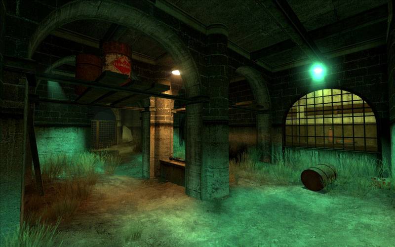
I had a quick run to see it in action. The phys prop placement is nicely done, yet a bit counterintuitive (hidden in the corners). People spawn with the ggun in their hands so they're hardly an obstacle and hiding them in corners isn't good for the action IMO.

I just hear the "avoid the map being to cluttered" argument a little often as an excuse to turn a HL2DM map into a Quake map. So I'm getting tired of it. I've never seen a HL2DM map that has actually been that cluttered by physics props. People are so scared of this that a lot (of the best) maps are very boring physics-wise.

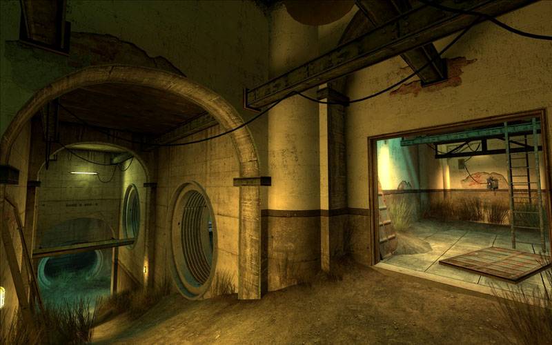
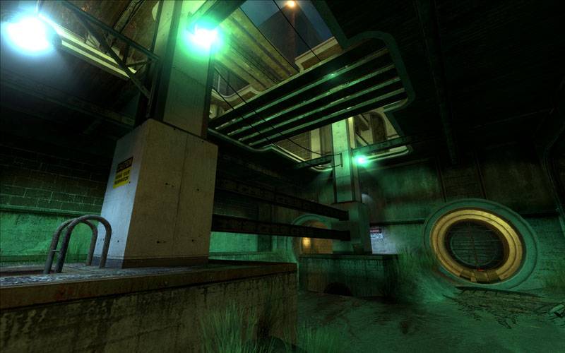
Lighting is delicious. Layout is smooth. Brushwork AAA+. It's just a bit irritating that an architect put so much fine detail on the top part only to cover the very raw, industrial bottom. But we already had that :D
Posted by mabufo on Tue May 1st 2007 at 12:24am

Yet another stunning map. Well done.