Very impressive for a first effort! Hope you don't mind my score of 5 - I reckon thats really not bad for a first release tho! A few thoughts that might help you out in the future:
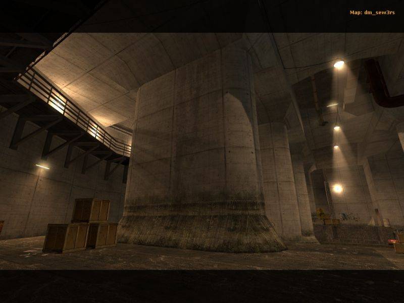
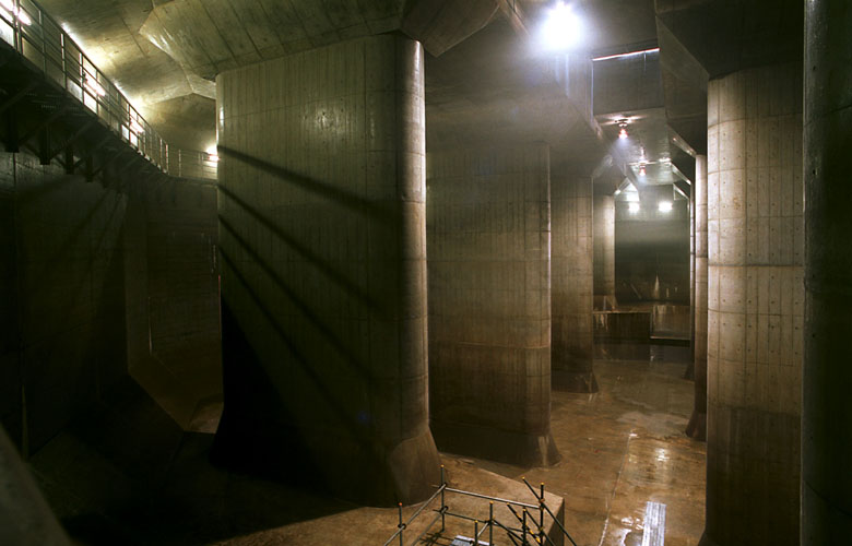
1. It's a little oversized, IMO. Not in terms of the size of the layout, but just the scale. You've got a good grasp of making believable and pleasant looking architecture, but everything is so huge and spaced apart that it feels painfully empty. You'd need a huge amount of clutter to make it feel "detailed" at the current scale. I guess its intended to make it feel grand and imposing, but I think that you could have achieved that feeling better if it was compacted in a little. Don't stress too much on accurately rebuilding your inspiration or reference material. Draw ideas from it, but building a perfect recreation isn't necessarily the best approach.
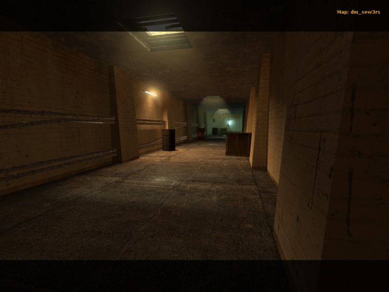
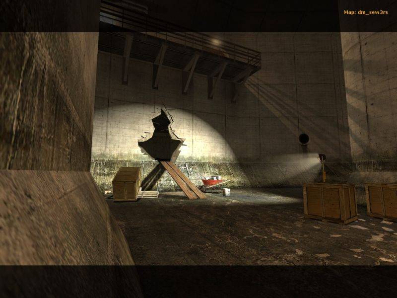
2. The layout isn't working too well IMO. The main hall is quite nice, with neat use of large pillars to break up the play area, and the raised ground sections with stairs leading up act as bottlenecks that enable players to predict the movement of enemies. Thing is, the rest of the map is just a bit boring. Every other area is just corridors, featuring no internal layout or cover. Such areas are good when used in small doses, leading players from one interesting area to another, but here they take too long to navigate and lead you into yet more corridors. A lot of them are also painfully long. The upper corridor with the combine rifle is far longer than it needs to be and has nothing to break up the journey along it. Its really screaming out for a room that then connects to elsewhere in the map, so as to provide a route choice. I'd have been tempted to throw in a room with a broken floor somewhere above the "hole in the wall" RPG room, that allows players to connect between the two. Basically you want more rooms like your main area, that offer choices of route and internal layouts. Less corridors.
3. Using only ladders to connect the floors is a bit of a no no, especially when they're such long climbs. Which leads me on to the fact that the lower sewer area is positioned so far below the main area - there's no need for it to be such a large drop really. I'd suggest keeping the lower floor as tight against the main floor as possible; the vertical drop/climb between the two isn't really a functional part of the playing area, so there's no need to extend it further than necessary.
4. Could benefit from more variety in the textures - it's all a little too grey at the moment. You've used overlays to pretty good effect though. On that note, unfortunately, I suffered from some overlays flickering in and out, most notably the "Northern Petrol" one in the main hall, which, given the significant size of it, was quite distracting and ugly

The console was barking errors about too many overlays trying to be rendered at once, so basically due to the open nature of the level you can't get away with that many overlays.
5. Lighting was nice, some really neat touches. I thought the overall brightness level in the main hall coulda been dropped down a bit to make it more atmospheric, but you've still managed to get a fair chunk of contrast in there so fair play to you. There's a basically pitch black corner in the lower sewer that could have done with more light, but it's nothing too major. My main issue with the lighting is more of a technical one - you've really gone crazy with the lightmap resolution

It's resulted in some really nice effects but you've dropped it to really low values on almost all surfaces, and in MOST cases it isn't having any visual effect. That doesn't mean it isn't contributing to the filesize though, hence your 22mb BSP for a map that could really use less than half of that. In future by all means use high res lightmaps where you need them for fancy lighting effects, but not where you don't. If you've got faces that are entirely in shadow or in light then you don't need the resolution - bump up the value to 16 or 32 and you'll never notice the difference. Also, if you've a huge wall with only one small portion of the face that needs a high res lightmap, cut up the brush into multiple brushes and only use high res values on the parts you need. It'll cut down the BSP filesize, speed up your compile times, and reduce the memory requirements of the level in-game.
Anyway, this has grown a little longer than anticipated so I'll stop here. Hope it's been of some help! Keep it up man, looking forward to seeing more from you

