Say hi to our newest member, RichardELDEN!
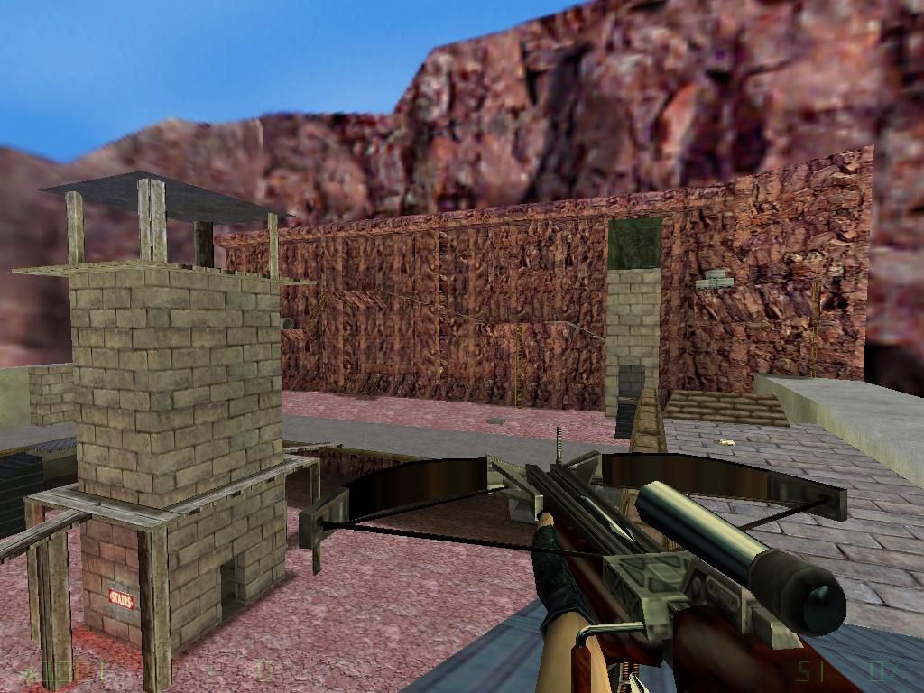
Niborius said:Well, I'd have to agree with what aaron said afterward about that statement. The stairs simply don't 'fit' within the rest of the environment. Sure, you can claim "the map isn't based on reality" -and I'll buy that, but to relate it to fantasy is another issue. Please don't get into the habit of hiding poor craftsmanship on 'fantasy' Many beginner mappers get into this habit and never go on to create anything more interesting than a killbox.
aaron_da_killa said:The map isn't based on reality. And btw, some fantasy stuff is ok to me...
Bad stairway, would it really look like that in reality?
Niborius said:I should have said texture instead of colour. Its to spereate the cliff wall from the cliff floors, adds contrast to the cliff and helps players navigate the cliff easier.
aaron_da_killa said:Why?
Floor should be a different colour.
Niborius said:Actually reducing the scale of a texture increases performance. At the point where the texture tiles, the brush the texture is on is cut creating more polygons which have to be processed, this is just the way BSP geometry works.
aaron_da_killa said:I fixed all of them, but then i've set the scale of the mountain texture a little bit lower in the hope to fix the lag bug. After that i forgot to check if i should align the textures again.
Lots of misaliigned textures.
aaron_da_killa said:How can i best fix that?
Misaligned ladder texture (side).
Niborius said:You need to rotate the texture and modify the scale if you have to, both of these operations are done with the texture painting tool.
aaron_da_killa said:I have NO idea how to fix that. i've come across the same thing multiply times.
Misaligned wood texture (side).
Niborius said:Then prevent that surface from being cut and thus causing the glitch, when two world brushes (a brush that isn't tied to an entity) touch or overlap, they cut into each other creating more polygons and can sometimes cause lighting glitches like this.
aaron_da_killa said:I tried everything, and yes, i have ZHLT 3.4
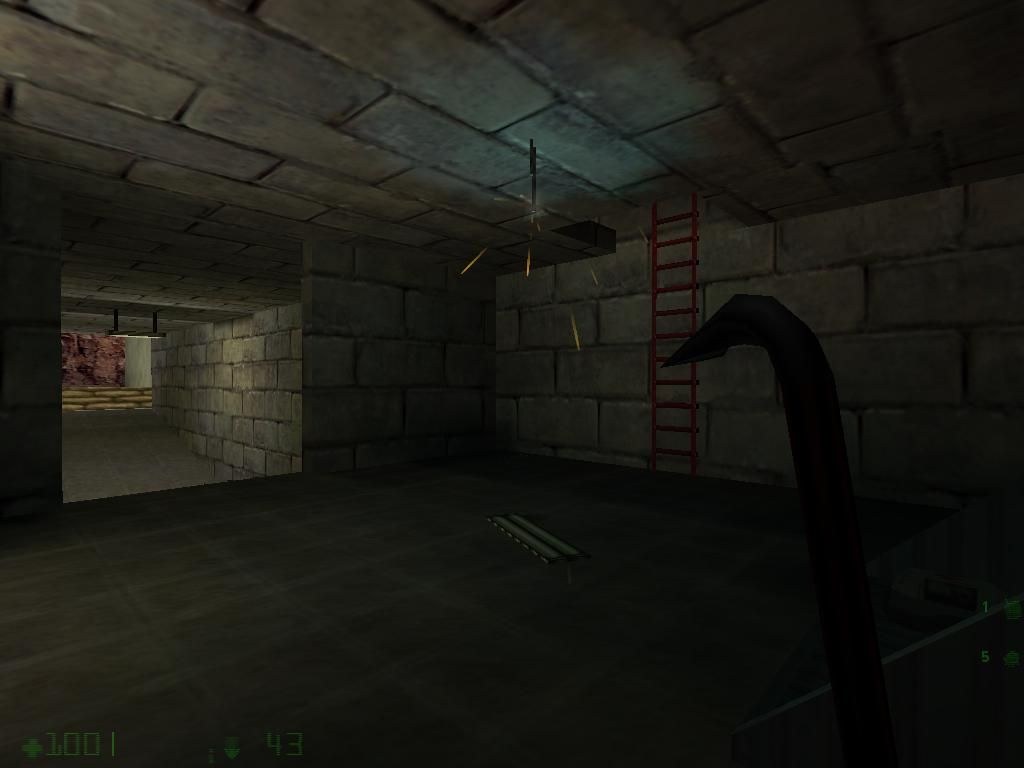
Light glitch, ensure your using the latest compile tools (ZHLT 3.4).
Niborius said:Well it certainly looks realistic to me, you are using "realistic" textures and whatnot and have created an environment that is likely to be possible or one exists similarly in real life. All I'm saying is that the stairway doesn't look good in that its very big and bulky, it has a metal texture all round and the way that it extends to the floor throughout like that from top to bottom. I'd like to show you what I think you should have done but the image is on my imageshack account and pictures from that go missing all the time
aaron_da_killa said:The map isn't based on reality. And btw, some fantasy stuff is ok to me...
Bad stairway, would it really look like that in reality?

Niborius said:Believe me, this has been done many times before by myself and many other people. You just have to keep tweaking it a little but anyway, if you couldn't get it working right than you shouldn't have put it in at all
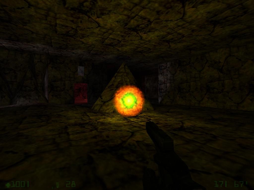
aaron_da_killa said:When i made it bigger and closer to the light, half of the sprite could not be seen. But at least i put sprites in it.
Increase the scale of the sprite and move it a bit closer to the light next time.
Niborius said:Here. Basically what you have to do is have your door and a small bush covered in the origin texture which acts as the hinge, then you just need to set the correct settings. You tie both the door and the origin brush to func_door_rotating.
aaron_da_killa said:Right. Offcourse i did already tried that. But that's too complex to me. I put a origin texture on the side that the container should open like and tied it to func_door_rotating. But ingame, when i touched the container, the "door" or w\e it's called, was floating around my whole map. Also, it was the same in the previous version...
Haha, apperciate the effort but a dumpster like object like this wouldn't open like that, not to mention the lid is floating. It should have a hindge, use func_door_rotating next time.
Niborius said:I said hypothetical
aaron_da_killa said:Ok sorry but you're completely wrong. I checked almost every sound in the ambience folder, and i throught these would fit the best in the map. And i think i was right. I mean, when you stand on a high building\mountain in real life, you hear wind too.
maybe you put the ambient sound in, maybe you realized that it didn't play everywhere, maybe you didn't realize it, whether or not you noticed it and decided not to fix it or didn't notice it at all, you still didn't spend enough time making sure it worked, making sure it was perfect, spending time and tweaking those things and really putting some thought and effort into the map. Just "good enough" sucks, you can't do "good enough", you have to really do "good" or better, that's what you should be aiming for. The same applies for the sound you chose and this is just an example/hypothetical. Let's say you where looking through the ambient sounds and you came across one that you thought "yeah, that could fit", you didn't bother to keep looking, you just chose the first one that fit in the map, that's not good enough. You have to keep looking, there might be a better one!
 I was just trying to illustrate a point.
Niborius said:Good, I did say that this version is an improvement of the last didn't I? I was just trying to say that its important to focus on getting everything perfect and not just adding in more stuff. I'm not saying that's what you did, I don't know how much level design experience you have so I can't say whether your doing "well" or not. If this is your first map, which I doubt because this is better than a first map, than your doing really well and you are obviously focusing on detail, if you have been mapping frequently for 5 years than I can say that this really isn't a map that reflects that sort of experience. I'd guess that you have been mapping the equivalent of a year of frequent mapping or less. But I just wanted to say that to make sure you understand that polishing the map is important, quality is more important of quantity. Its pretty silly asking you if you focused on quality because you would say yes and quality is relative, plus if you said no then I'd be a bit worried.
Now in overall, i spent alot of time in this map, like 4 times more than i put in the old version. I even added background stuff (like in the cave, where you can see a light dropped on the ground with a long path in the cave, which you can't reach because it's blocked by spikes)
aaron_da_killa said:Why?
Floor should be a different colour.
aaron_da_killa said:I fixed all of them, but then i've set the scale of the mountain texture a little bit lower in the hope to fix the lag bug. After that i forgot to check if i should align the textures again.
Lots of misaliigned textures.
aaron_da_killa said:I know, there was a reason why i didn't do that but i forgot.
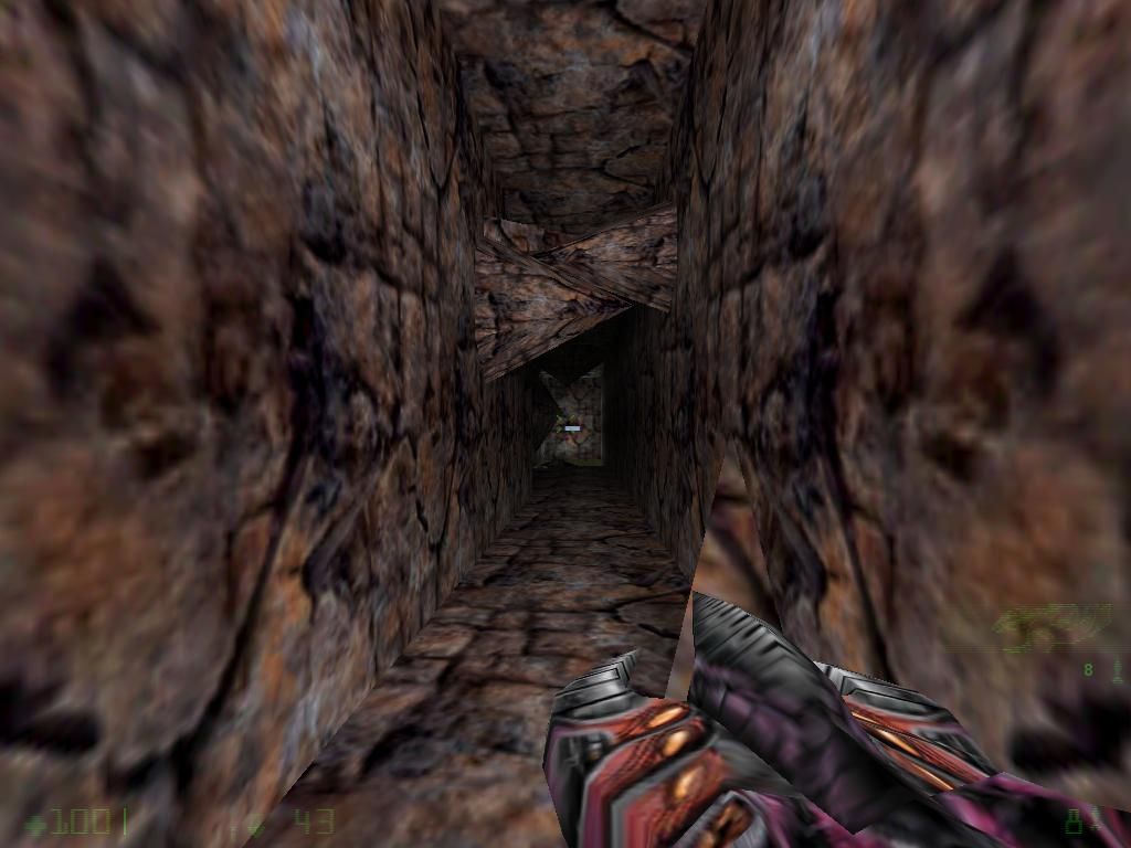
Misaligned and stretched light texture, side of the light should be a metal texture or concrete texture.
aaron_da_killa said:How can i best fix that?
Misaligned ladder texture (side).
aaron_da_killa said:I have NO idea how to fix that. i've come across the same thing multiply times.
Misaligned wood texture (side).
aaron_da_killa said:I tried everything, and yes, i have ZHLT 3.4
Light glitch, ensure your using the latest compile tools (ZHLT 3.4).
aaron_da_killa said:Good one. Thanks for the tip.
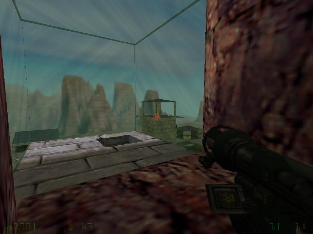
Glass pieces shoudln't touch or overlap. Put a metal truss on those edges next time.
aaron_da_killa said:The map isn't based on reality. And btw, some fantasy stuff is ok to me...
Bad stairway, would it really look like that in reality?
aaron_da_killa said:When i made it bigger and closer to the light, half of the sprite could not be seen. But at least i put sprites in it.
Increase the scale of the sprite and move it a bit closer to the light next time.
aaron_da_killa said:Right. Offcourse i did already tried that. But that's too complex to me. I put a origin texture on the side that the container should open like and tied it to func_door_rotating. But ingame, when i touched the container, the "door" or w\e it's called, was floating around my whole map. Also, it was the same in the previous version...
Haha, apperciate the effort but a dumpster like object like this wouldn't open like that, not to mention the lid is floating. It should have a hindge, use func_door_rotating next time.
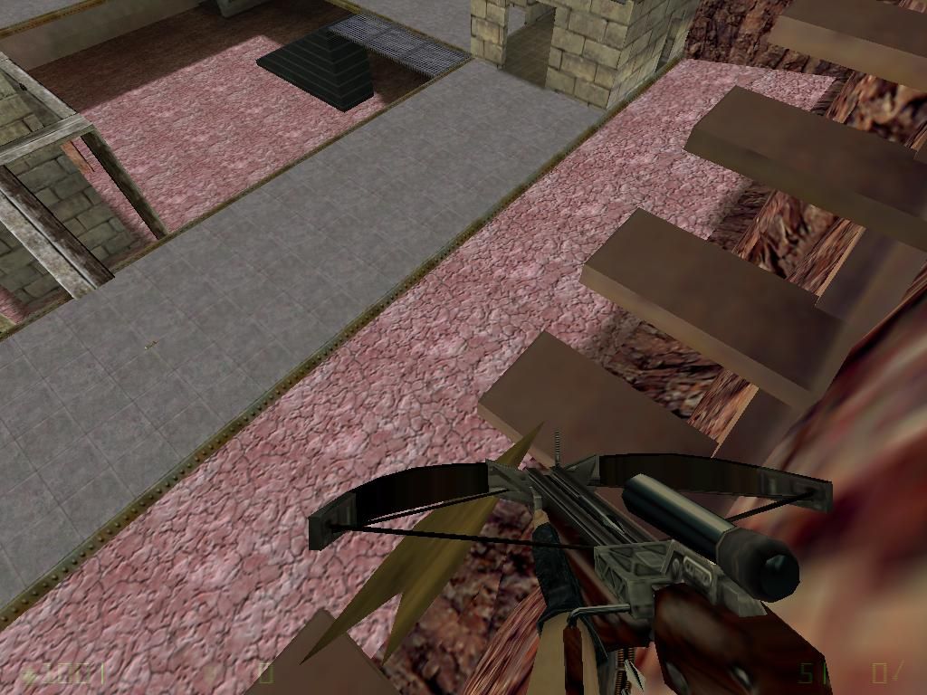
aaron_da_killa said:I put some bars under it before but i got compiling errors so i removed them.
This platform is floating.
aaron_da_killa said:Ok sorry but you're completely wrong. I checked almost every sound in the ambience folder, and i throught these would fit the best in the map. And i think i was right. I mean, when you stand on a high building\mountain in real life, you hear wind too.
maybe you put the ambient sound in, maybe you realized that it didn't play everywhere, maybe you didn't realize it, whether or not you noticed it and decided not to fix it or didn't notice it at all, you still didn't spend enough time making sure it worked, making sure it was perfect, spending time and tweaking those things and really putting some thought and effort into the map. Just "good enough" sucks, you can't do "good enough", you have to really do "good" or better, that's what you should be aiming for. The same applies for the sound you chose and this is just an example/hypothetical. Let's say you where looking through the ambient sounds and you came across one that you thought "yeah, that could fit", you didn't bother to keep looking, you just chose the first one that fit in the map, that's not good enough. You have to keep looking, there might be a better one!
