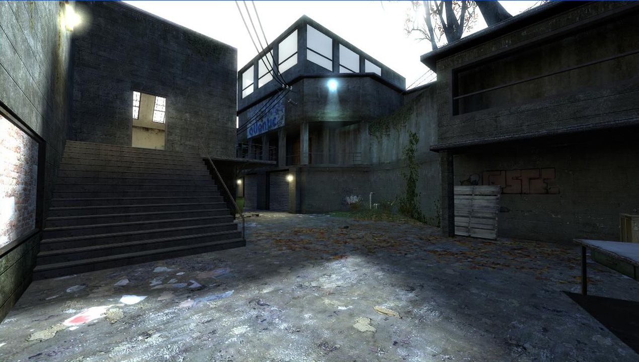
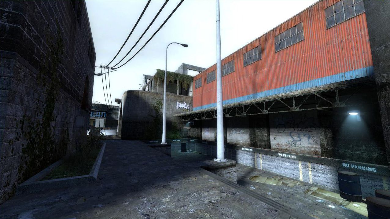
DM_kowloon by popcornjake

Map Rating

  • 4
  • 2 ratings / 4 stars

Map Download

Map Info

Map Description

This is the first map I've released and I've been working on it for a good few months now, after months of procrastination since beta 5, I've finally dusted off the final version(which I never actually envisioned happening). It's a medium/large map with a somewhat symmetrical layout.

The name doesn't actually have anything to do with Kowloon, or the walled city of kowloon, the map started out as a map on the rooftops of that city but it eventually changed to what it is now, though the name stayed the same.

I don't really have any clue as to how to organise some sort of a play test session so if somebody could pretty please push me in the right direction i would be very grateful.

Discussion

Posted by haymaker on Sat May 30th 2009 at 6:41pm

Ive had a peek at b3. Some thoughts:
  • I really like the flow potential here. Could be a fast-playing map.
[URL=http://s546.photobucket.com/albums/hh409/bc_haymaker/?action=view&current=dm_kowloon_b30005.jpg][IMG]http://i546.photobucket.com/albums/hh409/bc_haymaker/th_dm_kowloon_b30005.jpg[/IMG][/URL]
^ Note my frames. Far too low. Make sure the world geometry for the building is as simple as possible, could even make the top 2 stories func_detail. A map-wide horizontal hint at the top of 1st floor line will come in handy.

[URL=http://s546.photobucket.com/albums/hh409/bc_haymaker/?action=view&current=dm_kowloon_b30007.jpg][IMG]http://i546.photobucket.com/albums/hh409/bc_haymaker/th_dm_kowloon_b30007.jpg[/IMG][/URL]
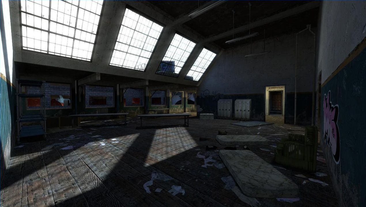
^ This room is far too dark. Love the lightmapping, but a bright light_spot shining towards the camera here from about 16-20 feet up will kill the darkness while keeping your shadow work. These shots are with my brightness at about 90% slider

[URL=http://s546.photobucket.com/albums/hh409/bc_haymaker/?action=view&current=dm_kowloon_b30008.jpg][IMG]http://i546.photobucket.com/albums/hh409/bc_haymaker/th_dm_kowloon_b30008.jpg[/IMG][/URL]
^ ( I cant even see from the thumb what this is ) These props are definite candidates for deletion, or very aggressive propfading at least. Mkae them non-solid too, save a tiny chunk of overhead there plus it will help movement a lot. I hate getting stuck on that shit.

[URL=http://s546.photobucket.com/albums/hh409/bc_haymaker/?action=view&current=dm_kowloon_b30009.jpg][IMG]http://i546.photobucket.com/albums/hh409/bc_haymaker/th_dm_kowloon_b30009.jpg[/IMG][/URL]
^ Same thing. Especially that twisted one in there.

[URL=http://s546.photobucket.com/albums/hh409/bc_haymaker/?action=view&current=dm_kowloon_b30000.jpg][IMG]http://i546.photobucket.com/albums/hh409/bc_haymaker/th_dm_kowloon_b30000.jpg[/IMG][/URL]
^ Whats going on in that glass, looks like a vis error. Also recommend removing all func_breakable glass to save overhead.

[URL=http://s546.photobucket.com/albums/hh409/bc_haymaker/?action=view&current=dm_kowloon_b30001.jpg][IMG]http://i546.photobucket.com/albums/hh409/bc_haymaker/th_dm_kowloon_b30001.jpg[/IMG][/URL]
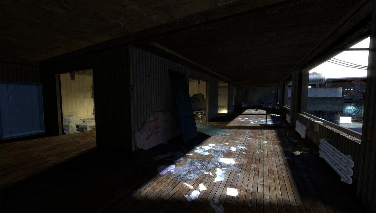
^ Again far too dark. Get creative with some electric lighting or light bleeding from windows, anything.

[URL=http://s546.photobucket.com/albums/hh409/bc_haymaker/?action=view&current=dm_kowloon_b30002.jpg][IMG]http://i546.photobucket.com/albums/hh409/bc_haymaker/th_dm_kowloon_b30002.jpg[/IMG][/URL]
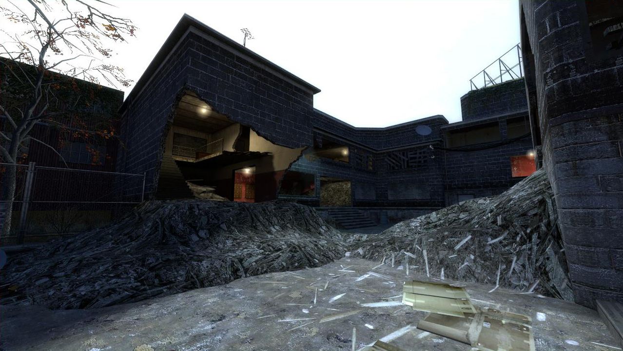
^ Can save some triangles, replace this with a safety glass door and delete the stairs. I like it but it's engine-visible from too far away.

[URL=http://s546.photobucket.com/albums/hh409/bc_haymaker/?action=view&current=dm_kowloon_b30004.jpg][IMG]http://i546.photobucket.com/albums/hh409/bc_haymaker/th_dm_kowloon_b30004.jpg[/IMG][/URL]
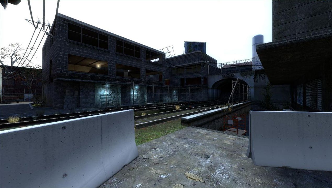
^ Make these rails non-solid, compile yr vrad with -staticproplighting. Don't like the impeded movement through here.

Please don't think Im coming off harshly here, i really do like this, like I said it has the potential to be a really fast, fun map. The two biggest issues are the lighting and performance.

I think your LOD is commendable but in my experience this is better off for a single-player thing or left as a set-piece, HL2DM is lot more processor-hungry than it appears, player models will eat up another 50-60% here. The map will get played more if you go apeshit on the optimising, for example be a lot more aggressive on the propfades/deletion, including throwables ( eg cardboard boxes ), players will never notice. A big part of the problem is that a lot of detail is out in the open, if you can find ways to tuck your goodies into little corners so they can be hidden, itll make for a more efficient map.

Keep at this!
Posted by popcornjake on Sat May 30th 2009 at 12:26am
[Author]

OK firstly I think I should apologize for the work I've caused you :oops: but thank you for helping me out with everything.

I updated the map to beta 3 with improvements to the optimisation which you can get here: http://files.filefront.com/dm+kowloon+b3rar/;13825063;/fileinfo.html or from the map profile page, so if you are awesome enough to test it out pretty please snatch up that version.

Juim I did read your original post and along with your post on interlopers it helped a lot so I thought I'd break my bad habit of not replying to things and respond to your four points:

Issue 1: I suck at optimising but beta 3 runs a little faster, I'm going to continue working on that of course, if anybody could help me out with any pointers on to chuck in some hint brushes I will love you forever

Issue 2: I noticed that too, I only really got it when I was flying around with noclip, vis occlusion culling/not rendering stuff/ I don't know what to call it seems to help that though.

Issue 3: I know you guys dislike your hdr but I'm a noob eye candy whore so I can't help but make my maps support it, I did up the ambient lighting brightness for you guys though :D

Issue 4: I left the stubs on the windows to simulate the windows being "blown out" seeing as that building has a 3 great big holes blown into it, I didn't want to leave those windows as bare rectangle cause then it would look silly for the upper story to have bullions and i didn't want to lose detail. Also I opened up some balconies in beta 3 but they are easily crouch jumped over.

So yeah thanks a lot for the feedback and sorry for all and any confusion I've caused. And yes I was managed to get more screenshots up onto the map, I'm going to try be a bit more smooth next time a release a map.

Enjoy the map!

/wall of text
Posted by Riven on Fri May 29th 2009 at 7:38pm

Ah, thanks for that! -You da MAN! :wcc: I'll stay more aware next time! :ghost:

If you're looking for more map reviews please skip this spoiler text...

Needless to say popcornjake, the topic has been merged. I deleted the redundant post by Juim and your old thread's description after checking to make sure they were the same (Juim, if there was additional info in your later version of the post let me know, I copied the text just in case, same goes for you popcornjake ;) ).

In the process of bringing everything over, I deleted the thread :|
In the heat of things, I normally take special precautions just in-case I do make booboos, and in this case those precautions proved fruitful. After deleting both threads entirely, I still had those pages pre-cached in other tabs that after talking with larchy about, was able to re-associate all the posts after I c/p-ed all the text with the timestamps of each post into a new thread named the same thing. So, what you see before you is a thread meticulously re-hashed to give you the illusion of a map profile thread. (the link on the map's profile even still links here! -way to go larch-man!) So, everyone may now continue with their review posts!

G'day!
Posted by larchy on Fri May 29th 2009 at 7:36pm

Riiiiiiiiiiiiiiiiiiiiiiiiiiiiiiiiiiiiiiiiiiiven :flail:
Posted by larchy on Fri May 29th 2009 at 7:31pm

Posted by larchy on Fri May 29th at 7:54am 2009

Er, you should be able to on the edit map page? :confused:
Posted by Le Chief on Fri May 29th 2009 at 7:30pm

Posted by aaron_da_killa on Fri May 29th at 12:06am 2009

Looks good, I'll give it a go this weekend and let you know what I think. I think I've seen one of those screenshots over at Interlopers, am I right? :naughty:
Posted by Juim on Fri May 29th 2009 at 7:29pm

Posted by Juim on Thu May 28th at 7:26am 2009

OK, I've had a run around this version and the improvements are good. Among the many issues you have to deal with now, I would say the biggest is performance. I experience up to 80% frame loss in the wider views. Optimizing has always been the bein of my existence, becaue I (Like just about any other mapper out there) want to cram as much eye candy and goodness as I can into a map. On almost every map I've ever made, I've wound up making huge changes in concept and layout in the name of performance. I tried to tell another mapper once. There are basically two kinds of maps. The ones that get server play, and the ones that don't. Slow performance will almost surely kill a maps popularity among other factors.
Issue #2:
I am getting hundreds of this message in the console as I run around the map:

R_DrawDecalsAll: overflowing m_aBatches. Reduce # of decals in the scene.

I don't know the technical reason for this(Other than there's just too many decals in the map???), but I do know the Source engine is delicate and lends itself to crashes often. Best to deal with this before final release.

Issue#3: The HDR. I turned off bloom all together and once again, IMO, the map stands up in LDR with flying colors. It's crisper,cleaner,and faster. The solar flare, and texture reflections and brightness levels in some places are just distracting, as well as resource hogs.

Issue 4#: The windows and balconies. You left a bunch of small stubs where the mullions used to be, and there are a few floating brushes around a couple of them. Plus, there are still a couple of dead end balconies on the (North?) side of the map.Needs some treats.
I'll look at the map[ some more this weekend, and playtest it with my FF mates. I'll post any further thoughts then.

Hook up with some of the more experienced mappers,like just about anybody here on this site(who maps), and they will be a wealth of information on optimizing. Don't be in a hurry to push the map out!. This one could be awesome!. Nice work.
Posted by ffjakebrake on Fri May 29th 2009 at 7:29pm

Posted by ffjakebrake on Wed May 27th at 9:26pm 2009

Wow! Very nice looking!! I'll download this tomorrow and playtest it a bit! It looks to be very sharp in detail with nice lighting! :)
Posted by Riven on Fri May 29th 2009 at 7:28pm

Posted by Riven on Wed May 27th at 4:31pm 2009

Ok, I've alerted our web-designer about it, and either he, or I will let you know if or when it get's fixed, and subsequently when you can try again...

I'm glad you brought it up, because we haven't seen any new maps added to our database in the last couple of weeks, so maybe this is the reason... We normally get at least one new map a week. So, your post is very important!

Thanks again!
Posted by popcornjake on Fri May 29th 2009 at 7:27pm
[Author]

Posted by popcornjake on Wed May 27th at 3:52pm 2009
Riven said:
Wow, very beautiful looking map! You should totally give this map a profile so that it shows up on the front page. Doing that, it will automatically start your own thread in the 'Maps' forum for the map. If you do that, I'll automatically copy all of the text and pictures from this post into that post so that you don't loose anything.

-To add a map to our database, simply click on your 'control panel' at the top, select the 'maps' tab then click the 'add map' button. It'll bring you to a page where you can upload all the screenshots you've posted here, a description for it, and you can even upload the map itself to our webserver so that others can download it straight from the Pit. Even maps that are under construction are welcome, as you can always update their profiles with updated content. Once you do that, I'm sure this map will get some front page coverage!

-I'll review it when I can later.
Yes I've been trying to get it up onto the database but whenever i click submit all i get is a blank page with the letter 1 at the top left hand corner. With every try after that the number eventually works it's way to 2 then 3 and so on. If you could help me out with that I'd be very grateful.

Thanks for the reply!