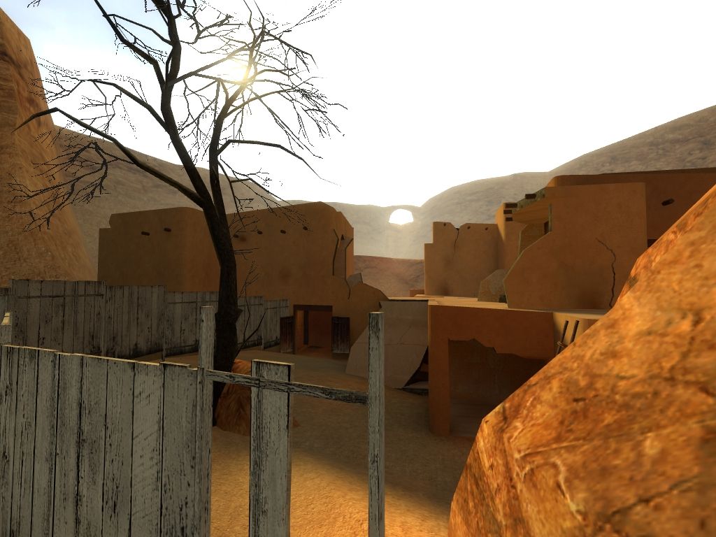
thx Dedi. To answer your query the exterior wall textures are all imported from the cncr pack with a few modifications to colour. The sand and red rock I think I got from css and made a blend out of them while adding a bumpmap. Most interiors are painted with stock hl2 textures.
I wasnt entirely happy with the way the cliffs turned out, partly because of the deadline. You can see better reference examples in the readme.
Haven't played it yet but it looks very very nice. I have to ask you, since I'm making a map that I want to have a similar feel, are those textures you used regular textures from Source, or did you import them? Because they look exactly like the textures I want for my map, wild_west, but I've used other, less accurate textures for my purpose.
Also, thanks for giving me the idea for what style of cliffs I should have around my map, because I plan on completely destroying my surrounding cliffs and rebuilding them with Source, as I've imported them from the HL1 editor.
Quite a nice map indeed! I'm going to go over each mentionable aspect of the map in order of importance.
Layout seemed really good, the map had a really nice flow, I wasn't bumping into things or hitting dead ends all the time. Really good map for deathmatch gameplay.
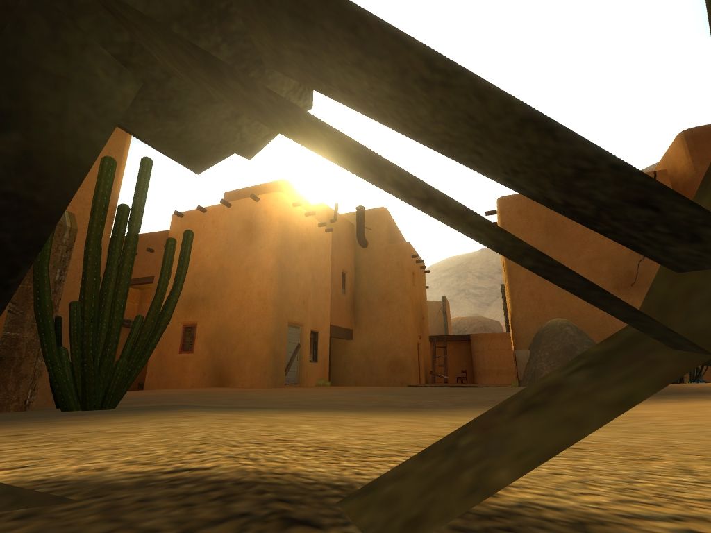
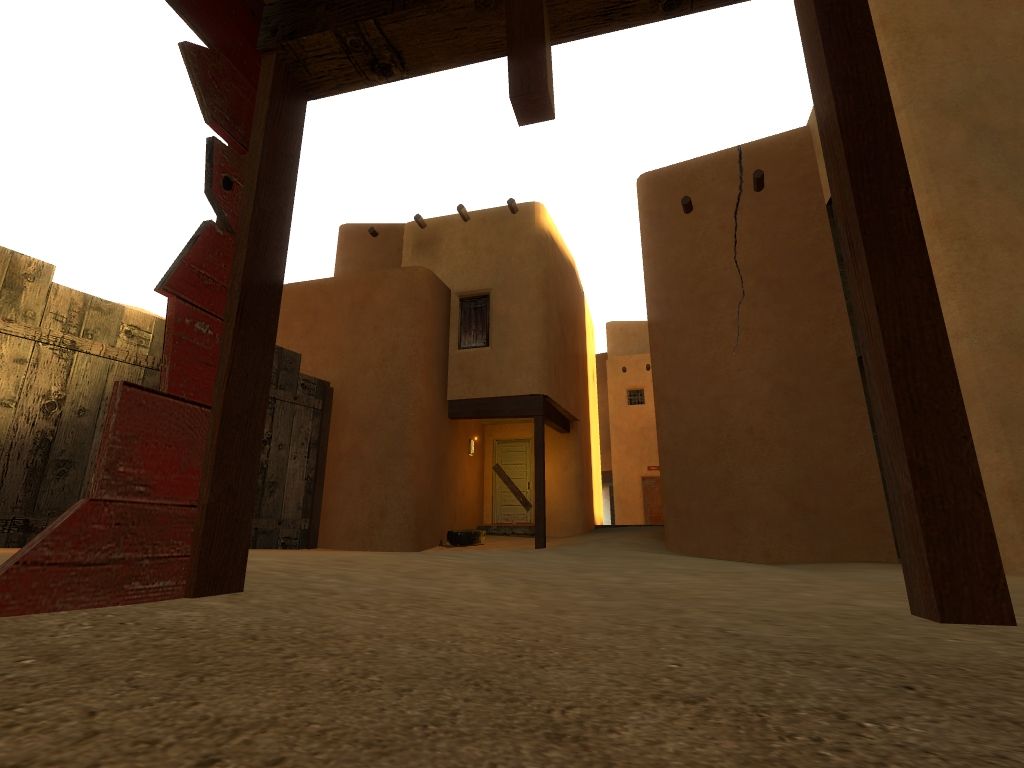
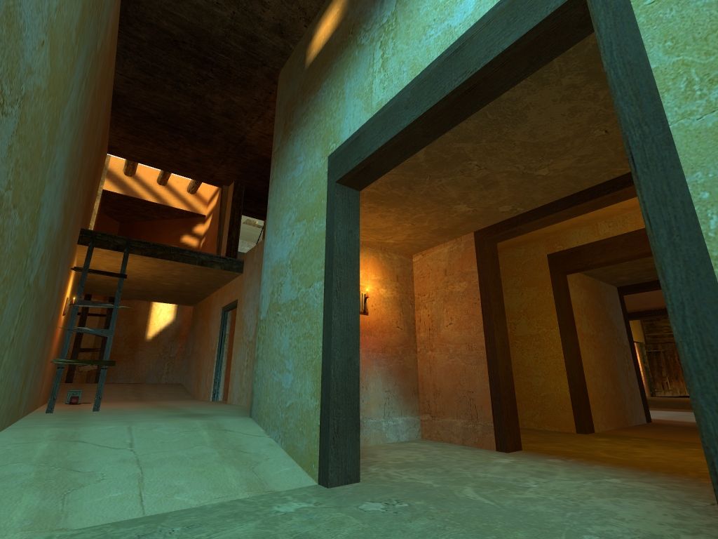
Visual theme was nice, it was good to see an original themed map. The theme was solid and consistent and worked well. Nice use of default content to create an original environment, lighting was nice. Good job!
Ambient sound.. what ambient sound? You needed way more than what you had there. I think the cricket sounds where good but I didn't like it that when the crickets stopped making noise, there was no other ambient sound in alot of the places in the map. Perhaps a subtle wind sound would have been nice. And I think the interior spaces could have used a generic global subtle "corridor" sound too would have been nice to sort of make the interiors feel cool compared to the exteriors. Could have added bird sounds and like dirt/sand rustling around, I think I did hear a snake sound or that's what I thought it was.
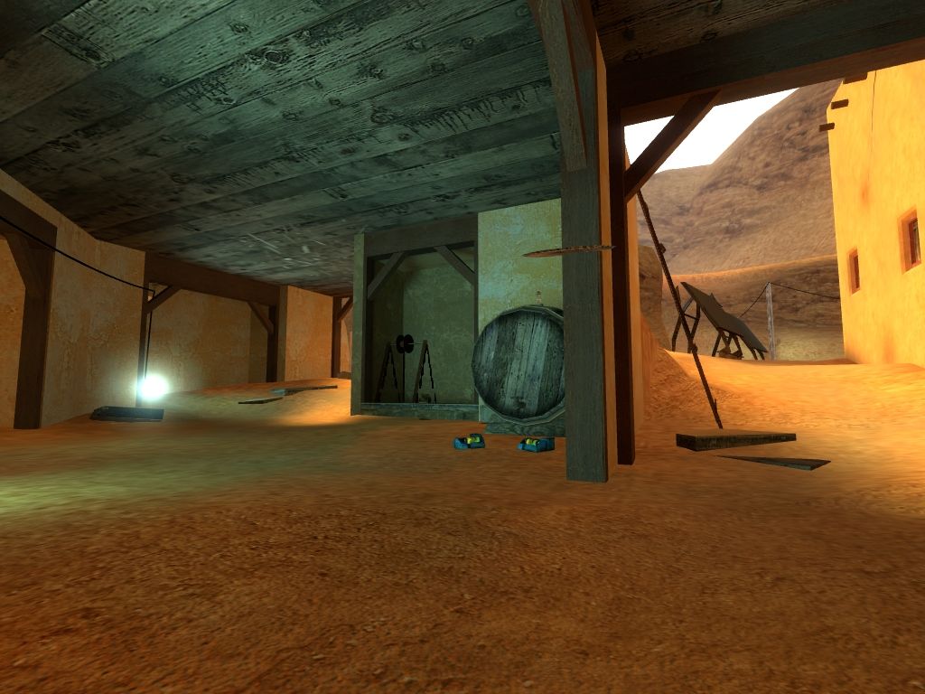
Detail in the map was alright. In a way, I felt everything was chunky, could have put a bit more polygons into some things I think, especially those displacements outside the playable space. I think also you could have thrown in more detail, more decals and sprites, models, brushwork and so on. I wouldn't say it looked like a GoldSource engine map but I think that although this is a multiplayer map, a bit of extra detail would have been good.
Anyway, great map haymaker! I think the nice map flow and the original, well done visual style are the most notable things in the map!
Nicely done Hay.Your thourough attention to detail with regaurd to a theme always amazes me. This one should be a massacre on a full server. (I really love the solar panels, hehe).Good flow, excellent design, and a practically flawless execution. (That means, the perfect map does'nt exist yet, but it's as close to it as a mere human can get though! )Woo-Hoo for the 3rd place as well, the competition seemed to have been fierce based on the 1st and 2nd place maps. Congrats!
All right. First, congrats on scoring 3rd in the HL2DMU mapping contest. There was some tough competition and quality all around.
This is one amazing map. Layout seems flawless, even from just a quick run through. I love the setting, texturing, the warmth of the sunlight. A very nice break from the usual HL2DM themes.
Also, I kinda admire how you got HDR and all the custom content in a reasonable 25MB. Very efficiently done.
This sure deserves a spotlight? Riven?
Posted by reaper47 on
Sat Jun 20th 2009 at 11:29am
Holy. Crap.
Those screenshots make me drool. I'll give it a try right now.
haymaker said: umm I originally posted these 'inspiration' pics in the discussion thread....Riven? Anybody?
All posts on a map's profile are linked to their respective discussion thread. So your images will show up in both places regardless of which link you post them through.
Nice looking map btw, I'll play it and review it later
Hey, this map is looking really good. I think you are doing a good job of capturing the feel of your source material. I'll give you a few pieces of advice..
look for places to play up warm vs cool lighting, in order to create variety and contrast, paying special attention to the transition between warm and cool (i.e. let a little cool bleed into your warm places, and a little warm bleed into your cool places, but have designated spots that are clearly warm or cool).
Pay special attention to transitions between objects - places where different materials meet. There's usually lots of interesting stuff happening where the dirt meets wall, wood meets clay, tree meets dirt, etc.. Decals, overlays, and blended displacements are great for this.
Push and pull the ground plane, and avoid flat planes of ground everywhere. Obviously keep playability in mind first, but give your walls and floors some bend where appropriate
 )Woo-Hoo for the 3rd place as well, the competition seemed to have been fierce based on the 1st and 2nd place maps. Congrats!
