urbanwaralpha by sgtfly

Map Rating

  • 0
  • unrated

Map Download

Map Info

Map Description

Set around 3 old row houses in a big city suburb with road construction around them.
This map is in beta, lighting isn't complete and no optimization yet. I have yet to install hint brushes player clips and area portals. Also I may move a couple stair ways around to make player movement more fluid.
Weapon and items are scattered around but may not be in their final positions yet, but I put them in to get a feel for the place.
The file is big due to custom texures and models. I am going to redo some models since I'm not happy with them or their texturing.

I updated the player locations and a soundscape also got new screenies
Ok, I used pakrat to compress it and add the files to the BSP. Hope I got it right.
One more time.
Okay I have it right now. Sorry for all the bad files b4, this one should work.

Discussion

Posted by Le Chief on Sun Mar 28th 2010 at 1:35pm

Nice feedback guys, Riven ;) yep

This looked interesting but if it's 166mb... :scared:

Just looking at the thumbnails all together like that, the lighting doesn't really look fantastic. It's very "white" and a bit uninteresting. Looking at the images themselves, some things don't appear to be lit properly,
User posted image
Take this as an example, the buildings and some other geometry are much darker than the skybox suggests they would be, yet you have almost full bright looking barricades on the left and an almost fullbright looking window on the right. The right side of the image appears to be far more lit than the left and it defiantly dosen't look natural.

Also some surfaces you have are quite bare and they really stick out, such as these walls. Balancing out your level so that all the surfaces look detailed to the right proportions so that nothing sticks out and everything looks nice together is really a skill that is learnt from experience and there's a lot of tricks and little things you can do to break up large surfaces and add details/depth to surfaces.
Posted by Yak_Fighter on Sun Mar 28th 2010 at 8:37am

Well your map managed to blue screen my computer, so that's impressive.

I am at a loss as to why this deathmatch map is 166Mb in size, as the majority of your textures and models seemed to be in the skybox and serve no real purpose. You have a ton of detail way way out there past the playable area that can barely be seen and yet next to nothing in the building interior, which is where players will spend the majority of their time.

Anyways, all this is a moot point considering the layout is in dire shape. This map is a perfect example of why real world locations do not translate well into dm maps or fps maps in general. Your hallways, stairways and doorways are all too narrow, the layout is cramped, the connectivity between the buildings is lacking, the street is overly reliant on random props strewn about, vertical combat is lacking... Sad to say I don't know how you'd fix this layout short of blowing it up and starting over.
Posted by Riven on Thu Mar 25th 2010 at 1:52am

Well, I felt it time to do a nice good critique, because I feel this map deserves one. So, I took a butt-load of screenshots and even made some animated gif images to help condense them and get the point across much more clearly.

First off, I just have to say how impressed I am with this map and the custom content that has gone into it. It clearly has been given a lot of attention and I believe it deserves some from the community too. The quality of "craft" in the brush construction for these destroyed walls is what I like to see, and frankly don't get to see too often. Really something to be proud of as a mapper. And while I believe this map shines in so many areas, there are unfortunately quite a few other areas where I find the map is lacking from the same care I see everywhere else.

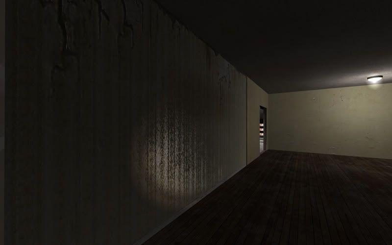
Lazy Texturing: Let me begin with some areas incorporating what I call lazy texturing. (see below)
User posted image
User posted image
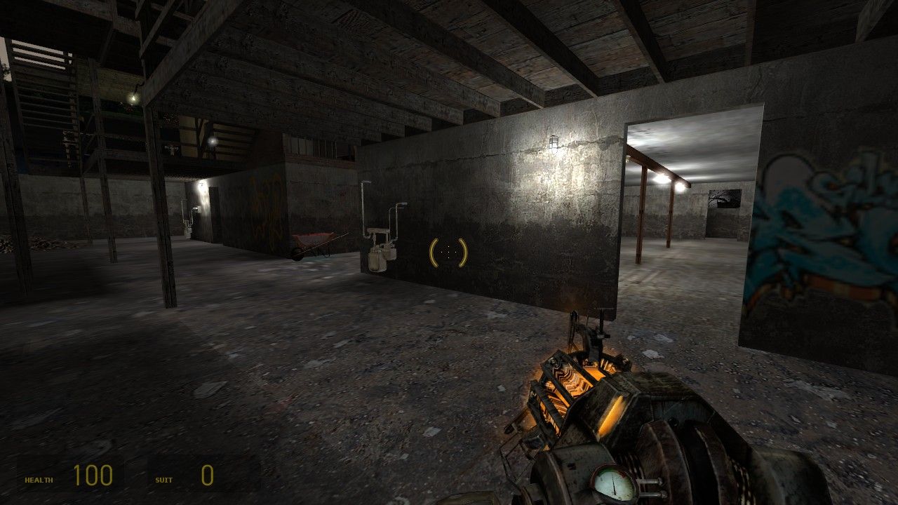
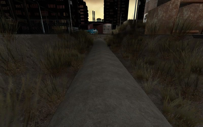
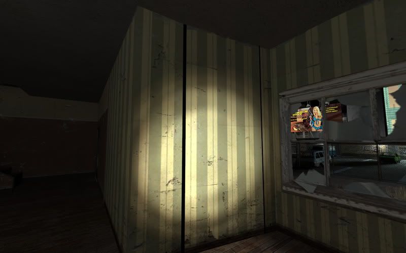
It's very repetitive and not scaled properly. goes on for a very large amount of space without being broken up. Could perhaps use some decals or overlays too.

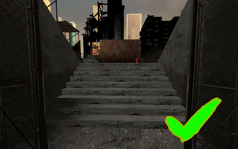
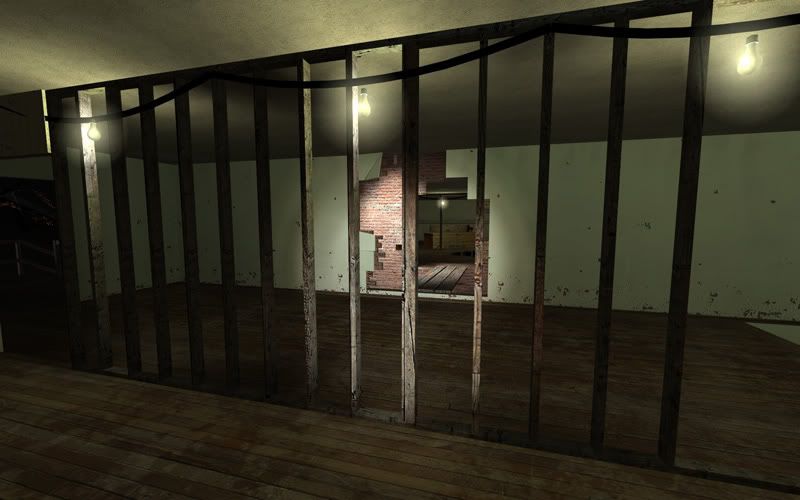
Now, for stairs, it looks like you did a good job for one of them (that I could see) but for the rest I guess you just kind of crapped out? (see animated gif below)
User posted image
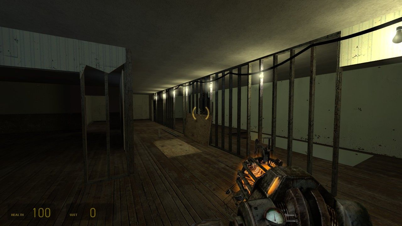
It's very evident especially for the wood studs because they're standing at player height. It may be tedious, but I think it would pay off if you went back over some of these places and re-aligned some of those textures so that they didn't line up so obviously. Make it feel a bit more "natural" (as natural as wood studs can get :p).

This one needs to be lined up better so that it meets the wall:
User posted image
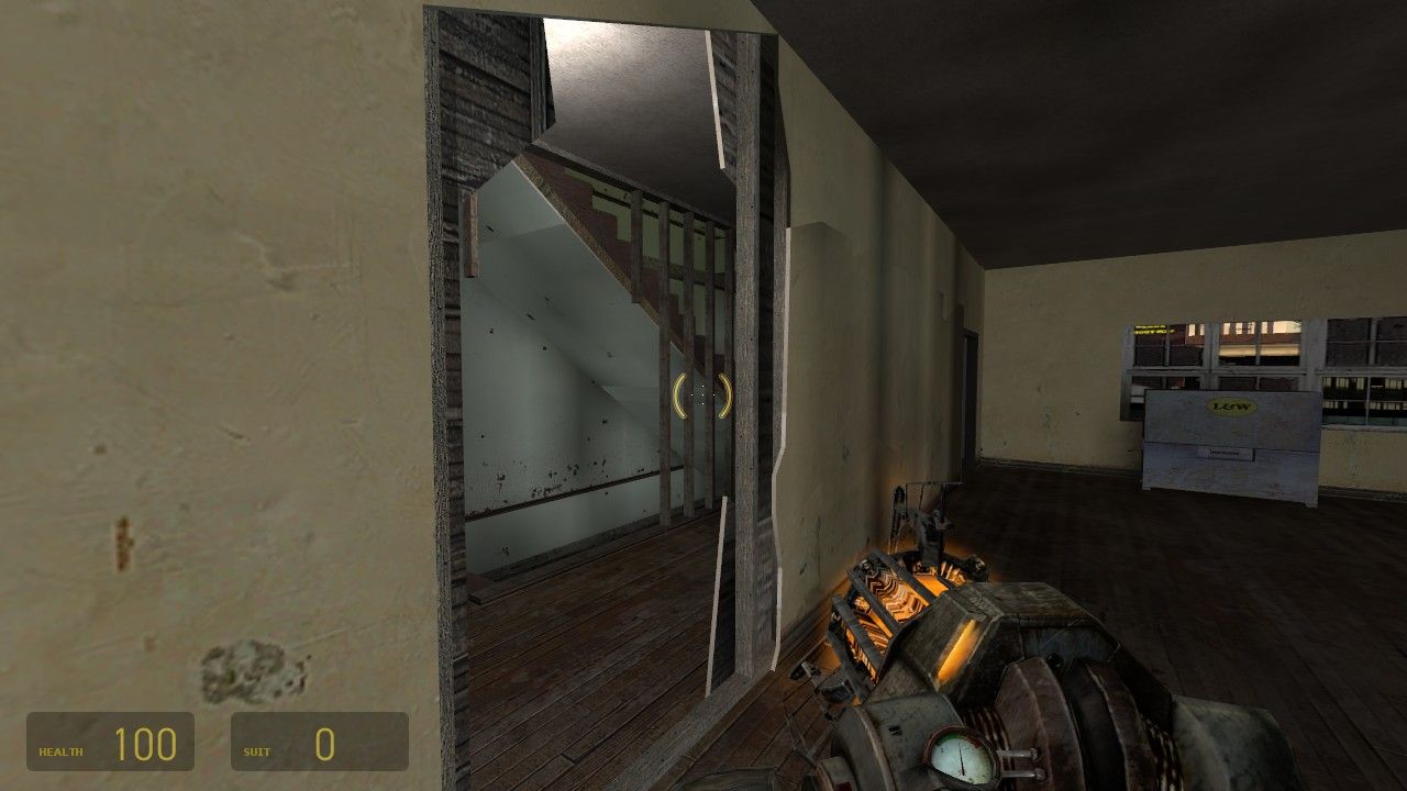
I feel the next one is more or less a texture job, but I also urge you to reconsider what's going on here with the brush work. It may be under the stairs, but it's not invisible...
User posted image
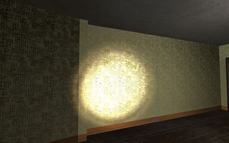
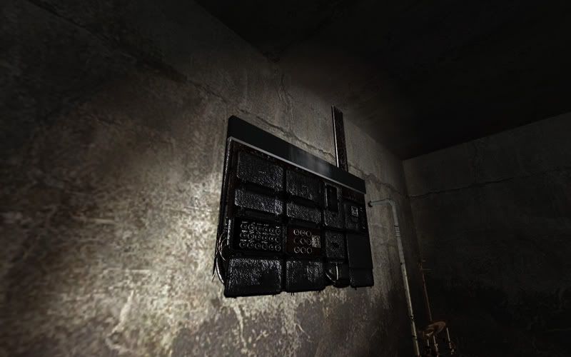
Crazy Bumps: I really love the custom textures and models, but some of them are way exploded on the bumpmap work that it becomes distracting. Here are a few examples:

With this one, The bumps are so steep that the wall gets really dark and reflective, like mirror reflective when you walk near it even though I'm guessing it should be made of plaster?
User posted image
On this one, you can see how the wall with its deep bumps placed in a well-lit room becomes super washed-out when looking at it head on. the bumps are making this wall way too shiny IMO.
User posted image
Here you can see that the bumps for this control panel are soo deep and are so shiny that the environment mask using the nearest cubemap makes the model seem blacked-out, the opposite is true for when the other copy of this brush-texture in the map is lit up really well, it becomes very bright.
User posted image
My guess was that you discovered the free program "CrazyBump" and had a field day bumpitizing a bunch of your textures without further editing them to tone them down a bit. Here I think your bumpmaps are working against you and my be best if they were either eliminated, or given more attention via some tutorials. There's a good one I stumbled upon a couple years ago that I bookmarked here: http://img393.imageshack.us/img393/8381/normalmapminitutba2.jpg (It's a large image that explains the whole thing). The article makes a good point about not over-exaggerating your bumps. Probably worth a look.

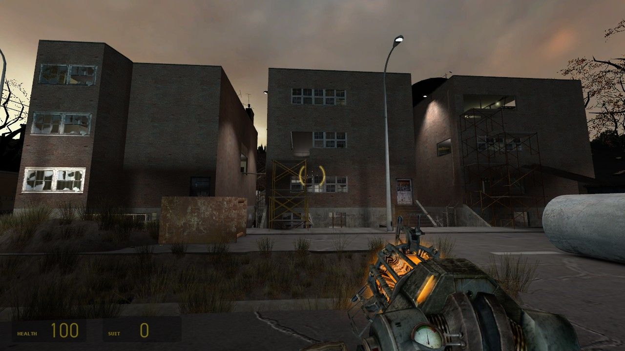
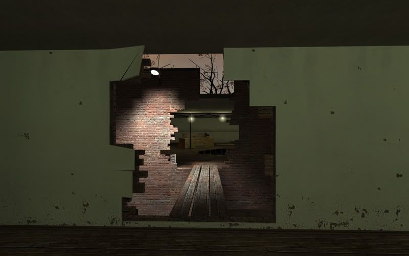
Brush Work: I can't continue until I first commend you on your destroyed walls. They really look convincing for brush work. -Did I already say that? -Oops; I'm sorry, they're just really really well done I think ;)

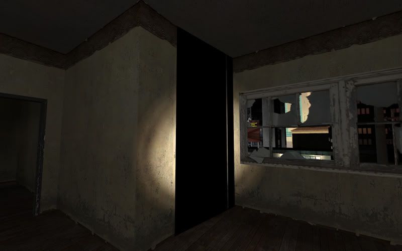
However, there were a few places that showed up as plain bugs or, were a bit off.

I'm not sure what's going on here, but I do know that it probably needs to be fixed:
User posted image
Also here:
User posted image
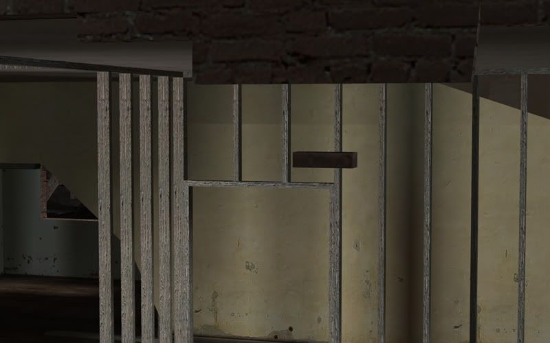
This brick is floating from the wall it should be a part of:
User posted image
This crack needs to be sealed a bit:
User posted image
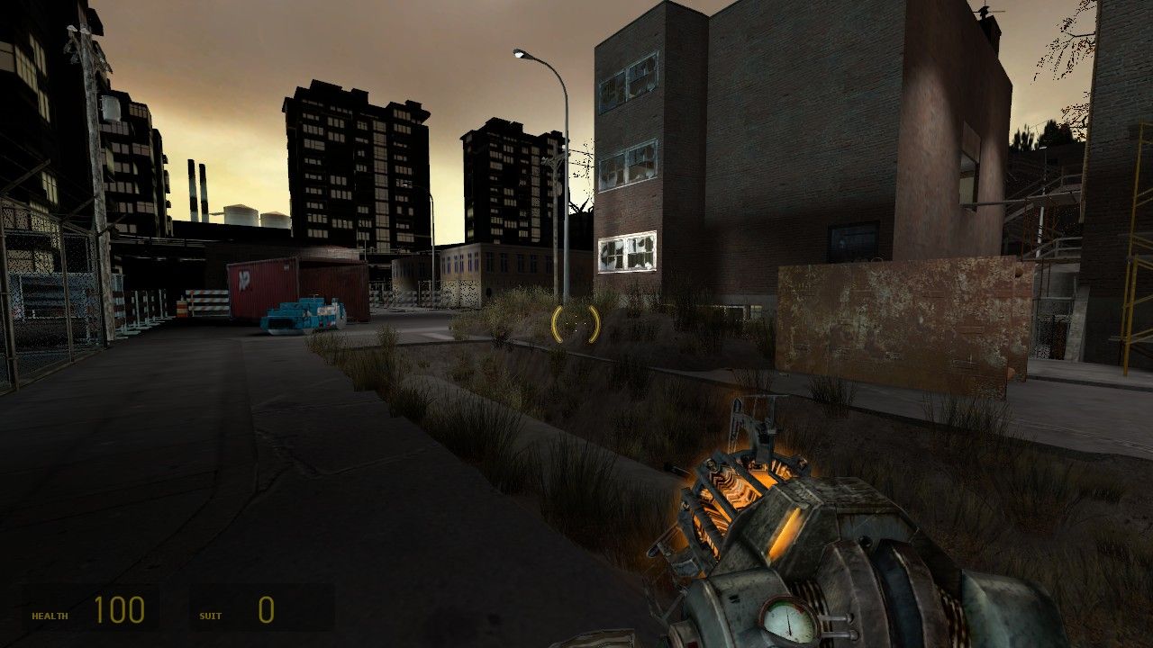
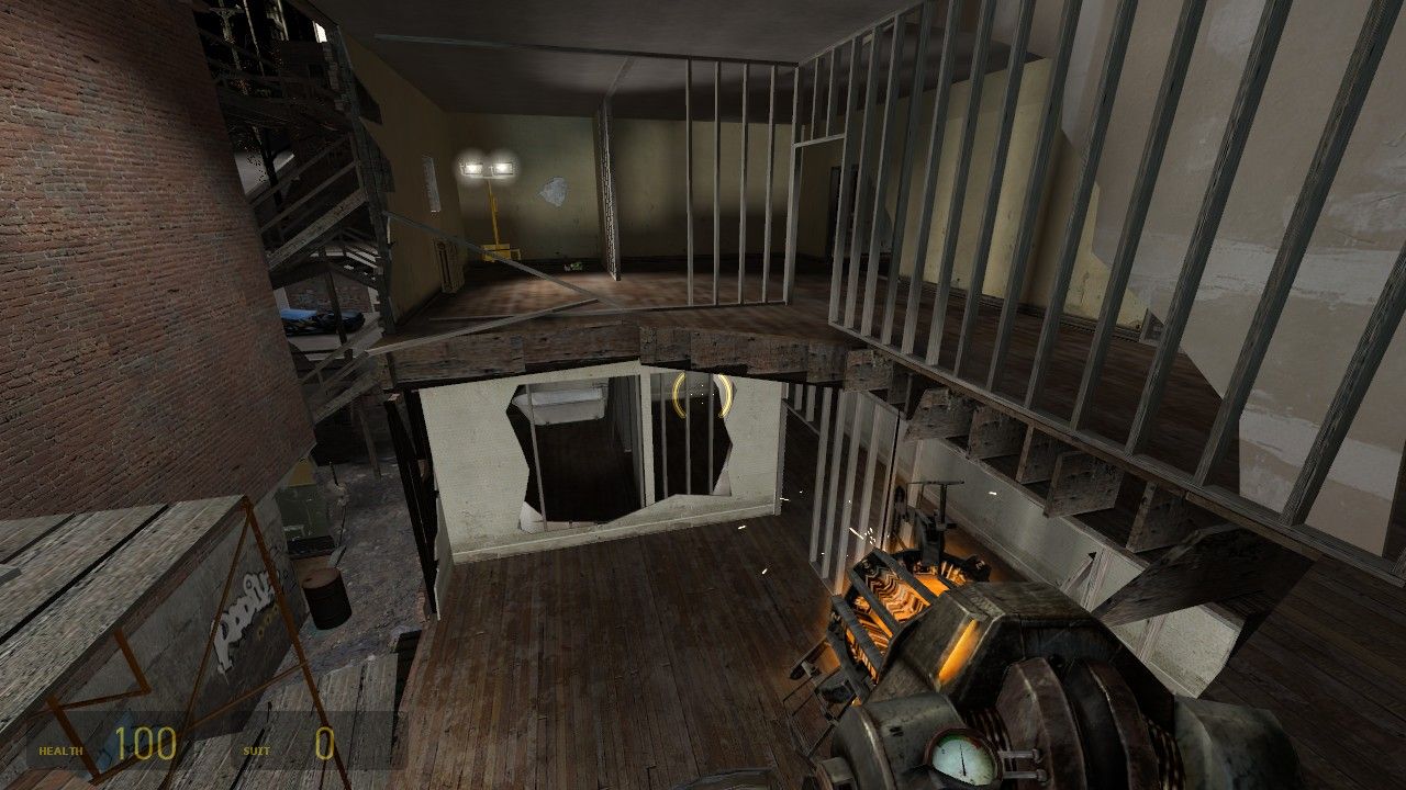
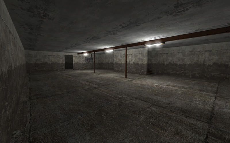
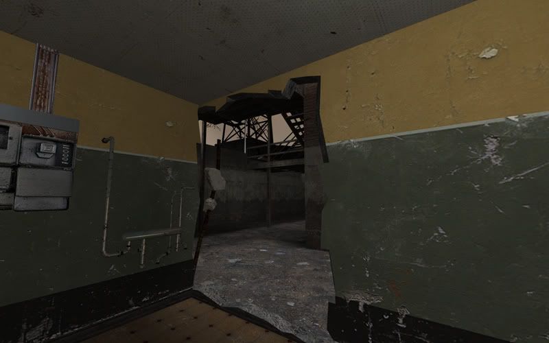
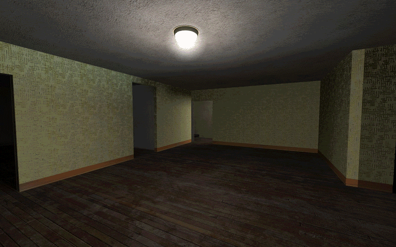
This room feels really boring to me, and yet, it has so much potential. It's the largest open indoor space in the map, and I think it deserves at least some more brush construction detail. Maybe some columns along the walls or water heaters or more of those wood pile models you made? Need to give players somewhere to hide and chase one another:
User posted image
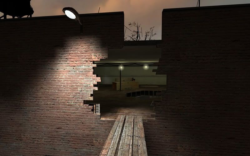
And before I end with this segment, I'd like to post some images of the destroyed sections for all to enjoy :D
User posted image
User posted image
User posted image
Miscellaneous: A few things that I couldn't fit in elsewhere:

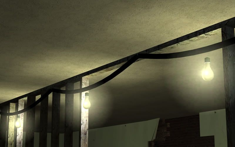
I like how you extracted the light bulb part of the full models to use for this scene, but however they're floating way too far away from cable to feel believable. I understand it's hard to line-up a cable to simulate things hanging from it, but perhaps you could place the keyframes at the bulbs instead of between them, and then add a little brush "post" to connect them in a makeshift manner to the studs.
User posted image
User posted image
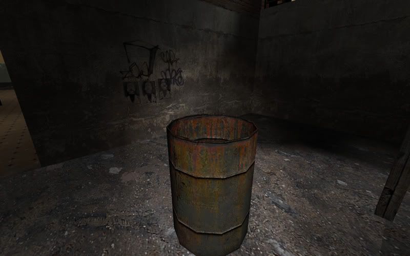
I was walking around when all of a sudden, I started to get burn damage. Curious, I looked around and couldn't see any fire about the place, until I jumped on top of this barrel (while getting burned) to see a lowly flame burning away. I had no indication this barrel could hurt me. So I advise adding an orange light and glow, and also increase the fire sprite size so that it stretches beyond the barrel. It would make a nice touch for this modified model you made and make players more aware to avoid it.
User posted image
Optimization: I hate to say it, but this is the largest downfall for this map. It is terribly optimized. There are way too many things that aren't done to help this map be run much more fluently. I did not have a lower-end computer to test this on, so I do not know how well it would perform on such a system, but looking around, I could find the tale-tell signs that assure me it probably wouldn't do too well. Here are some:

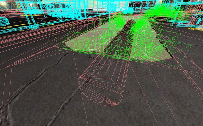
This func_detail "pipe" with only it's upper half exposed, should be clipped in half to prevent having to render the underside:
User posted image
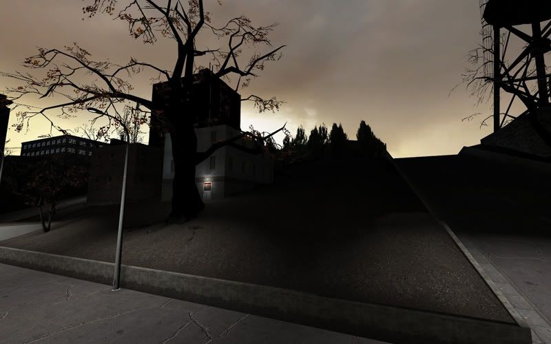
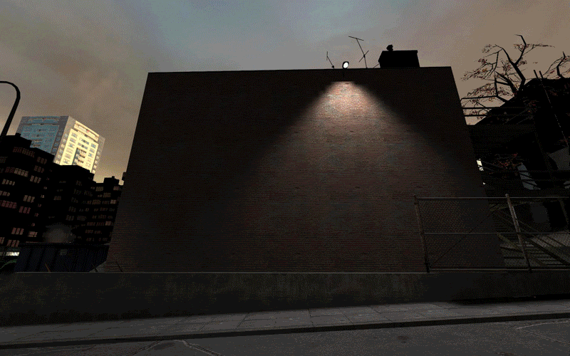
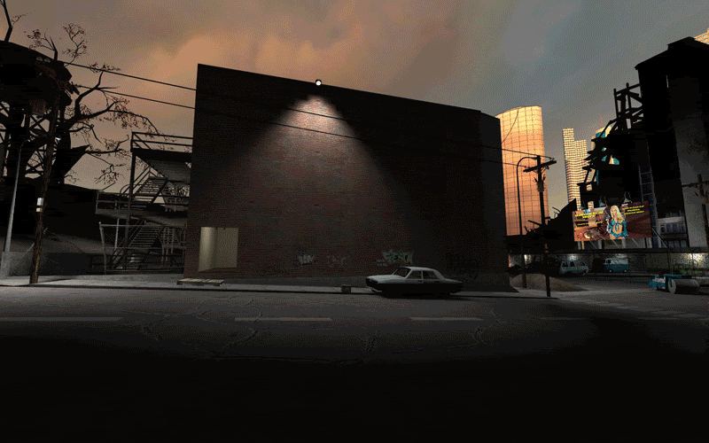
I noticed this elsewhere, but the lighting around this map looks somewhat atrocious in some areas. Like it has no bounce. And if that's the case, I'm willing to bet this map probably has a leak. For instance, the lighting in this area feels very wack to me:
User posted image
And lastly, here are 3 different innocent low-poly scenes I stood at and looked back on, and then turning on mat_wireframe 1 to see what was really being rendered. Enjoy the animated comparisons :hee:
User posted image
User posted image
User posted image
So, as you can see, There is way more being rendered than is necessary. And this map with its outdoor scenery bordering every edge probably needs a great deal of optimization that in-fact, I honestly wouldn't wish on my worst enemy to contend with. I hope that if any tests are conducted on lower-end systems, the map doesn't crash them completely. May the Source be with you on this one ~o) If you're looking for a good compilation of information on everything Source has to offer in the ways of optimizing your map, the whole tutorial done by zombie@computer here is really well done and is one of the best r
Posted by haymaker on Tue Mar 23rd 2010 at 3:58am

well main thing I noticed was an overabundance of entranceways and / or hallways that are too narrow. Try and make your main routes somewhere above 128 where you can. Pay attention to headroom as well, though I can't rememebr anything obvious.

I was just playing urban_day07 by Jacfu, not too dissimilar from where you're going, somewhat overly complex layout notwithstanding. Check it out, I think it's on here
Posted by sgtfly on Mon Mar 22nd 2010 at 8:23pm
[Author]

I do have several ideas for this map, maybe opening up one of the roofs (destroying a top floor) and making more areas accessable. I knew it was a hard idea to begin with but I thought the setting was to irresistable not to try. Any feedback or ideas would be appreciated.
Posted by haymaker on Sat Mar 20th 2010 at 4:52pm

Yes your eye for finesse is evident, I can see lots of great ideas at work here with regards to brushwork / models etc. I'm assuming you haven't really played around with lighting too much, so I won't make obvious suggestions.

Main weakness here is going to be layout, unless you plan on converting this to a different game. Too much repetition, too much sticky geometry, not enough speed at this stage. Still tons of room for new ideas though. Remember a lot of times just deleting / barricading a whole chunk of layout can make a world of difference.

You've got a really good handle on that 'sense of place' factor here, I especially like your soundscape ideas so far. I'm going to mildly disagree with Juim about the hl2 ethic and say, potentially, this feels somehow updated and more...North American for lack of better words.
Posted by Juim on Sat Mar 20th 2010 at 3:54pm

OK You got it to work. Good. I had a run around it yesterday. Your models and textures are all working, and the speeds seem fine. Other than that, I would put this map at a pre-alpha stage technically. I managed to walk out of the map at almost every perimiter. It feels so utterly standard HL2 in many ways. The interiors are sparse and blocky, and I can't get the feel for the layout yet. I recommend you keep at this one. It's obvious you have a handle on the technical side of mapping, but now you need to work on polish(lighting, texturing, design, etc), layout and connectivity, and weapon placement. In my experience, a file size this big should reward the downloader with a memorable/playable map. As soon as you hit beta, let me know and we'll playtest it for you at the Freedom Fighters servers. Very promising so far.
Posted by sgtfly on Thu Mar 18th 2010 at 10:42pm
[Author]

I used manbsp and got all the content in so it should be fine now. Tested it on one of my other machines and it worked perfectly so all is well I hope.
Let me havesome feedbback, I haven't really touched it sine that was what i was waiting for....but you gotta have the map first.
Posted by Riven on Thu Mar 18th 2010 at 7:46pm

Yea, I had a problem with packrat some years ago when using it on a Portal map for a competition. It was the deadline day, and I hurredly packed it up with all the custom content to get it uploaded in time, and turned out nobody could run it. So, I made it a point to test it on one independent computer without that custom content already on it and then maybe as many friends I knew who had the game, and would proceed from there to make it public. Packrat can do some funny stuff if you're not sure what it's doing in the first place. :dizzy:

Good luck! :hee:
Posted by sgtfly on Thu Mar 18th 2010 at 7:06pm
[Author]

Found that pakrat wasn't loading the models textures and it crashes everytime I try to include them.
And some it just won't include the vtf file
I'm looking into it so as soon as I figure it out I'll get the map out.