It's looking quite good BH. A few things I can think of
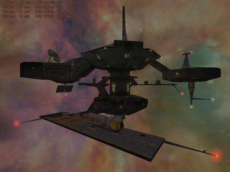
-Change the sky, it looks ugly :/
-In the low level shot, the undersides of most of the structures dont have very good definition... They look somewhat bland. Maybe use better textures, add borders around or something
-The landing strip really ends very abruptly. ROund off the edges, or add a ramp or build a wall around it.
-Textures on the model look very bland
-In the spaceship pic, the ground texture looks overstretched, and the texture on the wall behind the ship is misaligned (I think)
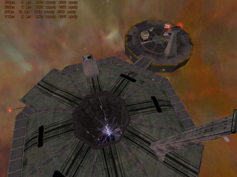
-The corridor with a crate room is brilliant. Just do something about the shaderlab roof texture, it looks out of place.