Say hi to our newest member, RichardELDEN!
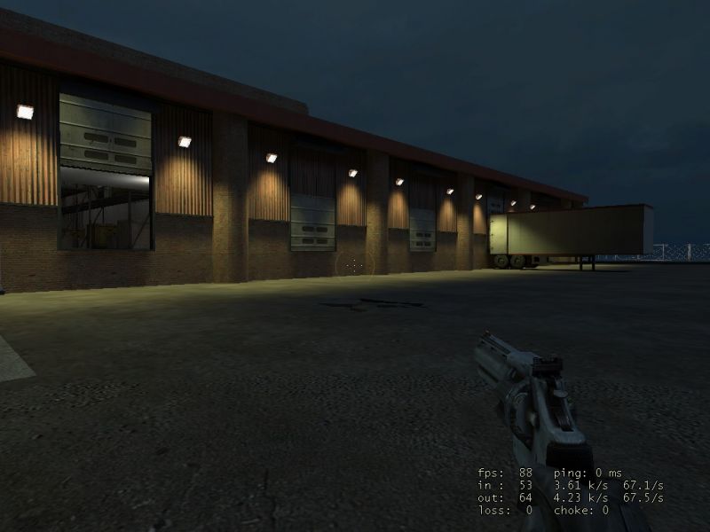

Night-Wolf said:Yeah, as I said one pitched at 90? and the other at -90? (270?).
Yeah some good tips there cheers. I tried spotlights but wasnt having much luck with them at all. Will try again tomorrow to see if I can figure it out, if you can, explain what you mean by the wall lights using 2 spots. Im guessing you mean 1 shining up and 1 shining down out of a light fixture thing.