The Combine has used this former mining facility as a research base for several years. However, the incident at City 17 has required the occupying unit to abandon the post.
After realizing that this map is entirely too large for 8x8 teamplay, I've decided to use my tutorial and make a TFC Warpath/Firearms for HL1/Battlefield 1942 style "push" gameplay. Mp_teamplay 0 will still allow regular deathmatch, since having 15 opponents ought to be enough even in large map.
I'm a stupid jerk for not releasing this. I guess I kind of got bored, but it was sitting nearly finished for months. It's probably too large to get playtime, but I'd still like feedback. If nothing else, I feel I learned a lot from this and had a good time making it.
Discussion
Posted by Captain P on
Sat Oct 29th 2005 at 10:15pm
First thing I noticed was the nodegraph building for the npc_seagulls.
I don't know if you can include these .nav (or whatever file it is)
files into the .bsp, but it's worth a try.
Anyway, the map itself has some really nice touches, I liked the
overall beach part and the leech death is a nice touch indeed. Your
displacement maps overall look too squarely shaped, try to get away of
that. The outside rocks for example all have about the same height,
which makes them feel less natural. The vertices don't necessarily need
to stay close to the original surface. Those base brushes don't even
need to be square, just as long as a dismap has 4 sides it's ok. Play
with it more to make it feel more natural. :smile:
I liked the subtle ambience touches like the computer sounds. They're
just loud enough to be heard but silent enough not to get annoying I
think. Nice stuff.
The outside buildings looked random placed though, no paths between
them, not even any connection with the road up ahead (it's a shame that
area is inaccessible! It would've given some nice vertical combat) and
it seems odd to me you built houses there with a connection to a secret
lab inside the rock. Oh, and add a road there for those houses or a
path or such. You have great detail at some places, but some places
just lack them which makes the map feel inconsistent. Boring hallways
versus interesting rooms...
The map also feels intimidatingly large I think. This may not be a
problem for 16 players, but personally I felt the hallways were too
long with little cover along the way. Some also were just high enough
to walk through, which made them feel very cramped vertically. Me not
likes a cramped feeling. The map is easily set up though so it should
be fast to learn, I think that's a good thing about this. All area's
have some sort of theme of their own which probably speeds up the
learning, but it looked a bit too random to me at times. Some area's
reminded me of FarCry labs, others of HL2 parking lots, others of HL
hallways... I agree different themes or rather, sections within a
theme, help people navigate, but I felt the logic connection between
the area's here was a bit too far off.
Overall, some nice details and athmospheric area's (cave :smile: ), but those are broken up with boring hallways and empty spaces.
It looks easy to learn yet it seems like a slow gameplay unless there's
really a lot of players running around. It misses some great
opportunities for vertical combat like the shore road and the parking
lot upper area that weren't used.
I did try the map and it is very well put together. I like your sense of design. Only comments I have are some if-y frame rates in certain areas. I was dipping down into the low 30's in a few areas, (although I play at 1600 x 1200, so they might not be so bad at a lower res). And the fade distance in the beach areas could stand with some adjustment, theres too wide open of a space, so the larger rocks just appear and disappear too clearly. If I were you I would use the mountain sides to jut out farther, maybe hide around corners so you can't see such a great distance outside. And lastly speaking of mountains, they could use some work, in some areas they look too blocky, almost building-like in shape. Top notch otherwise, you have nice eye for detail. I like the water leech death as well.
Sorry to be such a jerk, but could somebody actually try the map?
I really don't think that the problems listed are very noticeable in a
game. Also, just to clear things up, it's a large map with layout
based upon theme. Thematic differences are supposed to help the player
navigate, much like the larger Quake 2 multiplayer maps.
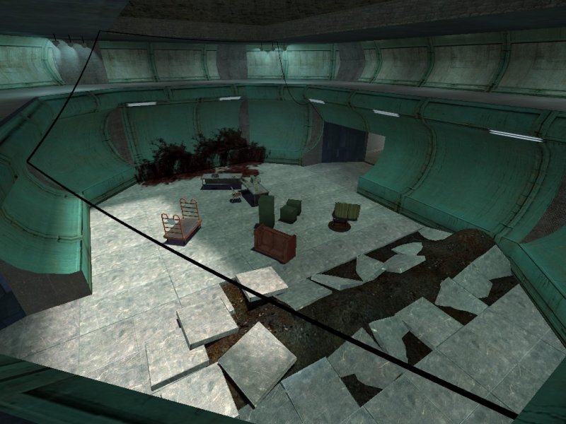
not bad, but i agree with the things said above. Also, in your 2nd screenshot, on those sine wall decorations, you should use a more generic texture, without the edges/lines in the texture. thats always very unnatural, unless if you rotate/... them so that they follow the architecture or so that you dont see the lines. but it's much easier to just use a texture without specific lines.
Posted by Underdog on
Fri Oct 28th 2005 at 12:51pm
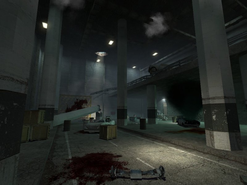
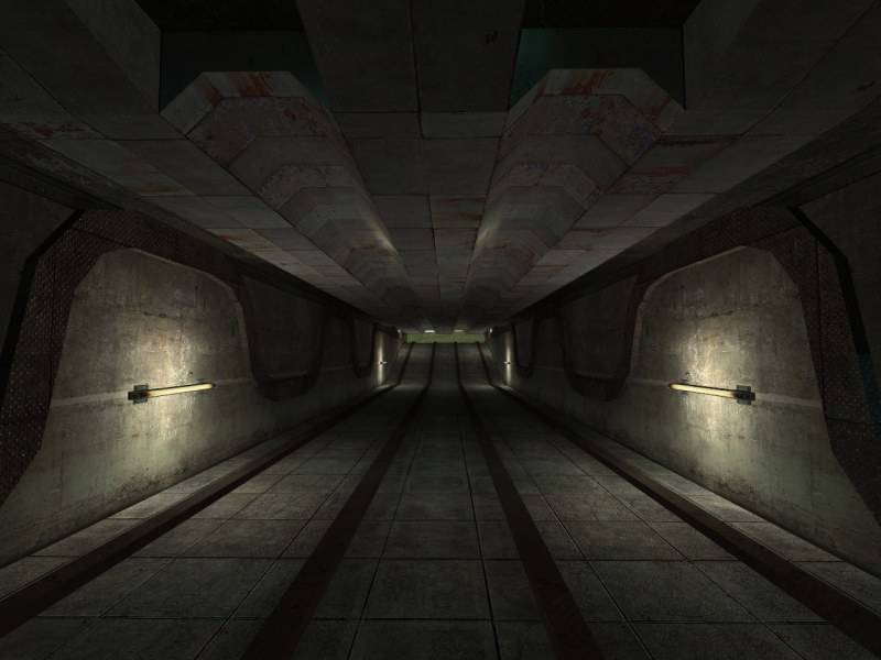
The three screens seem to have no discernible theme. Particularly out of place is #3. It seems to be a hole with some props thrown in.
Perhaps you should post a few more screens of the rest of the map to give a better feel for what you attempted to accomplish.
In the first pic, all things are spread out in a mess. It doesent really look like they serve a purpose other than being crap in the way. Also i find the texturechoice on the pillar quite strange. That green stripe looks odd.
I think the lightning overall could use a bit more colors.