frostbite by ChemicalBurn

Map Rating

  • 0
  • unrated

Map Download

Map Info

Map Description

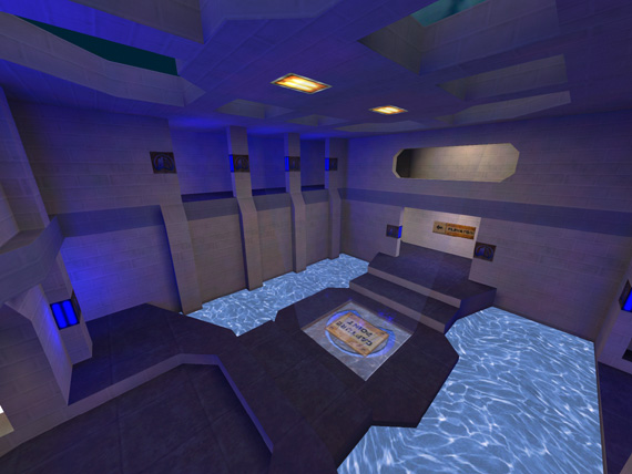
The team whom the base belongs to only easily accesses the upper level of the bases in Frostbite, much like the Valve map ?rock2?. This creates lots of great sentry gun locations.

Discussion

Posted by ReNo on Thu Feb 24th 2005 at 6:11pm

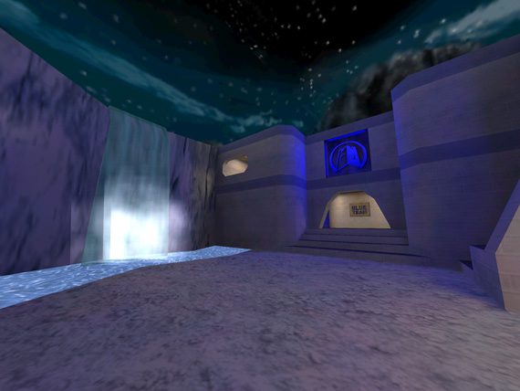
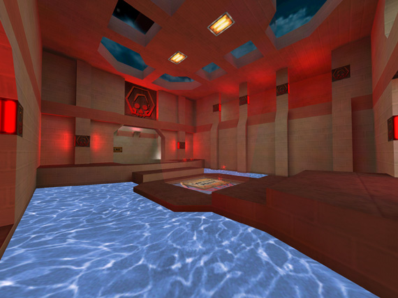
You have done a really nice job with this. As others have said it is really quite simple looking but this adds to its charm. The simplistic textures go really nicely with the interesting though somewhat basic architecture, and this is complimented again by the almost playful use of coloured lighting. I agree with mike that the water in the red base might be better as lava or something, or perhaps you could change both bases' water into a more neutral colour?
Posted by Addicted to Morphine on Thu Feb 24th 2005 at 5:19am

Mike-O, while aesthetically I think that would complement the red base... the theme of the map is indeed winter, and Lava would seem very very out of place.

However, I do agree with your point about the ceiling lights. It is a nitpicky detail but perhaps a "cooler" (as in temperature) type of light texture would fit better with the theme of the map?

Overall, great look from the screenshots. I'll have to download it when I have some more free time.

Keep it up Chem, and let's see that waterfall tutorial :D (oh this is Buckshot Enema by the way)
Posted by G.Ballblue on Thu Feb 24th 2005 at 12:27am

As everyone has said, lighting looks fairly "funk-ay" and good. I would suggest using some more textures though, because it looks like the same exact textures in each screenshot.
Posted by mike-o on Wed Feb 23rd 2005 at 11:41pm

Red, lava-ish water would be cool in the red teams base. Also, those ceiling lights dont match the other textures.
Posted by parakeet on Wed Feb 23rd 2005 at 9:19pm

Only thing that I seem to dislike is that the water looks like super bright pool water. To "fix" this, change the FX amount to be like 90 or so . "it's identical to how you make glass clear"

The reason why i put quotations around the "fix" is that the effect may be intended and thus is purely an opinion.
Posted by Perin on Wed Feb 23rd 2005 at 5:44pm

I like the looks of this map because it looks cartoonish (in a good way also). The lighting uses unique, smooth colours which add to the factor of making this a 'fun map'. On to the architecture, it looks really nice too. A lot of TFC maps just use flat ceilings and walls, but you took the time to crop out, and form the walls.

Nice map. I'll download it.
Posted by satchmo on Wed Feb 23rd 2005 at 5:39pm

What funky colors! (in a good way)
The architecture looks very interesting, and the lighting is good. I like the outside environment with the waterfall.
Too bad that I don't play TFC.