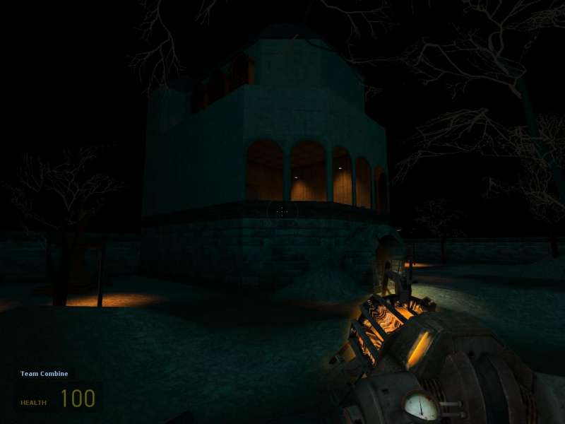
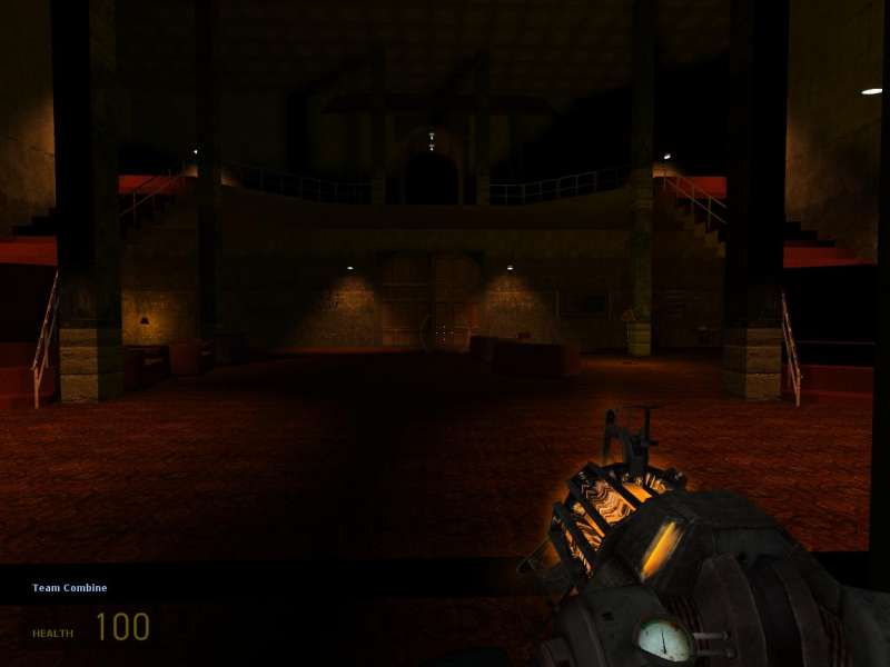
Ok, so I ran into Neoshock2k this afternoon in the snarkpit server, and promised to take a look at his wip, Dm_haunted. That I did, and have thus returned with some very strong impressions.
Bare with me Neo - this is going to be a rough ride, but what doesn't kill ya makes you stronger - right?
First of all, I don't think it appropriate to even tag this map with as a 'playtest' version - as the map is pretty much unplayable at this point.

My first spawn. Notice 19 fps. Bad, very bad....I'm getting spooked already.

So...lets see what is rendering here. Ok, well, EVERYTHING!!

Moving on, I come to this detailed doorway. What you can't see in this screenshot, is the blinking light, that casts this hallway in total darkness every second or so. Not a good idea for deathmatch maps. Blinking lights are more taxing on the map, and dont really do that much for the ambiance, if used wrong. They should NOT be the primary light source in an area, if they are used at all. Also, while it may seem cool and dynamic, in my opinion, it quickly becomes annoying to have this non-stop strobe effect. Anywho...lets keep going.

First of all, this feels way too dark. You can barely make out the doorway in the screenie. Second of all, having doors that open in DM just doesn't work. I'm sorry, I know you worked hard to get the door just right - it did open well, but waiting for a door to open, while fleeing a fight in DM = bad. Seriously, you can still have the door, just make it static and keep it open, or maybe broken off laying on the floor. Something, anything, but not a door that you +use....wait...open.... It just doesn't fly in DM. This is the kind of thing that will make an experienced player hit 'esc', almost immediately.

I don't know what's going on here. Looks like you've got some invisible brushes clipping through your geometry. Poor construction - clean that up.

And again....these little mistakes seem to be all over the place. You have to really pay attention to this kind of stuff. Make it a habit to map as cleanly as possible from the start, that way you don't have to go back and hunt for tons of little alignment errors in the map. Make things fit together the right way, from the start. Trust me, it will save you tons of grief in the long run.

This hallway is just too narrow - only enough room for 1 person. It's ok to have maybe 1 or 2 doorways with this scale (lockdown has some, and they work fine), but a long skinny hallway is too frustrating and difficult to maneuver.

Interesting design, but hard to believe. Too many windows,not enough support, no roof-trim, clashing architectural styles. Mideival castle feel, mixed with crazy victorian arches? I don't really get it.

Whoa..... that is seriously flimsy looking. I assume these are supposed to be stone structures? This just looks wrong.

Ok, what in the world? Who teleported me to the psych ward in hell? Lay off the brown mushrooms Neo...this is too much. I don't know what a padded room is doing, in the basement of a (castle?), but it sure feels out of place. Hl2 texture set is full of cool s**t - it doesn't mean you should use it all in one map.

Taking this one shot, disregarding everything else I have seen - I almost have a glimpse of some cohesive style. A frankenstein castle, housing dark, wicked experiments.
Ok, to sum things up. Have you ever played Katamari Damacy? That is what this map reminded me of - some crazy ball of styles, textures, ideas, all rolled up into one huge uncontrollable ball of ........potential?
Neo, it is obvious that you are somewhat new to this - all mapping sins are forgiven, for now. This reminds me of my first map - crazy shapes, unrealistic scale, no theme, weird construction, blinking color lights everywhere. Its what you do, when you first start playing with this stuff and having fun. It's all good. I don't want to sound discouraging, as you should be playing around and having fun figuring this stuff out. Once that's done, though, and you are ready to step up to that next level, here's my advice.
- pick a solid theme, even if it seems boring: a factory, a labratory, a military bunker, etc... you get the idea.
- draw up a small, very solid design; paying attention to connectivity and flow. Can players keep moving through the map without hitting dead ends? Is there a main area, where you want players to circulate through? Are the rooms/hallways big enough?
- take this sketch, send it to a more experienced mapper, for critique, before you actually start building.
- Build this map - keep it fairly simple, but focus all of your energy on A. playability, B. solid construction, C. sticking to your theme.
This place should be centered around a tough-love approach to critique. I want you to know that I applaud you for wanting feedback, and give it, assuming you honestly want to improve. If that's your attitude - it wont be long before you start cranking out some great maps.

