dm_haunted playtest1 by neoshock2k

Map Rating

  • 0
  • unrated

Map Download

Map Info

Map Description

Ok guys heres the second playtest of the map all of the lighting is now fixed and the map is looking good and ready to roll.

Hoping to get it put on snarkpit server rotation asap

Contact me if you have any problems with the downlaod link.

Map info:

Dark eerie mansion somehow left derilect, looks strangely like some odd experiments used to take place here (bet theres some secrets) :D

Enjoy all

UncleSte

Discussion

Posted by neoshock2k on Sun Mar 20th 2005 at 7:51pm
[Author]

cheers dude il get on it. Like ur style man best to be brutally honest no point with bulls**t :biggrin:

Have u got any tutorials or help on occlusion, hint brushing and lighting that i could use?? ive fixed up the doors to statics now have fixed up the lighting a bit. Understand what u say about the mansion tho. origionally i was gonna have the front and back garden. well lucky for me i built my rooms ok so if i need to majorly revamp its only really skybox issues.

I was a bit annoyed toh i looked at my vmf and ur right theres loads of problems wiht things lining up. Which is wierd im sure i was thourough in construction o well learn by mistakes man.

Hope to c u online for a game soon man thanks again.

UncleSte
Posted by Finger on Sun Mar 20th 2005 at 7:43pm

<DIV class=quote>
<DIV class=quotetitle>? quoting neoshock2k</DIV>
<DIV class=quotetext>any thing thaty u liked about it tho like the kitchen etc btw??</DIV></DIV>

Neo, I saw lots of little things that had very solid potential. Some of the architecture was fairly interesting. The first room, with the staircases had a nice feel to it. The part where the tunnel emerges from the exterior is appealing. Looking at each peice of the map individually, I can see promise. As a whole, however, the map lacked a sense of cohesion. Is thsi place really a mansion? Look at some architecture for more reference.

The problem is, It didn't really feel like a real place to me. Seems to me you tried to make it spooky, by creating an overall dark map, brooding semi-goth architecture, with some strange colored lighting - which IMO comes across as more 'weird', because you didn't really nail the 'setting'. If this is a mansion, go look at some pics of mansions and really make this feel like one. You can keep the playable area the same, by only giving access to certain parts, but you need to build alot more around that building to really sell it as a mansion, or castle.

As far as it feeling haunted, Ravenholm felt more haunted than this, because it really felt like a deserted town. The context was very solid.
Posted by Orpheus on Sun Mar 20th 2005 at 12:11pm

<DIV class=quote>
<DIV class=quotetitle>? quoting neoshock2k</DIV>
<DIV class=quotetext>whoah mind blowing.

Man that must have took u ages thanks for taking the time out to help dude.

</DIV></DIV>
he had a good example, how can one expect anything less :smile:
Posted by neoshock2k on Sun Mar 20th 2005 at 11:59am
[Author]

any thing thaty u liked about it tho like the kitchen etc btw??
Posted by neoshock2k on Sun Mar 20th 2005 at 10:35am
[Author]

whoah mind blowing.

Man that must have took u ages thanks for taking the time out to help dude.

Being the obbsesive compulsive git i am, am already werking on 3rd version of the map :biggrin:

Definitely justified comments tho man, i kinda thought the theme was there tho, was supposed to kinda be a mansion where sum crazy bitch scientist geezer may have lived an i did the two styles to kinda give an impression of seperation between the house and the crazy basement. the padded room/gas chamber is kinda supposed to be a trap that is activated by the basement wall switch. then the door bams shoot gas pours out and the player inside is muntered. The gooing glass was done so that the people outside can see in but inside cant see out so its risky going for the ar2.

Complete agreement on the doors, im gonna set em to prop statics asap today.

Im gonna up the lighting a bit more today for those dark areas.

I think the main problem i have is that the map seems to werk fine on me p[c cos its a beast i only really get lag in the hall way here so its a bit hard to gauge, also i had a cocup with the lighting due to me monitor brightness/contrast being high compared to most ppls :sad:

Ill keep werking on it as much as poss. I hope that we can still playtest it for a game tho to see any other pros/cons and so i can judge better cos its hard just doin it here. But hey i managed to get it together in a week so anything from here is a bonus :biggrin:

Ill do my best to get version 3 done today so that we can get a better playtest version, if u guys wanna put it on.

Again many thanks for the critique finger, have another map which was my first that i would like to show u some time, its kinda an unfinished project, but pm me man and well talk, would love to do a project some time.

Right onto hammer and door breaking :biggrin:

O btw dude remember the comment on it rendering everything, ive been having trouble with area porttals and hintbrushing could mebbe do with a bit of help on it sometime.

UncleSte
Posted by Finger on Sun Mar 20th 2005 at 2:59am

Ok, so I ran into Neoshock2k this afternoon in the snarkpit server, and promised to take a look at his wip, Dm_haunted. That I did, and have thus returned with some very strong impressions.

Bare with me Neo - this is going to be a rough ride, but what doesn't kill ya makes you stronger - right?

First of all, I don't think it appropriate to even tag this map with as a 'playtest' version - as the map is pretty much unplayable at this point.

User posted image

My first spawn. Notice 19 fps. Bad, very bad....I'm getting spooked already.

User posted image

So...lets see what is rendering here. Ok, well, EVERYTHING!!

User posted image

Moving on, I come to this detailed doorway. What you can't see in this screenshot, is the blinking light, that casts this hallway in total darkness every second or so. Not a good idea for deathmatch maps. Blinking lights are more taxing on the map, and dont really do that much for the ambiance, if used wrong. They should NOT be the primary light source in an area, if they are used at all. Also, while it may seem cool and dynamic, in my opinion, it quickly becomes annoying to have this non-stop strobe effect. Anywho...lets keep going.

User posted image

First of all, this feels way too dark. You can barely make out the doorway in the screenie. Second of all, having doors that open in DM just doesn't work. I'm sorry, I know you worked hard to get the door just right - it did open well, but waiting for a door to open, while fleeing a fight in DM = bad. Seriously, you can still have the door, just make it static and keep it open, or maybe broken off laying on the floor. Something, anything, but not a door that you +use....wait...open.... It just doesn't fly in DM. This is the kind of thing that will make an experienced player hit 'esc', almost immediately.

User posted image

I don't know what's going on here. Looks like you've got some invisible brushes clipping through your geometry. Poor construction - clean that up.

User posted image

And again....these little mistakes seem to be all over the place. You have to really pay attention to this kind of stuff. Make it a habit to map as cleanly as possible from the start, that way you don't have to go back and hunt for tons of little alignment errors in the map. Make things fit together the right way, from the start. Trust me, it will save you tons of grief in the long run.

User posted image

This hallway is just too narrow - only enough room for 1 person. It's ok to have maybe 1 or 2 doorways with this scale (lockdown has some, and they work fine), but a long skinny hallway is too frustrating and difficult to maneuver.

User posted image

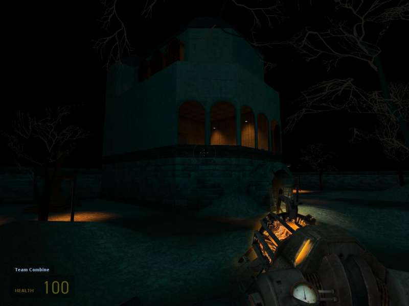
Interesting design, but hard to believe. Too many windows,not enough support, no roof-trim, clashing architectural styles. Mideival castle feel, mixed with crazy victorian arches? I don't really get it.

User posted image

Whoa..... that is seriously flimsy looking. I assume these are supposed to be stone structures? This just looks wrong.

User posted image

Ok, what in the world? Who teleported me to the psych ward in hell? Lay off the brown mushrooms Neo...this is too much. I don't know what a padded room is doing, in the basement of a (castle?), but it sure feels out of place. Hl2 texture set is full of cool s**t - it doesn't mean you should use it all in one map.

User posted image

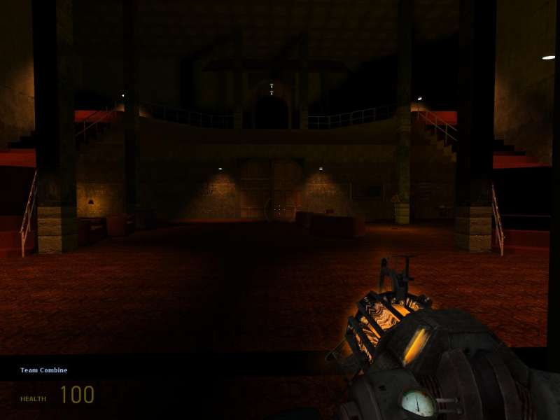
Taking this one shot, disregarding everything else I have seen - I almost have a glimpse of some cohesive style. A frankenstein castle, housing dark, wicked experiments.
Ok, to sum things up. Have you ever played Katamari Damacy? That is what this map reminded me of - some crazy ball of styles, textures, ideas, all rolled up into one huge uncontrollable ball of ........potential?

Neo, it is obvious that you are somewhat new to this - all mapping sins are forgiven, for now. This reminds me of my first map - crazy shapes, unrealistic scale, no theme, weird construction, blinking color lights everywhere. Its what you do, when you first start playing with this stuff and having fun. It's all good. I don't want to sound discouraging, as you should be playing around and having fun figuring this stuff out. Once that's done, though, and you are ready to step up to that next level, here's my advice.
  • pick a solid theme, even if it seems boring: a factory, a labratory, a military bunker, etc... you get the idea.
  • draw up a small, very solid design; paying attention to connectivity and flow. Can players keep moving through the map without hitting dead ends? Is there a main area, where you want players to circulate through? Are the rooms/hallways big enough?
  • take this sketch, send it to a more experienced mapper, for critique, before you actually start building.
  • Build this map - keep it fairly simple, but focus all of your energy on A. playability, B. solid construction, C. sticking to your theme.
  • submit for critique.
This place should be centered around a tough-love approach to critique. I want you to know that I applaud you for wanting feedback, and give it, assuming you honestly want to improve. If that's your attitude - it wont be long before you start cranking out some great maps.
Posted by neoshock2k on Sat Mar 19th 2005 at 7:13pm
[Author]

thanks for the crit man i agree yesterdays version was a little poo

Have now fixed many of the previous lag issues and have sorted out all the lighting on the new version

ps yo glass i emailed u the map a couple of hours ago dude u should have it from neshock2k@gmail.com

UncleSte
Posted by Juim on Sat Mar 19th 2005 at 6:55pm

I gave this map a run around before leaving for work yesterday. A major note, I think , is the maps performance. I was getting some lower frame rates(and lag/stuttering, although minor) in many areas, and i think this might translate into real trouble with a full player load. The concept itself is great, and there are many fine touches already in the map. I especially liked the glass with the lava on one side, but you can see through the glass into the lava side from outside that room and that kind of ruins the effect. You definitely have some haunted house ambience going. I also think that the usable doors affect gameplay somewhat , they should be made static in opened positions. Lastly, I would renovate the outside a bit, add some depth and variance to the landscape and re-consider how you lit it. It is definitely too dark.
Posted by DrGlass on Sat Mar 19th 2005 at 6:44pm

just send it to me and I'll host it.
Posted by neoshock2k on Sat Mar 19th 2005 at 5:24pm
[Author]

Dam angelfire theyve stopped me linking to ppl off the site i need sumwhere to host the maps im waiting for a reply from DR glass atm for a good link then ill repost the new version of the map on the site if anyone knows of hosting of maps plz let me know thnx

UncleSte