Say hi to our newest member, Danielblina!
Sorry if I'm a bit blunt, but here's my appraisal:I appreicate you taking the time to comment.
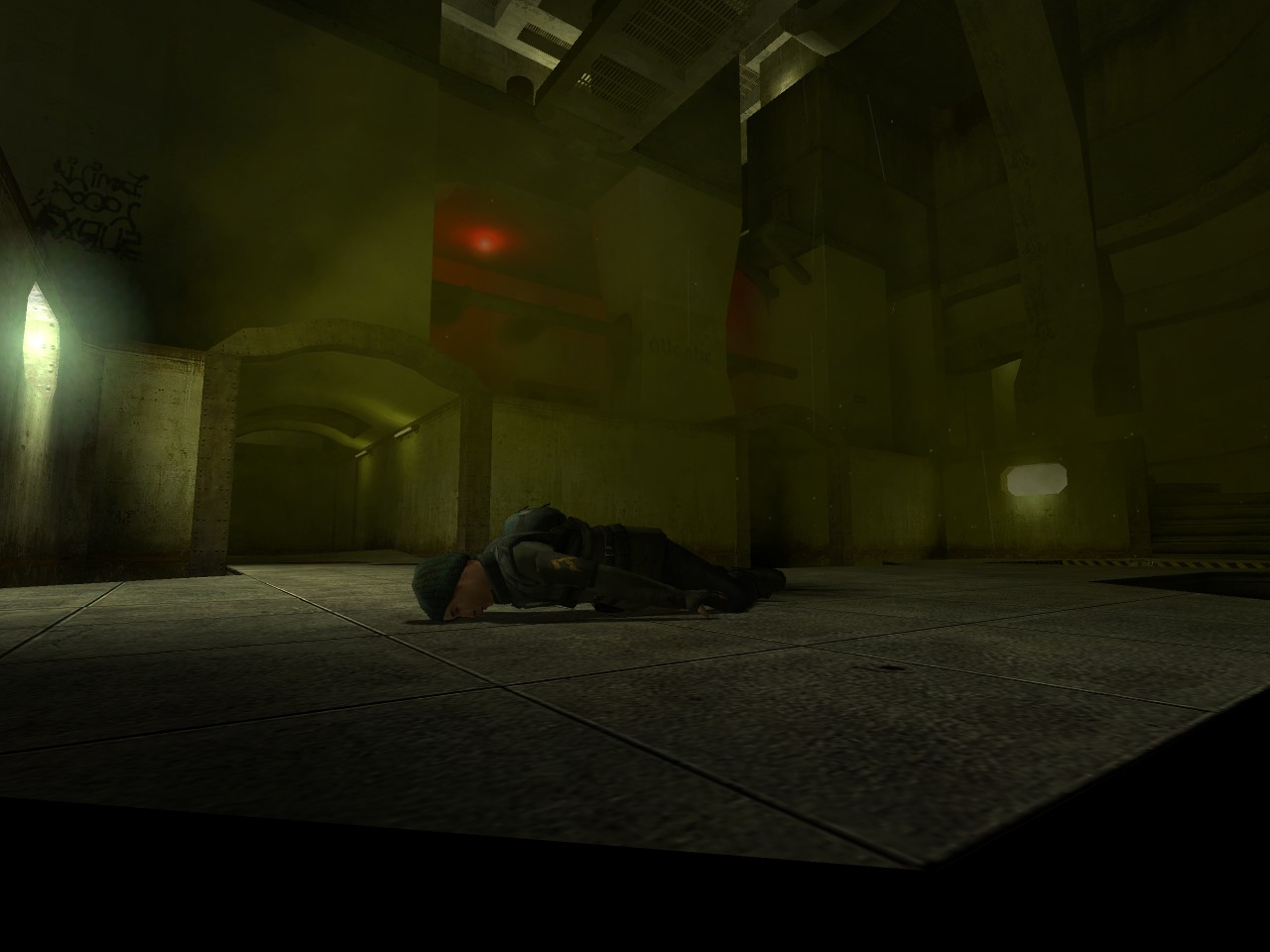
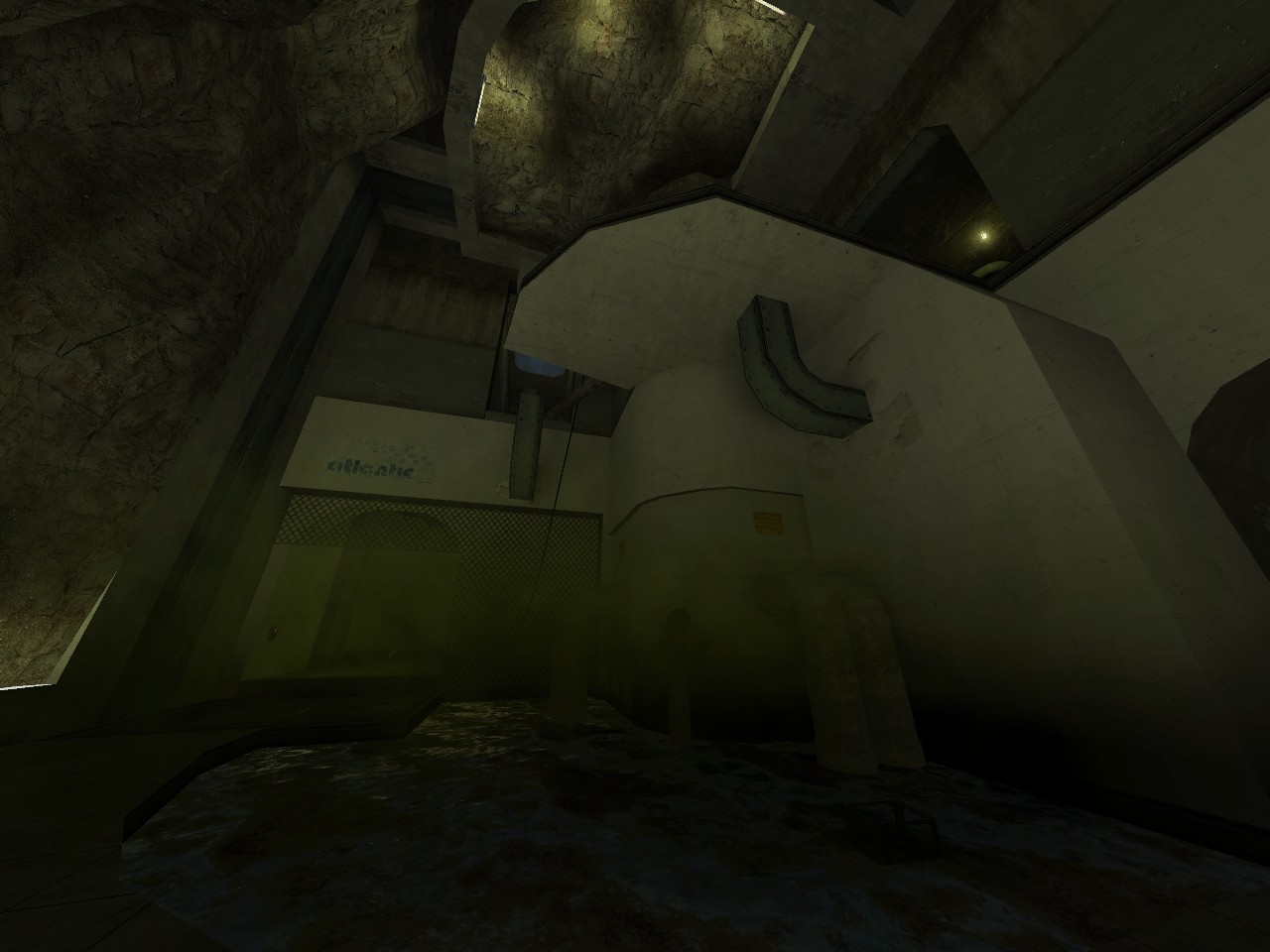
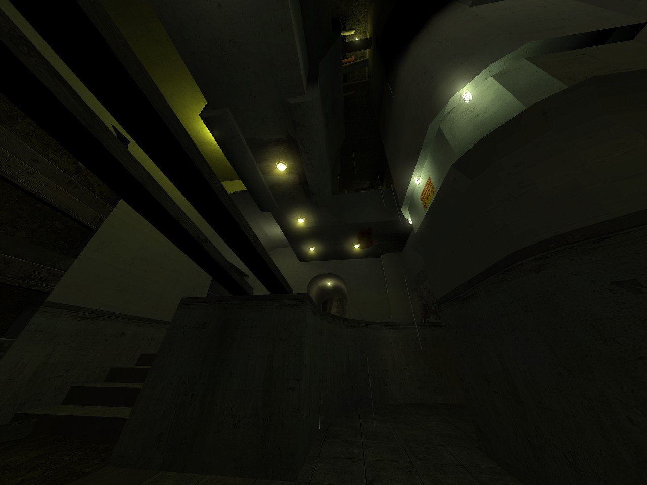
Way too dark for multiplayer and kind of boring (visually). I suggest
finding a real, definitive theme that anyone can look at and say "Wow,
that definitely looks like a ____ !" As of now, it just looks like a
fog-filled concrete bunker. Why is there fog there in the first place?
Emphasis on gameplay is great and everything, but it is all ultimately
useless if it isn't visually interesting enough to engage the player!
Visuals have a lot to do with gameplay - people respond to lighting
cues (red maintenance lights for vents in Natural Selection, for
example) and architectural cues, and need strong definitive visual
landmarks to navigate a map easily.
Looks like you have a good grasp of the editor, now you just need to branch out more!
