Most of them have got me thinking about the textures...I'll have to be
careful not to make everything look too similar, so thanks for that.
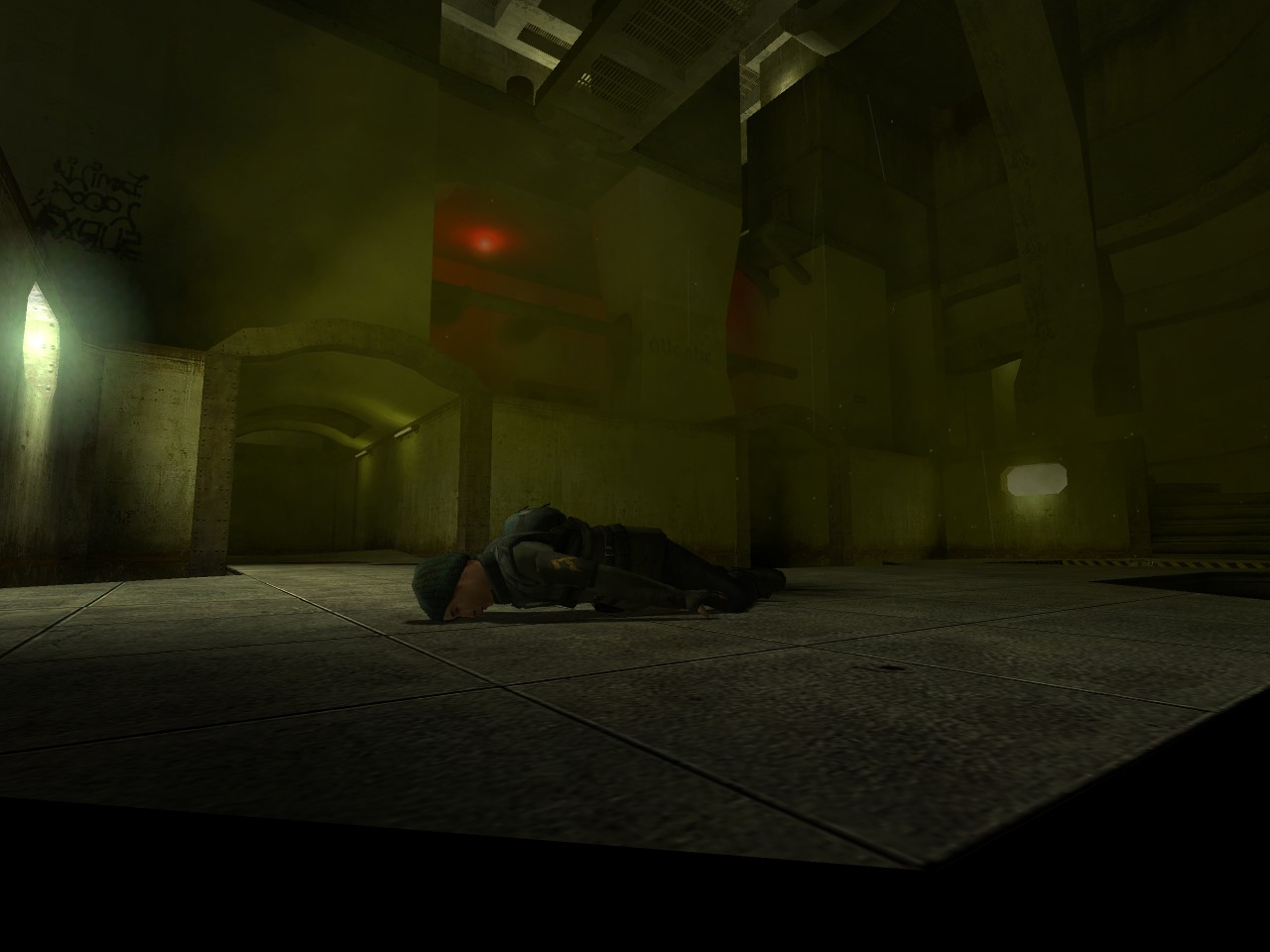
Also, the lighting isn't going to change very much. It was alot
brighter before, and it just didn't look right for the sewer/undeground
place I want it to be. Don't worry though, because you can see your
opponent perfectly in the map -- I've run around the alpha with a few
people, and it's fine in that respect.
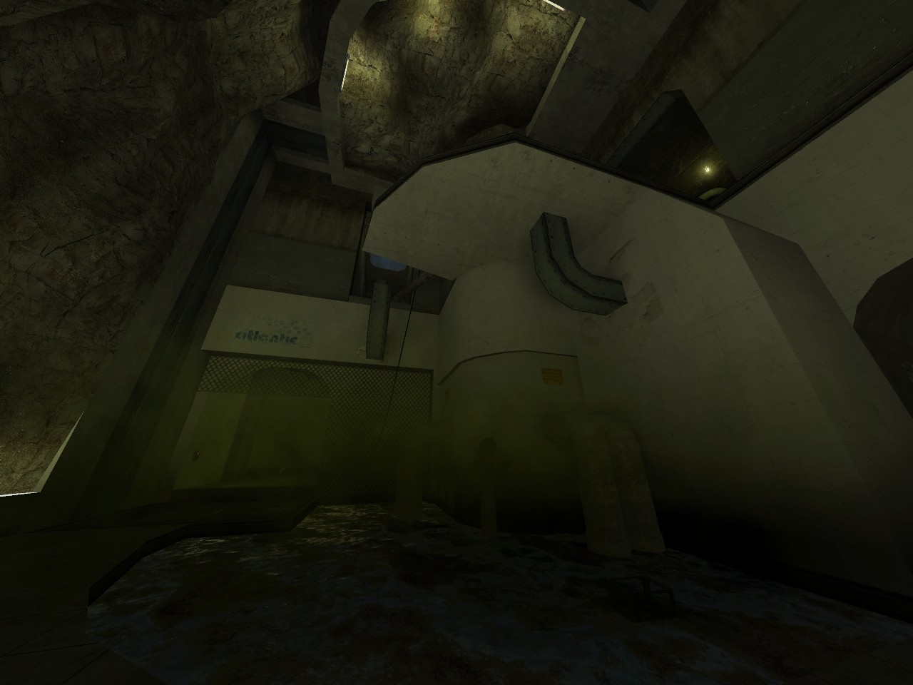
Maybe it's the fog or the quality of the screenshots, but this map comes across as 'plasterville' to me. I don't really read concrete here, it all looks like sheetrock or something. Give us something to run around in - it's very hard to judge much from these shots other than some interesting, monotextured, shapes.
I like the dank dark feel, but I think that you will need just a little
more light, I like to add very dim, dark (almost black) colored light
to even out some rooms, give it a try.
Again, I know that there are a few concrete textures, but that's
basically the theme of the map. Yeah, I am going for like a waste/sewer
setting, so it's basically big, support laden architecture with pipes
and stuff. The lighting will be fairly dark. I know it might look a
tade same-y from the screenshots, but when it's done, download it and
take a look, I think you'll be pleasantly surprised.
What theme were you going for in this map? I can't quite tell. It looks a little bit like a waste disposal facility.
I like your architecture, because it seems like it would be really fun
to run around with the shotgun in that map, but even though you used
different textures, they all appear to be the same color / concrete
material. I think the map could benefit from some texture
variety.
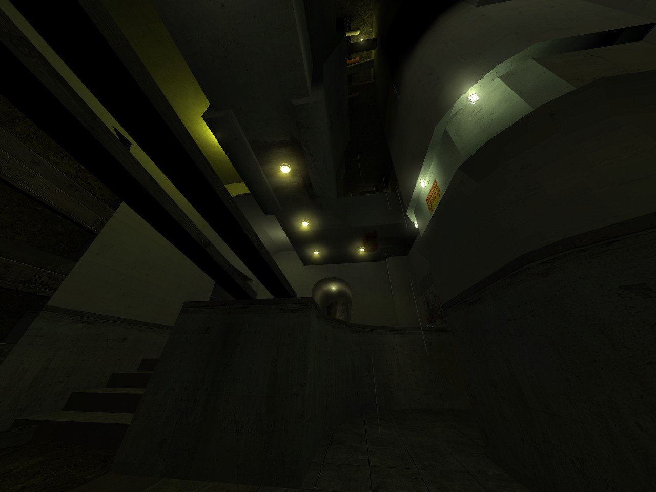
Are you going to add more lighting or are you going to keep some areas dark like that?
wonder if he just built the architecture using 1 texture and then is
gonna texture it all up properly when thats done (like what they
apparently did with hl2 but using those orange textures)? Either way
there is very little can say about it/ Brushwork in pic 3 looks fairly
decent though, curious to know what the setting is :smile: