dm_comsci by Addicted to Morphine

Map Rating

  • 0
  • unrated

Map Download

Map Info

Map Description

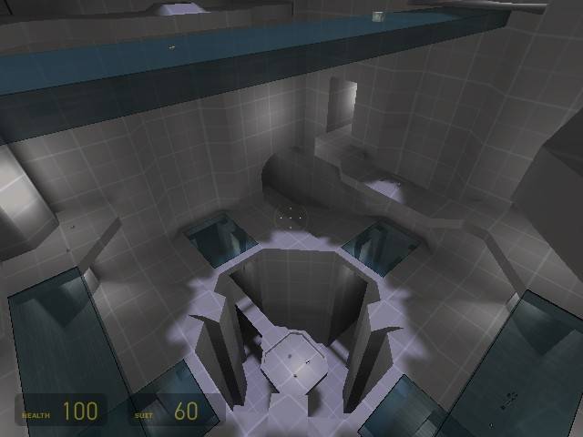
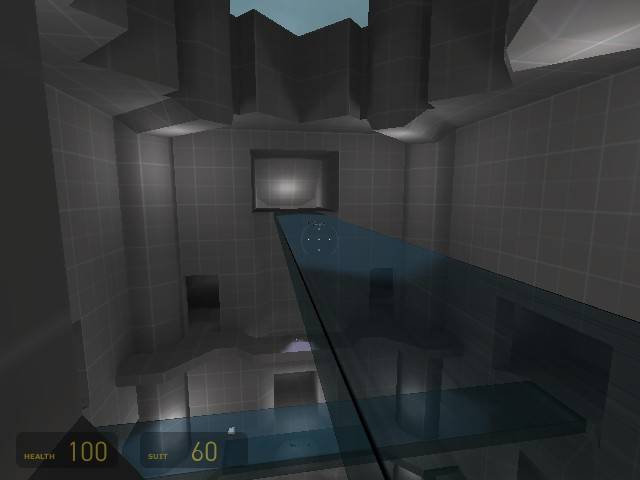
I'm attempting to create a map with a lot of vertical gameplay.

In an attempt to focus on gameplay, I'm only creating the very basic brushwork. Once I'm happy with the gameplay I'll add textures, lighting, props, and more detailed geometry.

The theme of the map is undecided at the moment. Although I'm leaning towards the inside of some sort of Combine science testing silo.

I would appreciate any comments on the general layout so far. There is much much more to be done, and I'll be updating the screenshots as I go along.

Discussion

Posted by Addicted to Morphine on Sun May 1st 2005 at 2:49pm
[Author]

I was sitting in class and my professor was talking about a specific
type of design for a prison, which involved a single tower surrounded
by a ring of cells which were fully visible from the tower. The
tower had smoked glass so the inmates couldn't tell if they were being
watched at that particular moment.

This map doesn't resemble that design much, except for the emphasis on
action surrounding a central point. I had an idea for the first
floor, and after I mapped out the pit and the glass, I really just went
from there on without a solid plan for the rest of the map. The
layout has gone through a couple revisions.

Thanks for the compliments. I know it's plain, but I'm working on that now.

I almost don't want to make it too detailed, so I can just keep a classic DM feel...
Posted by SnarkSephiroth on Sun May 1st 2005 at 8:32am

From the looks of it, Id say this map is going to be really cool! Keep
up the good work! Where did you get the idea for it? Any sources or
just from thought? I like it.
Posted by viper5k on Sun May 1st 2005 at 4:49am

Nice but plain
Posted by mazemaster on Sun May 1st 2005 at 2:19am

Maybe on the edges of the glass put some supporting metal beams. That would look cool but still let you see through most of it. I definitely like vertical aspect.
Posted by Ferret on Sun May 1st 2005 at 12:28am

desperately requires better texturing, and moreinteresting static props to flush out the walls ect.
Posted by Addicted to Morphine on Sat Apr 30th 2005 at 8:17pm
[Author]

I've finally decided to ahead with the combine theme. I textured a tiny
bit of the map to see which textures fit well... and I think I'm
keeping that blue wall texture and the turquoise for the
platforms. The floor textures I'm nots so sure about.
Anyway... here's a taste.

User posted image
Posted by Addicted to Morphine on Sat Apr 30th 2005 at 2:11pm
[Author]

Thanks for the comments. I'll definitely have to sort out the
spawn issues. I'm going to move those two that are in the open
area to a place where they'll have some cover.

What do you think I should do about the sense of scale? You can't
drop from level to level without losing 10 hp... and aside from the one
ladder there's no way (currently) where you can get down safely.
I'm thinking of adding vents etc that you can jump onto so that you can
make it down without losing life if you want. Although 10 hp
really isn't much. Do you think I should sacrifice the height of
the map to accomidate the proportions/safely dropping from level to
level?
Posted by DrGlass on Sat Apr 30th 2005 at 9:40am

Well... play tested it today here a few thoughts.
  • Give spawns some cover! I always like a second or two to collect
    myself when I spawn, but here I spawned in the middle of fire fights
    and was at 50 hp before I could even fire my gun</li>
  • Small details, add some supports, props, combine stuff, pipes, etc. (i know you know that)
  • more light variation. try and shoot for 3 kinds of lights,
    hard cold spot lights, soft white lights, and some colored lights (war
    color, like red or orange.</li>
  • more wepons, but seperate the gun from the ammo so the player cant just camp in one spot with full ammo.
  • more cover, add some pillers along the walls or half walls you can crouch behind.
  • texture (duh)
Thats about it for now, cant wait to play it again!
Posted by Addicted to Morphine on Sat Apr 30th 2005 at 3:01am
[Author]

Architecture looks very halo esque...
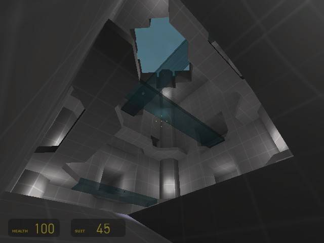
Hmm you're right. That's not a good thing for HL2. We
playtested today. It seems the general concensus was that the
layout was fine. The map just looks really out of scale (too too
big). At first everyone was like "whoah, this is really not
scaled right" but I think most of them found it didn't bother them
after a little bit. I'm going to try to fill up the space with
some more support brushes, pipes, light fixtures, etc... and hopefully
that will beef up the level and make it less empty and appear better
scaled. In other words, after I finish, I hope it doesn't look
like halo.
Posted by Myrk- on Sat Apr 30th 2005 at 12:27am

Architecture looks very halo esque...