dm_comsci by Addicted to Morphine

Map Rating

  • 0
  • unrated

Map Download

Map Info

Map Description

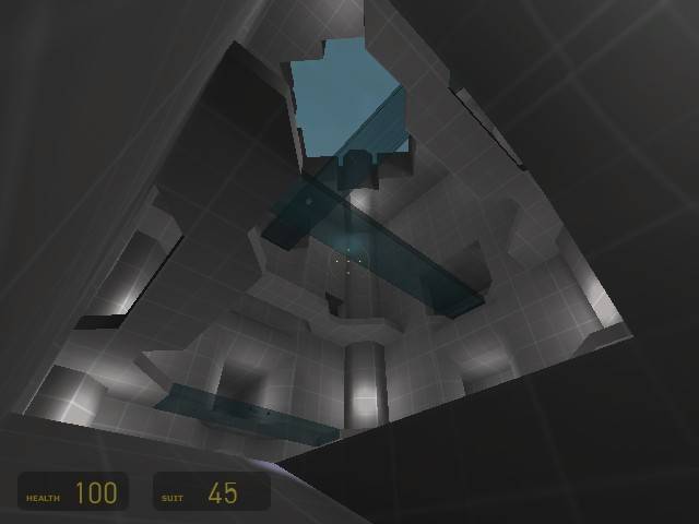
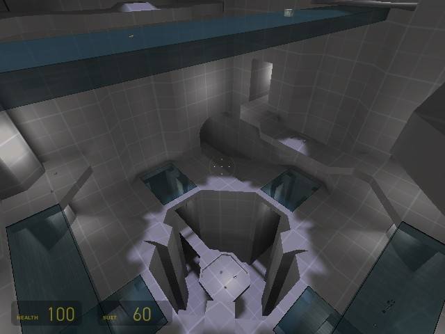
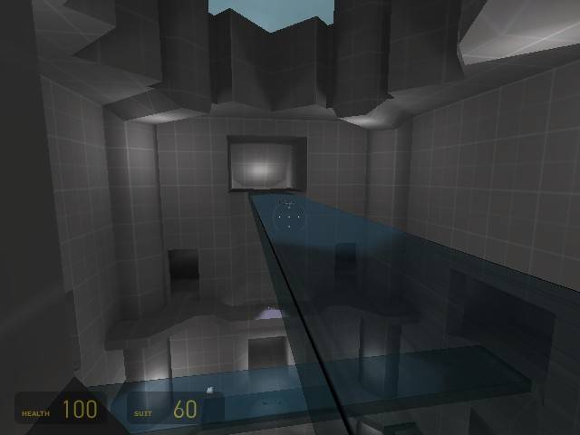
I'm attempting to create a map with a lot of vertical gameplay.

In an attempt to focus on gameplay, I'm only creating the very basic brushwork. Once I'm happy with the gameplay I'll add textures, lighting, props, and more detailed geometry.

The theme of the map is undecided at the moment. Although I'm leaning towards the inside of some sort of Combine science testing silo.

I would appreciate any comments on the general layout so far. There is much much more to be done, and I'll be updating the screenshots as I go along.

Discussion

Posted by BlisTer on Mon May 2nd 2005 at 7:43pm

nice architecture and idea. i started from the same idea of verticality for px_shockwave but ended up with too high r_speeds so i couldnt really explore it further and i continued horizontally... i hope you have more fortune with it, keep it up
Posted by Orpheus on Mon May 2nd 2005 at 3:42pm

Addicted to Morphine said:
I've taken a deep breath and am giving it another go.
Lots of shallow ones work better. The hyperventilate feel does wonders. :dodgy:
Posted by Addicted to Morphine on Mon May 2nd 2005 at 3:26pm
[Author]

Thanks guys. I've taken a deep breath and am giving it another go.
Posted by Push6 on Mon May 2nd 2005 at 3:08pm

The orange map was used so the mappers and playtesters could
concerntrate solely on the gameplay, rather than how pretty It looked.

Back on topic though, I still think the floor/platforms look too
HL1-ish. Also, if you add support beams around the outside walls, or
maybe even break it up with consoles, etc. Do make use of the combine
pipes as well, like Leperous said. Finally, Dont give up! stick with
it. :smile:
Posted by DrGlass on Mon May 2nd 2005 at 2:08pm

Addicted to Morphine said:
I officially hate texturing...

http://img69.echo.cx/my.php?image=comscialpha400010pm.jpghttp://img27.echo.cx/my.php?image=comscialpha400021dk.jpg
http://img27.echo.cx/my.php?image=comscialpha400030fg.jpghttp://img27.echo.cx/my.php?image=comscialpha400044zm.jpg
Because you were dumb enough to wait till it became a chore silly.

I texture as i go, I may change my mind on some later but its not a
chore then. I know many mappers who scrap a map simply because they
were stupid enough to wait to the end and "Try to force" the textures
work. They give up in defeat.

Some mappers however do well by waiting, but they are few and far between,

Next time, texture as you go and save yourself a bit of text you will waste on crying.

/ 2 cents
I texture as I go, but I dont think its better or worse. If you
wait till the end you can really get the scope of your project and
texture everything in the same style.

on the other hand, your brush work may be the wrong size for the
texture and if that happens you s**t out of luck unless you want to
change a huge amount of your map to fit one or two textures.

The 'orange map' was (I think) used becuase there really weren't any textures when the mappers started work.
Posted by Addicted to Morphine on Mon May 2nd 2005 at 1:23pm
[Author]

Well. It seemed like a good idea at the time. Often, I
spend hours hunting around for a good texture and I lose focus on
completing a working layout.

I'll be using a different approach next time.
Posted by Orpheus on Mon May 2nd 2005 at 9:36am

Addicted to Morphine said:
I officially hate texturing...

http://img69.echo.cx/my.php?image=comscialpha400010pm.jpghttp://img27.echo.cx/my.php?image=comscialpha400021dk.jpg
http://img27.echo.cx/my.php?image=comscialpha400030fg.jpghttp://img27.echo.cx/my.php?image=comscialpha400044zm.jpg
Because you were dumb enough to wait till it became a chore silly.

I texture as i go, I may change my mind on some later but its not a chore then. I know many mappers who scrap a map simply because they were stupid enough to wait to the end and "Try to force" the textures work. They give up in defeat.

Some mappers however do well by waiting, but they are few and far between,

Next time, texture as you go and save yourself a bit of text you will waste on crying.

/ 2 cents
Posted by Leperous on Mon May 2nd 2005 at 8:26am

Use some combine tubes, giant monitors (not necessarily working) and more props/detail to spice up the flat walls. I don't want this turning into a big tall killbox :razz:
Posted by DrGlass on Mon May 2nd 2005 at 4:21am

To fix the scale you should add smaller details, 2x2 unit trim.
Small details, and static props. As for the fall damage, you
could make 'landing' pads that had a trigger_push above them so if you
jump on the pad it slows you down about 128 units above the ground.
Posted by Addicted to Morphine on Mon May 2nd 2005 at 3:52am
[Author]

I officially hate texturing...

I'm getting a bit frustrated with my attempts at progress in this
map. Here are 4 screens to show that I'm actually still working
on it. I'm not particularly happy with it. I almost want to
give someone an earlier version of the VMF which has no textures and
only the basic layout. I truly feel the layout has merit, but I'm
losing my motivation to beautify the map. I may just want to keep
it simple.

Anyway, no cubemaps yet. Here are some shots:

User posted imageUser posted image

User posted imageUser posted image

I already know the lighting in the second picture is too
yellow. There are lights without sources in the main
chamber. And... I'm afraid some of the wall columns are too
busy... too HL1ish.
If you see anything that is particularly garrish or offensive, do tell.
Don't spare my feelings.