Very nice map. The feel of this map was very unique and I could
really see the source picture when I looked at the map. You got
the feel and the mood down very well.
the first major problem is cubemaps even if you just add a few it would make the map look 10x better!.
http://img.photobucket.com/albums/v421/drglass/Mpas/dm_tertre_beta10009.jpg
Those balls pick up your cude map info, see how crappy they look? thats the cube map that all your items pick up, bleh!
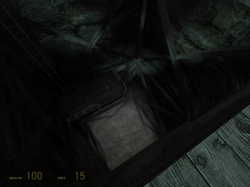
http://img.photobucket.com/albums/v421/drglass/Mpas/dm_tertre_beta10012.jpg
This pic shows how your X beams faded too fast. Looked bad. set the fad distance a little higher.
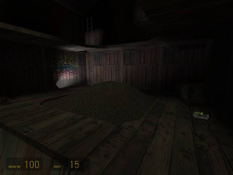
http://img.photobucket.com/albums/v421/drglass/Mpas/dm_tertre_beta10018.jpg
Nice, but the colors are way too bright and make me think Will Smith in
the Fresh Prints, tone it down to match the rest of the map a little
more.
Also I really wish your windows would break and that you didn't use
non-transperant windows. It looks very strange with all kinds of
diffrent windows and some you cant see through.
The doors didn't fit in the theme either, grey metal doors in a old wooden silo? try and change them.
You had a radiator in there that didn't unstick from the wall.
Performance was a bit of an issue, I think some window area portals would work very very well and fix any frame rate issues.
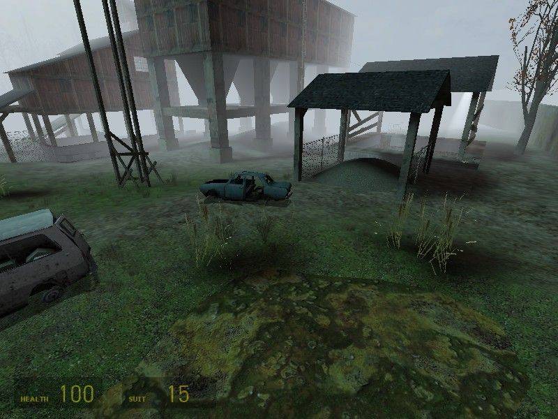
http://img.photobucket.com/albums/v421/drglass/Mpas/dm_tertre_beta10013.jpg
I think this pic looks great, I love the birds and the fog. Also
the sound that plays when you swing the playground thing was creepy.
nice map cant wait to play it.


