My second map and I wanted to reflect the fast paced gameplay of office one but with a different layout. The style is mostly the same, or I have aimed to keep it in the same style as the original, but with some twisted gameplay elements I wanted to make it as fun as the original.
In the screenshots I have tried to show some areas that aren't too similar to the original, cs_office.
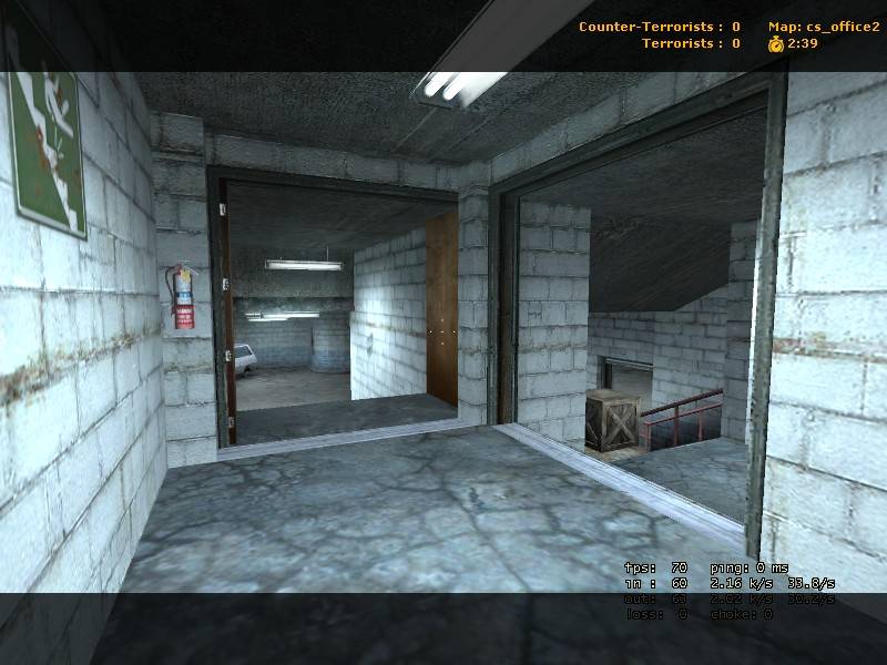
Screenshot 2 makes no sense, whats going on with those doors?! They are far too wide for single, and if they are double then it looks as though one of the doors goes straight into a support!
Posted by Sphynxis on
Wed Aug 10th 2005 at 10:33am
[Author]
Sorry, it only seems bright because I have my alpha settings really low
and I forgot to change it for the screenshots. If you want to get a
real feel of how it looks then I suggest you download it.
Posted by Windows 98 on
Wed Aug 10th 2005 at 4:31am
I'd like to 2nd that some areas are to bright. Also I'd like the add
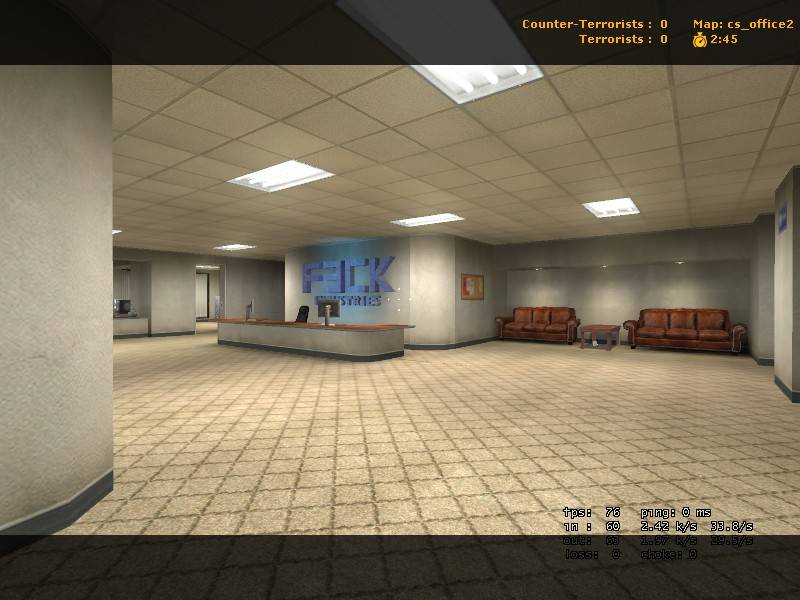
that the archetechure is a little dull. It appears to be some empty
rooms with some hallways. I havent played it, only seen the screens
Posted by Captain P on
Wed Aug 10th 2005 at 12:56am
From the screenshots, I'd say it's nice but a bit too bright at some
spots (shot 2) and some surfaces are too boring, no details or stuff to
break them up (shot 1).
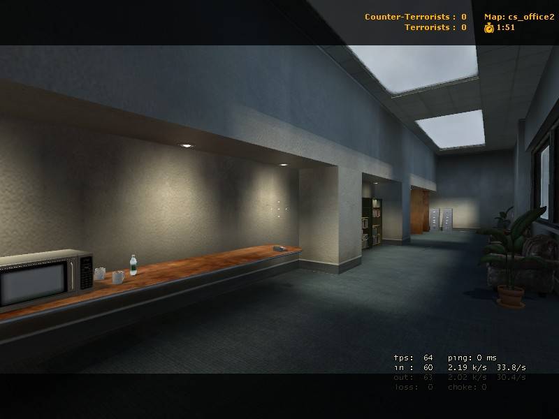
Shot 3 looks best, nice lighting and detailing.
Overall, can use some more detail and some lighting tweaks. Indeed, it's getting there.
I'll give the map a go when I have time for it. I'm quite busy as of late...