dm_Intense by BlisTer

Map Rating

  • 4
  • 1 rating / 4 stars

Map Download

Map Info

Map Description

competition entry 2005.

A base with surrealistic features. The screens give some of it away but you have to see it ingame really. Setting texture details to high is strongly recommended. Since the refract shader is used the effect is nicest with a dx9 graphics card.

Optimized for performance (atleast twice the fps of overwatch).

Connectivity.

Atmosphere.

have fun!

Discussion

Posted by Dark Tree on Wed Aug 24th 2005 at 10:14am

Christ you guys! This map is kickin'. You say it has no "consistant theme"....however, it is supposed to be, SURREAL...hence....not supposed to really be anything.

Pros:
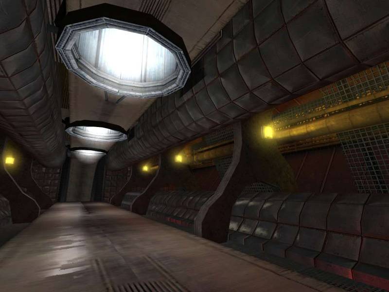
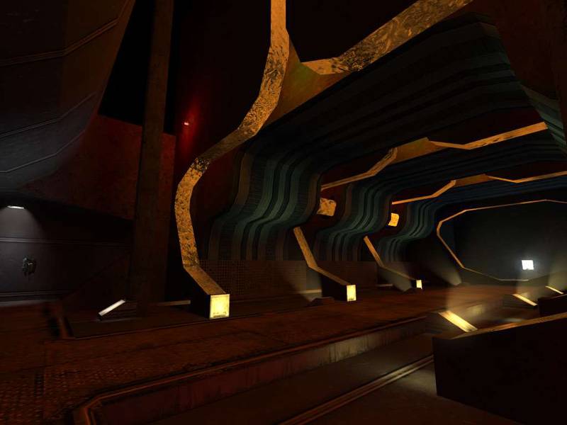
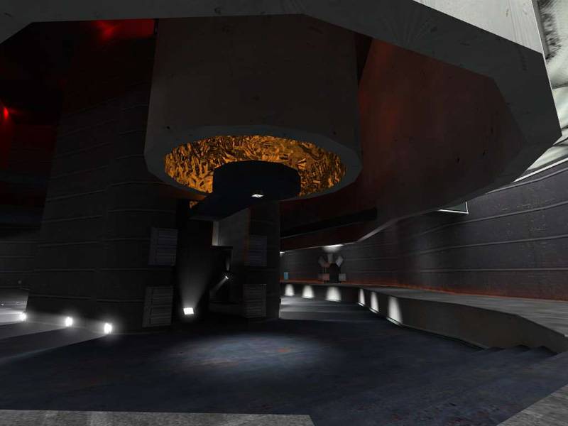
The texturing is really nice, the bump maps work great. the music is perfect. the large orb is completely kickass. There is even a poison pit. Hallways are cool. Great architecture.

Cons:
Too little amount of weapons. A couple of deadend areas. No secrets or traps (personal preference.)

Bottom Line: Great architecture and supreme atmospheric feel make for a great map, aside from some nitpicks.

10
-.5 for sparse weapons
-1 for some bad flow (deadends)
-.5 for no special interactivity (secrets/traps)
___
8

PS: this map doesn't really remind me of Quake or Doom....however....it kinda reminds me of dm_pinnacles ( http://www.snarkpit.net/maps.php?map=1781 ) although I'm not sure why.....
Posted by SHeeP on Sat Aug 20th 2005 at 7:53pm

^yep^

the 3rd shot falls short not in any way because its bad but the first 2 just raised the expectations too high :)
Posted by warlord on Wed Aug 17th 2005 at 1:14pm

Those hallways are incredible
Posted by DocRock on Wed Aug 17th 2005 at 2:04am

I think this map has alot of great potential. It looks and feels real good, and runs nicely. I like the layout a whole lot, and the shiny textures really look good. I think it's a very nice map and has captured the contest theme well. As far as landmarks for weapon placement -- thats for the map author to decide and is not something neccessary in any map. BlisTer: well done man!! congrats on a well built, solid, unique map ^^
Posted by BlisTer on Tue Aug 16th 2005 at 7:51pm
[Author]

Heh you guys are sparse on saying something positive :) i wonder how you feel on 95% of the maps that get produced here. Obviously everyone has his own opinion, others say that the golden liquid is the theme and holds it together, in some rooms appearing as a subtle presence - as i intended. i feel 5/10 is a bit harsh compared to ratings on other maps, but oh well

[edit]
Myrk: i made that texture
Satchmo: feel free to point me to maps that are the same
Posted by Ferret on Mon Aug 15th 2005 at 2:38am

Your level has a lot of potential but I'm afraid it fell short in a lot of aspects. For instance your theme. I couldn't find a great consistent theme asside from the golden texture you made. But thats too weak to hold a whole level together. If you had merged the golden texture with the circular tube lights you had you could've pushed it a little farther. You have some nice architecture but you can't make a level simply on architecture when they dont match. For instance some rooms have some interesting arch work, than other rooms are simply cut out blocks. Removes the player from any sense of atmosphere. ALso you need to refine your lighting in areas. Some areas have consistent themed lightings, other are just a bland red. The last thing I'd mention is landmarks. ALl of your items,weapons, and so forth need to have a land mark marking the place they spawn as "special" so players can have a mental picture. I'd say "unfinish" this map and refine it for another release.
Posted by satchmo on Sat Aug 13th 2005 at 11:58pm

Looks great, but I have to say it's not the most original. The theme reminds me of "Doom" or "Quake", which are both fabulous games.
Good mapping, needless to say, but it's not going to be the most unique map in the comp.
Posted by Hugh on Sat Aug 13th 2005 at 6:15pm

I like the first two shots a lot, the third one seems rather drab, especially in comparison. I'd play it if I had HL2, at least.
Posted by Myrk- on Sat Aug 13th 2005 at 2:15pm

Some of it looks too big and open. Reminds me of the film "Sphere". What texture is that too? (The crazy golden liquid one).

Had a run through, I have to say the same as Ferret. I'd consider it more of an extended experiment with nice lighting etc. What you need to do (if you have time) is trim it down and make it more coherent.
Posted by BlisTer on Fri Aug 12th 2005 at 8:21pm
[Author]

ok i changed a few things. the orb room walkways are more concentrated.
the atmosphere and detail is a bit increased in the areas Smith
mentioned, as you can best see ingame, here is a screenshot of the RPG
room

User posted image

if you read this , dm_intense is released, check map profile