First map of my 'Traps' Series! (Upcoming: trap_hitech)
The trap maps, as I call them, are maps where two teams are thrown into a maze-like map filled with concealed traps.
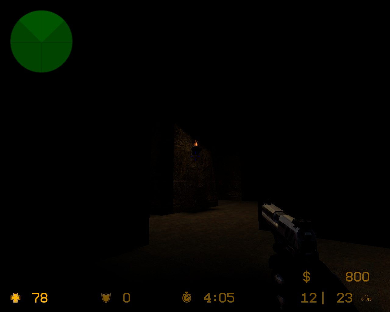
trap_catacombs is a dark and scary map where players need to eliminate their opposing team before the traps do. There are about 30 different traps in the map, and a scary theme to it. If you like new ideas and interesting concepts, this map is for you!
I've worked on it for quite a while and finally made a nice finished product. Even a few servers have that map in their lists! This is a great addition to any custom-map server. I've had a lot of feedback and took ideas given to me by other players to add more traps!
Don't judge this map by the screenshots, you'll need to play it to really judge it!
You ask for any comments, and at the first dose of criticism - and a mild one, at that - you resort to telling us that you didn't need us in the first place. You seem to have had the impression that this forum, like many others, lavishes praise and welcome on anyone who decides to register. Sorry to disappoint. This forum is intended to help with works in progress - that is, to improve a map, rather than debate its faults or assets as a finished product. If you can't appreciate feedback, you waste your time by posting here.
The mapping forum is to get feedback on how to improve a map. If you just want to show it off and get comments, that's what the map's profile is for.
Also, I was pretty nice in the way I said all that to you. I could have been much harsher.
Point is, if you sit there and defend an unfinished map by saying, "it's good enough": you shouldn't really bother with this community, you will not be a nice asset, since, you can't accept criticism and will, obviously, refuse to better your own skill. Which is the entire point.
Have you EVER thought about optimizing your maps? Eh? The map was...
how do I say it now... a huge bunch of brushes. The +showbudget gave me
a lots of this. Your map needs OPTIMIZATION! Ever heard of Vis? How
long did it take? On Normal.
I am going to check it out more thouroughly right now to see what you made wrong but at the first sight... I wouldn't play it.
edit:
okay, I know what went wrong.
The whole thing is surrounded by a HUGE empty black box. That's the killer. Get rid of it.
Couple of leak fixes afterwards perhaps and you're good. But don't you
dare leave it that way. It is normally called "lazy man skybox", only
this time it is not a skybox. Anyway, get rid of it and the huge room
under the main floor (yes, those things CAN go outside the world, just
make sure there ain't no leaks). If you need, add a non-hollow box
around them. They'll live.
Hey now, I didn't mean my comments in any hostile way at all. I never
download other maps, as I just find I play through them once or twice
and forget about them. Perhaps posting screenshots of brighter areas
would help?
I didn't say the gameplay wasn't good (which I couldn't say, since I
haven't played it), but from the only screenshot you've given us to go
by, the entire level is black.
Err, ok? That's just weird comments. First, you say the map is dark
(hm, *cough*catacombs*cough*) and second, you're throwing me some stuff
about how I should make this one better lalala. Actually, this map is
already on rotation on many servers, I was just putting it here to get
ideas for a sequel, as this one IS ALREADY good, but since not everyone
could agree on that, I posted it here for continuation of amelioration.
Too bad you guys didn't catch that and though "your valuable time" is
so much more important, considering this is a mapping community where
everybody takes part, right?
This isn't really a comment on your map, but I've never understood why a lot of people who make maps and say they want improvement only want to make another map ... why not change this map until it's good? Because, even if you have a good layout, that doesn't mean your map is anywhere near "done", especially if you plan on making a sequel map. Just fix this one ... you have a head start.
Anyway, I can't really tell what the map looks like from those screenshots and I'm not going to download it and runaround without some initial insentive.