Mudanchee by Captain P

Map Rating

  • Star map!
  • 5
  • 1 rating / 5 stars

Map Download

Map Info

Map Description

Mudanchee is a compact, fast and fun Half-Life 2 deathmatch map, set in an ancient cave system. Players combat each other between gloomy crystals, old tombs, clattering waterfalls and archeological equipment.

The complete weapon array is available, as well as various custom objects such as sharp crystals, hammers and rocks. Action is never far away due to the compact nature of the map, and vertical combat plays an important role. And there's the occasionally hidden items...

Discussion

Posted by Captain P on Wed Apr 30th 2008 at 7:47pm
[Author]

@Redwood: I noticed the uber-shinyness too, on my brothers system. Turned out to be a DirectX 9 specific part in the .vmt file, that's why I never noticed it. It'll be fixed in the next version. :smile:

Thanks for the other comments/nitpickery, too. I'll fix what I can. As for the final version, I've set the end of this week as my deadline.

@aaron_da_killa & reaper47: How's this? A road alongside the cliff, a parked van (from the archaeologists), a spare tree, different (lighter) rock texture...

User posted image

User posted image
Posted by reaper47 on Wed Apr 30th 2008 at 9:07am

I like the new vista (damn you Microsoft for taking that word!), just add some texture variation (blend to a different rock-style, some vegetation, etc.). Maybe some sandy areas around the water. Looks too homogeneous and flat, texture-wise.
Posted by Le Chief on Wed Apr 30th 2008 at 5:51am

Captain P, the vista is looking nice. Something looks wrong with the lighting in it though. Shouldn't there be some nice looking shadows cast there and such? RedWoods idea of logs in the water is good, go ahead and mass out that area with props and other things :wink:

As far as the cliffs in the vista are concerned, I think that the left side looks good and probably dosen't need to be touched anymore, but the right side still needs a bit more work. I think that the right side should curve left more and should vary more in height more than the left side, so I think that after the water curves to the right and begins to curve to the left, the right cliff should get either shorter or taller than the left side cliff, I think probably shorter looks better.

And don't forget to add some stuff on top of those cliffs too. You could do a few things with the top, the most obvious would probably be to put some trees there, but you could have a distant mountain or distant skyscrapers, or stick a bridge over the creek or something, whatever you thinks best.
Posted by RedWood on Tue Apr 29th 2008 at 11:39pm

The vista is better but how about some vegetation. Maybe some dead logs in the water below.

I had a run around and i really like it. Weapon placement is good. Flow is easy going. I like the openness. AR2 alt fire isn't vary effective in this map, so if you like, don't be afraid to add some more.

There was one bad thing that really stuck out though. The wooden floors were far to reflective. Beat up, dirty, wood plank floors don't reflect crap. Everywhere i went i could see a reflection of the sky box on the floor.

I assume its time for nit picking...

User posted image 
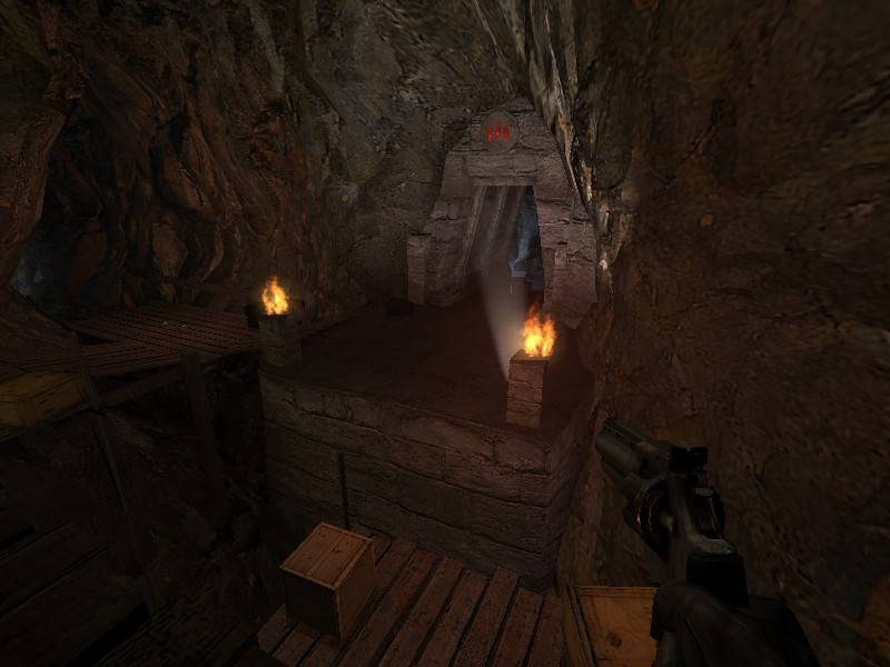
The air is far to clear for the light spot to stand out so much. I'm not expecting you to change it but i think if be cool if it was a little misty in there.

User posted image I don't know how this works but it looks like the 2 sections that im aiming at are flowing in the opposite direction. and think it would look better if the water flowing over the rocks was moving slower than the main stream.

User posted image Spawns so it looks like its floating.

User posted image Wires need slack.

User posted image The shadow on this box are to dark. (pitch black)

User posted image

User posted image

User posted image

User posted image I normally wouldn't point out something so trivial but it just stuck out for me. The wood hear is way to clean. Maybe add a overlay of some debre or something.

User posted image This rock is casting a odd shadow.

I hope this helps. Any idea on when you could have a final?
Posted by Captain P on Tue Apr 29th 2008 at 8:32pm
[Author]

About the vista, how's this? Personally I think it's a bit more open, but it's also pretty dark and the far-off horizon is a little empty still. What do you guys think?

User posted image

User posted image
Posted by reaper47 on Mon Apr 28th 2008 at 5:53pm

I know what you mean, Captain, I like the place as well, I'd definitely keep the details and just move them forward a bit to one of the other corridors. But it wouldn't hurt if you keep the back area either, just a suggestion.

I also agree with aaron. You could have a more spectacular view there. Once again, no big deal if you keep it this way, but if you are in the mood for some extra detailing, this would be an ideal spot.
Posted by Le Chief on Mon Apr 28th 2008 at 12:04am

I played the map and it was quite good. The different lighting gave me a sense of being and helped me navigate the map "Oh now I'm in the green light area". The rocky brush work was good as was the wooden paths with the hint of human presence in the map (chairs, tables, mining tools...). My only request is with this area:

User posted image

Now listen Captain P, this is the perfect opportunity to build an awesome looking vista to distract players. What you have done with it is, I would say acceptable, but you could really turn this into an awesome vista. Maybe like that muddy creek winding away into the rocky area with some light vegetation or something. Here is a little drawing. Kind of like this I guess but more in tune with the theme of your map. And I think that the vista shouldn't damage that awesome looking sun. I just think that you could do more with that nice area.

I guess some of them waterfalls and pools of water could use a bit more tweaking up, but all in all, I like it.
Posted by Captain P on Sun Apr 27th 2008 at 10:34pm
[Author]

Thanks for the feedback guys. :smile:

@Juim: The waterfall-that-leads-to-nothingness is a problem I encountered a few times before: the compile tools ignore hidden VisGroups. Toggling player clip brushes back on again should do the trick. Thanks for pointing out. :smile:

@haymaker: I put those trigger_hurts there to penalize players for falling in, it's done on purpose. Kinda gives the map something unique, sort of a harder difficulty if you can call it that. However, there's a few player clip brushes spread around to prevent players from getting stuck or falling in annoying places, so it's not that bad. I hope. :smile:

@reaper47: I remember you suggesting that. I'm a little hesitant on that - it's a part that I've worked on for some time and that has been around for a while, you grow attached to it. For this release, I'm not going to touch it, but I'll give it a try. We could always see whether dm_mudanchee_mini is more popular than dm_mudanchee... :wink:

Anyway, I've updated the download link to v46: Download! (.rar, 6.7 MB)
Posted by reaper47 on Sun Apr 27th 2008 at 11:42am

Oh. My. God. You're actually finishing this! :biggrin:

++ for stick-to-it-ness, I'm d/l right now.

EDIT:

I had a look and it seems pretty much flawless, except for the little glitch mentioned before.

If you want to give this another layout pass: I still think it's a little too big. I remember suggesting this a while ago:

User posted image

I still think you should consider tightening the corridors in the back area. The map is still huge without them and excessive map size is among the main complaints I hear for HL2DM maps these days.

I think the layout works well the way it is, though. This is just a suggestion for tuning the flow. Imagine this map with a (very realistic) 4-6 player count. You could run around for minutes without getting into a fight. And even if cut in size, this map should be able to handle a crowded 16 player server.

Just something to consider. I love the look, feel and all the little details. Beautiful.
Posted by haymaker on Sun Apr 27th 2008 at 6:19am

I remember this from when hl2 was new to me , lol. Getting very impressive too I will say. Movement is good, lighting is very well done considering the dark nature of the theme. I was going to point out the unclipped water zone but Juim beat me to it.

The only thing that puzzled me was the presence of trigger_hurts underneath some of the catwalks, I don't see how that would help gameplay really. Plenty of times you get knocked around by nearby spam splash, would be frustrating to die when a chance of survival should be granted. Also, throw a prop in there, it's gone for the rest of the game. Maybe a clip with a metal grate or something...

Anyway your horse isn't dead I would say, far from it.