Say hi to our newest member, RichardELDEN!
omegaslayer said:Well, I wouldn't read to much into my suggestions until more than one person says something close to similar bud. Suggestions are meant to be listened to, not necessarily adhered to.
When ill get the chance I will read through everything with a fine tooth comb and take your suggestions to heart. Thankyou!
omegaslayer said:
Thankyou orph, thats just the type of feedback I was looking for. You are quite welcome sir. Custom dictated that since you accommodated my desires for smaller images that I show my respect for them. /me bows.
/checks download link here again, time is a problem. Using your images alone, that critique took me over 30 minutes. Imagine if I downloaded your map, took screens, uploaded them and commented.Perhaps an hour to an hour.five?
Yup it still works. While your critiques were nice and informative, I think you actually need to visit those areas of the map to understand whats happening in them. I agree, but would it be worth the time I do not have? I grant that I cannot be very good using your screens but I will always give you my best/honest replies with the info I have.
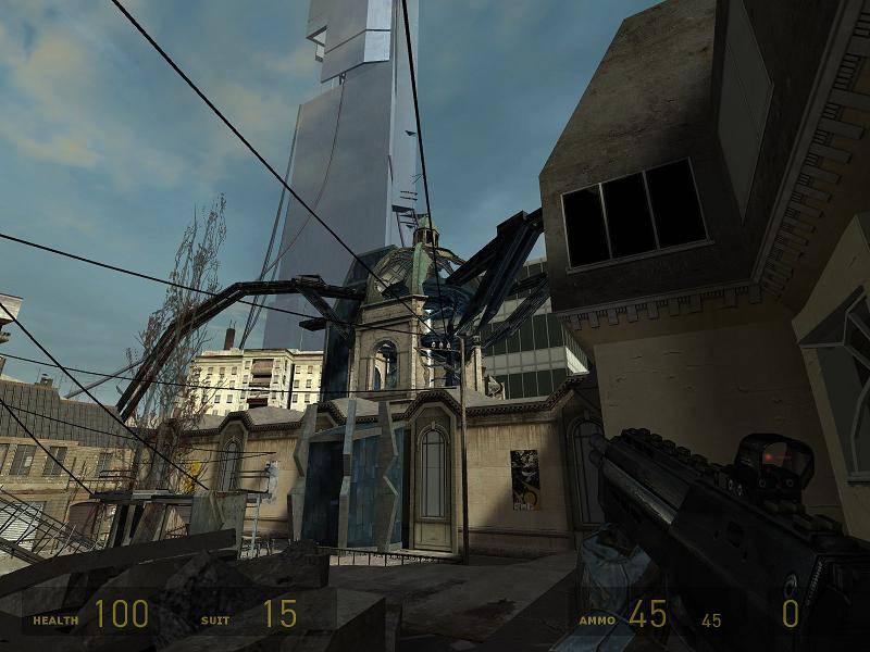
EG: The screen you did not know about needs to be visited so you may see what exactly is going on there.
1st screen: when you say "Trodden" do you mean trapled/walked on? Trampled yes. Trodden in my opinion would be better only because trampled sounds like its recent. Homes have pathways from here to there. Such as to the market or laundry.
2nd " this is actually a device that is carrying the "key" (the floating ball) to call down the air strike. The theme I was going for in the map was combine taking over, they have lots of devices all around the place that have different purposes. My apologies. I was uninformed. Now I am not. :smile:
3rd : I agree 100% too blocky and those textures are a bit too high. I was thinking, Leave the blocks BUT make them resemble blocks. Try increasing the scale to make the walls thinner. Blocks have very large holes in them and thin to moderately thin walls.
4th: is ist a really good idea to make something dimly lit for a DM map? I also thought of dimly-ness here, but I thought that gameplay dictates that light needs to be somewhat bright to see other players. There is dimly and dark. Dimly works if you have no deep shadows. You can have deep shadows but its best to not have them as camping locations. I would lower the light to 1/2 its current level and brighten it slowly till you acquire the desired lumen's.
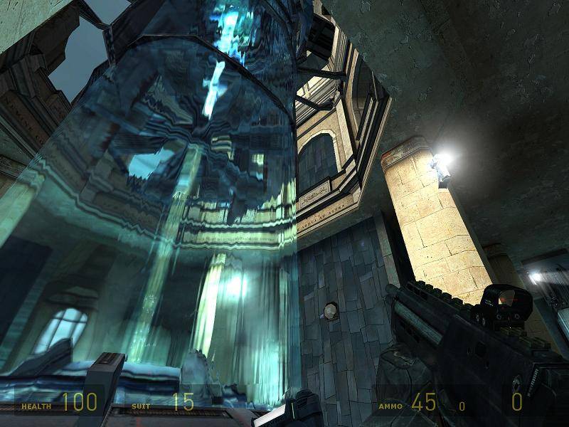
5th: The light values are a bit high here, ill lower/remove some to give a better sence of atmosphere (add some color as well). On the topic of the door. I actually placed the door as a func_physbox so you may toss it. Currently it floats in hammer, and falls to the ground when the map spawns, so I guess you could say it is "natural" :S. Break a few, do not remove them. Lowering the value in lumen's here will help too I suppose. Its that god awful blue I dislike. Funny thing is, most all my maps had blue basic lighting throughout them. HL1 textures were accented perfectly by it. HL2 textures balk at it IMO.
6th: Are you saying here that im lacking in originality? Thats really not a problem I can solve since everything Ive built is original. But do you mean the theme of "combine mixed with old city" isnt mine? Thats just something that you really can't get away from. Lacking originality in theme, not content. I realize you built it but you modeled it after 10's of 100's of other maps. You can get away from it I bet with some creative originality. Cities the world over use the same colors paint without looking the same. In fact, the new England side of the USA looks drastically different that the West Coast. They both use brick and mortar.
7th: Obscured shot, I just wanted to catch someones eye with mid-afternoon light comming in from the top contrasted with the combine infestation. Obscure only because I am not sure what the blurry object represents.
8th: I like your suggestions here. What would you recomend I do with the cat walk? replace it with a wooden one instead? Bullets and such reach far. You do not need a path up there unless you truly need to run from over there to over here. I mean, is it a path of adding connectivity? Why not restrict some movement with the removal of all that metal? Put a hallway on the outside to connect the two ends and remove the grating. Assuming only that I am looking ONLY at the screen and have no idea why the room has a catwalk. The wire area to the left looks smashingly great. I love the fencing it restricts movement but allows much visibility.
Once again thankd for the suggestions. This post was merely to gain some understanding of the critiques. Keep up the good input orph. :smile:


omegaslayer said:I complain often but, I never complain needlessly. :wink:
I was worried a bit about incuring the wrath of 56k Orph. Thanks :smile:
