Say hi to our newest member, RichardELDEN!

Addicted to Morphine said:</div></div>
I hope the thumbnails help. They should be less than 3kb each, and I tried to keep the images themselves below 90 (most are 60-80kb).
I'll pay you back with a map rating soon.
Thanks for taking the time to give me such a thorough breakdown of the map. I appreciate it. Now to address your points:
The thumbs help sure, but I do have to link to everything at least once in order to write any critique. So, however many steps it takes me to achieve this, its all through a 56k connection. "thumb>full image>my thoughts>coded to final result".
You also do realize that anything I type can be "Vetoed", right? It might dampen my spirits a bit about being so forthcoming next time, but as long as you have a good reason I won't hold it against you.
<DIV class=quote>
<DIV class=quotetitle>? quoting Orpheus</DIV>
<DIV class=quotetext><BR style="COLOR: gold">
I'm not sure how to change the path to make it more realistic. Should I add some space between the retainer wall and the pathway?
I'd consider making the pathway either more real looking, or less real, such as a dirt path. For all we know, this instillation might be still in the process of being built and the paths are yet to be completed.
I'm kind of at a loss for how to make the grass less "neat." Do you mean I should add more noise to the displacements?
I am not sure if you can implement it, but some of that tall spindly grass would definitely messy it up a bit.
I've tentatively retextured the stone building, let me know what you think.
[color=red]IMO, bricks don't belong in this map. So... The tentative red bricks clash as much as the rocks did/do.
[/color]
Painted section? Do you mean adding a sidewalk of some sort?
You know, some roadways have bike routes along the edge? well a similar path could be cordoned off for pedestrians.
I'll try to give the illusion of inside illumination. If I do decide to hollow out the buildings then this problem will be solved.
[color=red]Hollow a small section behind a window. Make the glass slightly opaque and put a light inside. The glass will be unclear enough so no one will see anything but a dim light inside.
[/color]
I can't come up with a good reason for the huge drainage pipe. I'm open to any suggestions, although ultimately I think the player is just gonna have to suspend their disbelief. Hopefully the headcrabs will distract them.
[color=red]You could have a skybox with a dam in the distance and possibly a river to give the impression that flooding is a periodic event to deal with?
[/color]
As per yours and ReNo's comments the path texture is now due to be replaced. Do you think a dirt path would suffice or do I need to put some real concrete pathways in?
[color=red]As I stated above, dirt may work.
[/color]
I don't think much can be done about the clashing brick and stone textures. I'll splatter some blood on the stones and see if that helps.
[color=red]Sure you can, lose the bricks in favor of sheet metal. :biggrin:
[/color]
Orpheus said:I hope the thumbnails help. They should be less than 3kb each, and I
Critiques are so freaking hard now.
I curse 56k daily. You guys may be tired of my whining about file
sizes, but its nothing compared to the reality of sitting here waiting
for them to arrive.
Don't forget to download and rate another map. :smile:
Orpheus said:
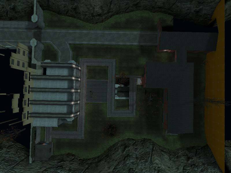
No insult intended but, this looks amazingly like
a box thats been filled in with stuff. I know that thats not really the
case but it does none the less. My advice, take a look at the top down
image of this map. It
is essentially a box filled with stuff too but, it has non-accessible
vistas to make it appear larger than it is. You need something besides
a sky to give this map the advantage of roominess. Break the box and
give the players something to look at.
Truly, the playable
area is very square, but I had hoped the cliffs on the side and the
inaccessible area with the yellow and white buildings and watertower
would prevent the level from feeling too much like a box. I'll go
back and reevaluate how to fix this problem. I'll try to put the
yellow and white buildings on seperate planes from the stone and red
buildings. Putting the whole level on a slant might help.
The two things that strike me first in this shot
are both realism items. 1st, the grating is much to thick. Real world
grating like that would weigh a few metric tonnes. Make it a bit
thinner. 2nd, canals have steeply sloping sides. This helps prevent
debris from accumulating on the edges due to slowing water. If you are
going to have vertical sides, add more piles of debris. Especially in
the corners. Eddies draw debris by the currents of the water flowing
slower in them. That pile of whatever in the center, probably wouldn't
be there.
I agree about the
grating. I'll thin it out and throw some support beams a la Crono's
post. I'll add a slant to the walls and play around with the
displacements to try to make it look more realistic.
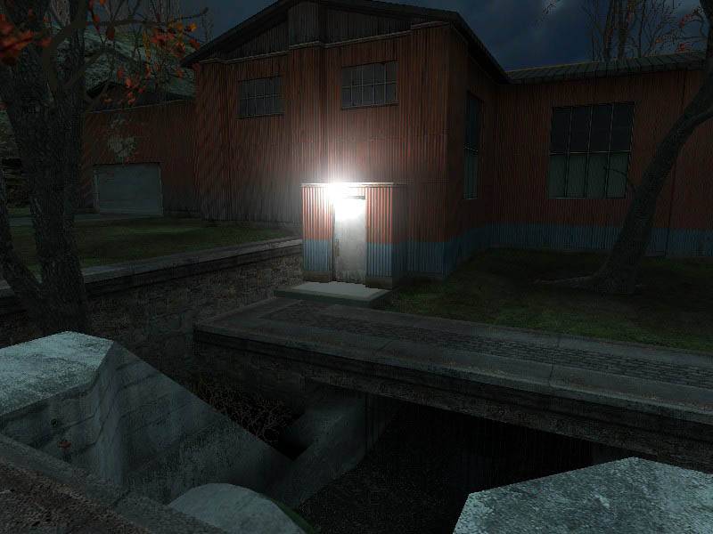
Here again reality is kicking you in the butt. The
pathway leads right up to the wall. Why? Also, since I have not been
inside the map I cannot tell for sure but it appears as if the tree in
the center is growing over top of a tunnel or a hollow place under the
map. If you are intending to retain the path, place some sort of a
fence, or a hedgerow to make it distinct and PLANNED. A fence/barrier
on the upper level above the path couldn't hurt either. I am also not
liking the blue tint to the map. Night time tends to be such but, your
light sources are white, yet they have no indication on the ground
beneath them. The light sprite is glowing massively, yet its dark under
the doorway. Its almost as if the glow is preventing the light from
reaching the ground.<br style="color: gold;">
I'm not sure how to change the path to make
it more realistic. Should I add some space between the retainer
wall and the pathway?
I'll move that tree to the right, it doesn't make sense where it is right now, although the tunnel does end with another pipie.
I'm a little afraid to add fences to the
paths because I want to give the player free reign to run wherever he
wants. I don't want him fenced into particular paths, especially
when the paths lead to doors that don't open.
The lighting is very rough right now, I just threw a few in so that
there was something other than the light_environment. You're spot
on though, for the later compiles I'll have to increase the brightness
on the actual lights (they are only at a brightness of 50 right now)
and reduce the glow effect. As for the color of the light
environment, hopefully when I start really working on the lighting the
lights will ward off the gloomy blue moonlight.
The retainer wall that separates the upper from
the lower area seems a bit thick. Also, would it really be flush with
the grass in a real world area? Also, the building needs some air
vents. Factories generate heat. You need some air exchange.
I'll play with the thickness on that retainer
wall. As for being flush with the grass, do you mean that it
should transition to dirt before it hits the wall? That's what I
originally intended but the alpha displacement bug inverted the blend
texture.
I will try to add air
vents as well as other props to the building to bring it to life...
although I wish that I had the CS:S source assets... the stuff from the
cs_assault would be perfect.
The dock doors would also have some illumination
in a real world setting. The grass is to neat, but I imagine you have
plans for that already. Usually, factories have a corporate logo or
name someplace. You have one in mind? The windows on the overlook
connection between the buildings need to be closer together. Buildings
almost always have gutters too. Dock doors almost always have some sort
of a conventional entryway beside them. it allows egress without
opening that big door.
There's a corporate logo right above the
garage door, but it's not very clear. I'll add some lighting to
highlight the company logo.
I'm kind of at a loss for how to make the gress less "neat." Do you mean I should add more noise to the displacements?
I agree, those windows are too wide, I will tighten them up.
Like you suggested, I'll try moving the door over from the side to the front.
From this angle, it looks to much like a mirror
image between the walls. remove the right hand door and put it beside
the dock door as I mentioned earlier. OK, now the critical part. The
red and yellow fit fantastically but, the rocks in the center region
clash sharply. At least IMO they do. If you can, try to keep the arch
things intact but replace the rocks with the red or yellow. See how it
looks that way. I'd go for the red personally but its your call.
I've tentatively retextured the stone building, let me know what you think.
From this angle, it truly becomes apparent that
the rocks are different from the theme you are attempting. Another
point, do you expect the people to use the street to travel about the
compound? If so, perhaps a painted section for the route is in order.
Another thing that truly sticks out in this shot is, the buildings are
essentially all on the same plain. You need some variation between
them. Look at this shot, the red one, the rock one the yellow one and
the white one all are level. This is not a bad thing but it would add a
tiny bit of perspective and depth to have them at least not so level.
Its true that you have basements but from here, they are not so readily
apparent.
Painted section? Do you mean adding a sidewalk of some sort?
Diversifying the
planes will be a hassle but ultimately I will have to do it because
you're right it looks way too amateurish at the moment.
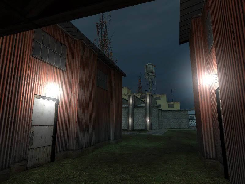
Two things stick out. 1st, that path. Its not
fitting the theme. 2nd, the buildings. People leave lights on
sometimes, even when the shop is closed for the day. Turn on something
inside. A computer monitor, or a bathroom light perhaps.
I'll try to give the
illusion of inside illumination. If I do decide to hollow out the
buildings then this problem will be solved.
The stairway looks to much like a pit with stairs. Put some grating/fencing around it. Can't see much else from this angle.
I'll put a small
fence around the pit, just to stop people from falling in. It was
a bitch to get the displacements to fit around the stairwell and still
sew together, so I don't want to touch the actual dimensions of the
stairwell.
One has to ask, Why such a big drainage pipe? It
might be beneficial to have a reason other than a route for the
fraggers to travel.
I can't come up with
a good reason for the huge drainage pipe. I'm open to any
suggestions, although ultimately I think the player is just gonna have
to suspend their disbelief. Hopefully the headcrabs will distract
them.
This shot shows a real good illustration of that
path. It looks like you took a wall texture and placed it sideways upon
the ground. There have got to be true path textures. Look for a more
appropriate one. The bricks clash with the rocks too. Might be
unavoidable but try anyway.
As per yours and
ReNo's comments the path texture is now due to be replaced. Do
you think a dirt path would suffice or do I need to put some real
concrete pathways in?
I don't think much
can be done about the clashing brick and stone textuers. I'll
splatter some blood on the stones and see if that helps. :smile:
Hope some of this helps.
Of course it did, thank you for taking the time.


