I've been working with this map for some time now, and thought i could just finish it, and add here. But as i have some memories from last times, i got good suggestions from here and i decided to add this a bit earlier, so you can throw any kind of ideas. Im always intrested. Theme of the map.. well.. its a somekind of facility. Oldish, thus the name. I was after prodigy and nuke with the style, and it worked suprisingly good.
Oh well, i hope you like the pictures so far, i would of add more (i got loads of em) but there is some limit here. Maybe i upload them later and put em all here.
Discussion
Posted by Captain P on
Fri Dec 15th 2006 at 5:51pm
Nice improvements. :smile:
The first shot is still a bit dull in terms of color variation, but it looks better already. I like the second shot: interesting colors and objects. The 3D skybox looks superb and I like that walkway and the buildings on pillars. Keep it up. :smile:
The flourescent fixtures in pic 2 look like they are turned off yet they emit light. Switch models to the ones that are turned on. The ceiling texture in that same screenie looks a bit like concrete flooring(could just be the lighting though). Otherwise looks real well made. I like the next to the last shot very much. Good job on the skybox.
Ack! Been off with this map some while now, actually finished up another map i had in progress. Thinking of publishing both same time.
Now, i finally made the 3D skybox, it covers quite nicely the area, and was pain to do (stupid hammer liked to crash alot too). Gotta agree with lighting, it needs more work. I removed all lights from map and start working with em from beginning, hopefully with better result this time :wink: . Will be posting pics in few days.
The lighting still could be spiced up a lot! Use spotlights instead of normal lights to avoid the discs of light around the light fixture prop. Give the lights much more color (blues or yellows). Make some lights off to add a little asymmetry.
There's a lot more potential for lighting atmosphere here! It's all too evenly covered in white brightness.
Posted by Captain P on
Tue Nov 28th 2006 at 10:49am
Just add screenshots in a next post. Otherwise you mess up the comment order and such, could be confusing. :smile:
Anyway, in the first new shot it looks like the floor is made of dirt instead of concrete. Looks a bit odd. Some dirt piles on top of concrete might be better. Props look strategically placed bytheway and the lighting is good imho.
Second shot looks too bright and whiteish, and also very narrow. Looks like a movement bottleneck. I'm not sure about the ceiling texture, but it doesn't look like a solid concrete ceiling. Concrete plates look better.
In the thrid shot, you could add some ceiling beams for support. I think it's fine otherwise, except perhaps that it's low on contrast.
The fourth shot looks awkwards: I don't think those blue tiles go well together with the crates and barrels, and the generally very industrialistic nature of that area.
Some images in this post have been automatically down-sized, click on them to view the full sized versions:
Some images in this post have been automatically down-sized, click on them to view the full sized versions:
Thanks all for the comments. Ive been looking into the problems mentioned, and started working with em. At the third pic on the outside, i added little something to get more feeling that you actually are somewhere, uploaded a pic from it
and dont worry, i will be moving that to 3D skybox once im finished with all the props in there. From the top of the tunnel, yeah should move the rocks and place something in there. I thought i make the trainrails take a turn there and to a tunnel.
Also worked with the inside area (second pic), made the tables bit better
Posted by Captain P on
Sun Nov 26th 2006 at 2:56pm
First shot is a bit empty and open, and the tunnel entrance looks like a flat textured rough block, but I like the atmosphere, especially the buildings to the left. The hills look a bit like they're dropped on top of the tunnel, rather than that the tunnel is built inside a cliff. You could consider making the cliff taller.
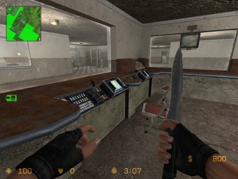
Second shot is nice. A bit greyish indeed and I feel that control room is quite spartan - a table and a couple of cups and stuff would be nice.
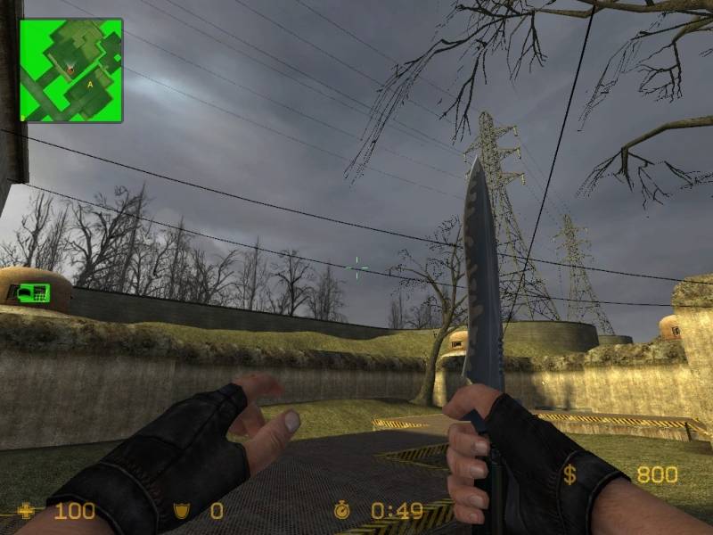
Third shot gives a nice wide and open impression, although the long wall just below the trees walls in the map too much for my taste. Some more hills beyond it and fences instead would give a more open, 'there's a world outside' feeling.
All in all, looks fine so far, besides a few things. Main problem is the very generic theme, although it's visible you've put some time in this map, which is a good sign. Keep it up! :smile:
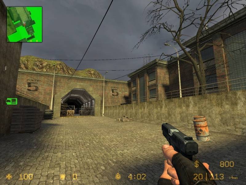
Posted by reaper47 on
Sun Nov 26th 2006 at 10:34am
The screens look nice so far. Try to get stronger coloring to the indoor lights (yellowish and blueish). They look a bit gray.
Also the theme is a little random for a CS map. There are so many facilities. Try putting in some landmark or visual eye-candy that stands out from the standard CSS maps a little more. What's done in those facilities? Why are they being bombed?
Oy there. :smile: So looking at the three screens you have up right now (excuse the kinda jumbled following paragraphs)...
What I like: Skybox and ropes. Nice job taking the time to extend the level out into the skybox (or at least past the playable environment) like any respectable map should, and the ropes look great (not all following one direction either - crisscrossing overhead looks cool, adds visual interest). Lighting isn't too bad, kinda plain but still better than fullbright or gray-colored. Lighting in the tunnel looks cool with lights along the sides. Some visual detail in the second interior shot looks nice, trimming along the edges of the desk top, sunken-in controls. Third shot, power lines off into the distance looks nice, yellow "hazard stripe" trim adds some interest.
What I dislike: Hmm.. kinda little from these screens. In the first shot maybe you can add a bit more terrain in the background; while it goes off the playable area it still kind of ends abruptly. Second shot: only maybe texturing choices for the ground (looks outdoor-cracked-concretey) and the sides of the desk top (also concrete-y and seems a bit out of place). Lighting also seems a little "even" and uninteresting in these areas, maybe you could get a bit more atmospheric and interesting with wall lamps instead, or at least some darker patches - vary it up. Third shot, again not too much to really critique.. the map edges (displacements) are quite uniform, you should break these up a bit heightwise, give it some variation.
That's about it, this map shows some promise and is looking pretty good so far. I'm hoping to see some more shots soon.. seems like a big map and we only got a tiny taste :smile: